Short updates are boring. Release notes new format. How to write

Release notes are something nobody wants to read. People launch a website to use some services, and we’re like, “Hey, look what we’ve made for you.”
The majority of release notes essentially boil down to technical updates and bug fixes. Being written as plainly as Terms & Conditions texts, they raise no interest in the product, so most readers simply ignore them.
This is a huge missed opportunity.
Release notes can attract thousands of potential customers to your new feature unless aimed at a few tech-savvy guys only.
We have made a long way by testing dozens of release notes samples telling our customers about Dashly updates. Our cumulative experience is gathered in this article.
Or you can watch our video 👇
It will explain to you:
- What release notes are;
- Release note structure;
- How to write release notes;
- Where to distribute them.
Thanks! Now check your inbox.
What are release notes?
A release note is a report informing readers of the new version of a product, or an update, or a bug fix.
Such texts can be written for internal or external consumers to boost their engagement and raise product awareness.
Typically, they describe the recent changes appearing in the product’s latest version, which improvements have been made, how it is going to impact the consumer, and what users might need to do differently.
It works the following way:
While the product and its updates are being prepared by a product manager, release notes are created in collaboration with many other departments and employees.
Once devs get the product ready for launch, marketing, sales and support departments come in to promote it.
Dev team should clearly explain to marketing and sales experts what, why, and to who is advertised.
Support managers should also stay in the know: they will address users’ burning questions about the product and possibly faced challenges.
Throughout all the processes, a marketing manager coordinates the work of departments, making sure the product’s value is presented in the right way to the right people.
Read more:
Release note structure examples
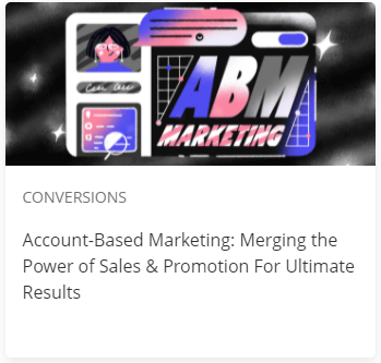
Depending on the purpose and the object described, a release notes template can be crafted according to a certain structure. It can include a variation of:
- Header
- Overview
- Purpose
- Issue Summary
- Steps to Reproduce
- Resolution
- End-User Impact
- Support Impacts
- Notes
- Disclaimers
- Contact data
- CTA
Pro Tip: A gripping release note often contains visual elements in order to capture and engage users. Those can be infographics, screenshots, videos, memes, or GIFs.
Let’s check out a few great release notes examples for you to figure out how those might work in your company.
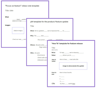
4W
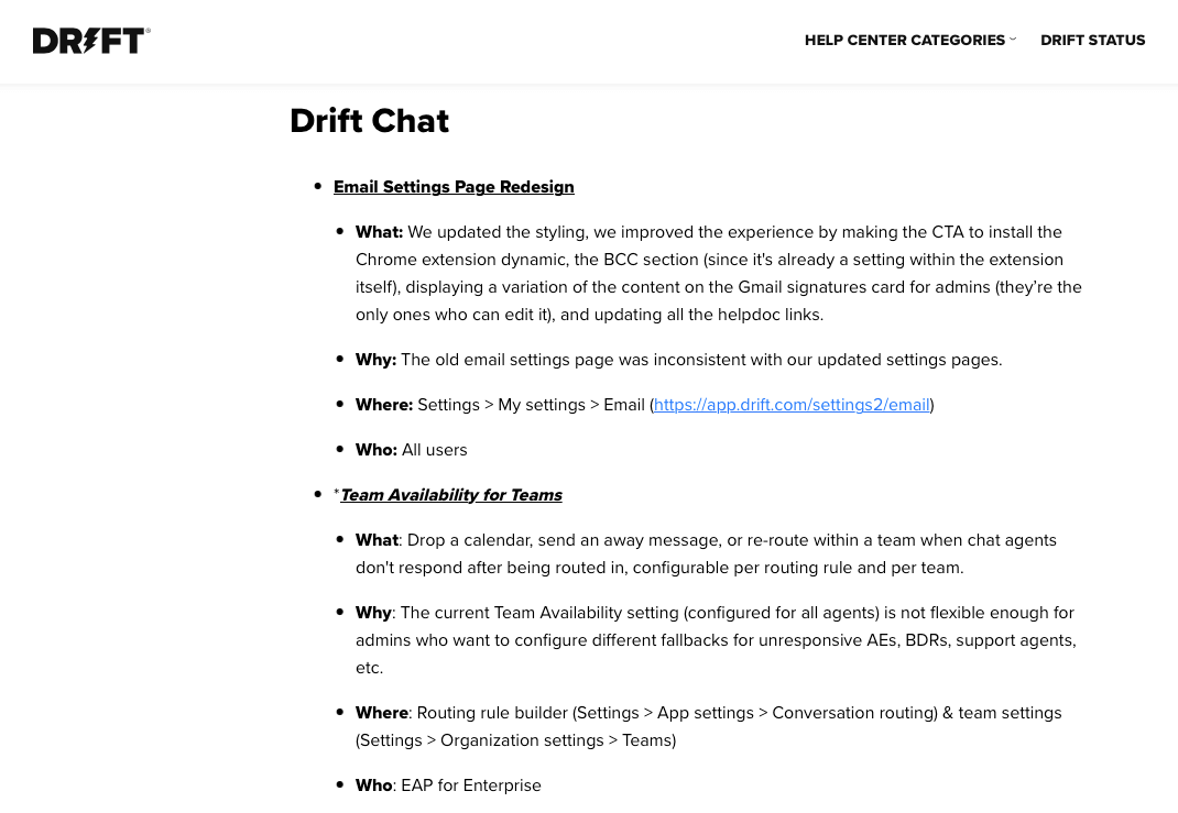
The Drift company has decided to keep it brief: their release notes contain everything users need and nothing they don’t. Texts are divided into super-digestible blocks:
- What has been updated?
- Why did they make improvements?
- Where these updates can be accessed.
- Whom it concerns.
Reading takes a couple of minutes, which highly raises the probability of customers paying their attention and dedicate time to studying the details.
Read more:
How-to’s release notes
When a product or feature release concerns regular users, it’s important to let them know how they can benefit from it and, most importantly, how it should be used.
Upwork briefly explained the advantages of the ‘Direct Contracts’ feature and provided a step-by-step guide on how to implement it.
Note that all hands-on information is given below the essential news.
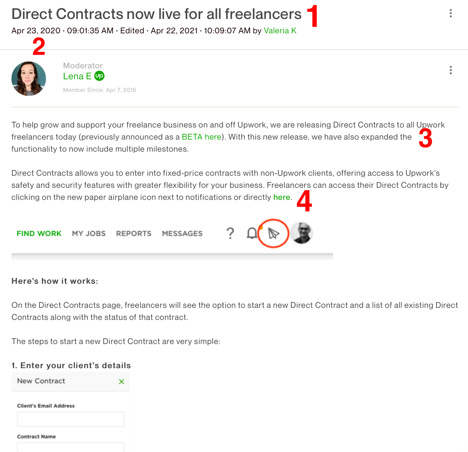
At the same time, this release note sample has all basic components:
- Header;
- Date;
- Brief overview;
- Value for end-users.
In the end, the team encourages readers to leave questions in comments if they need any additional help with this feature.
Update lists
Since Adyen payment processor is a B2B service provider, it’s not surprising that each software release note is aimed rather at developers than end-users (and can be found in the ‘Documentation’ section).
The scope of their services and supported payment gateways might be confusing, so they name each release note as ‘iOS Components’, ‘Checkout API’, ‘Android components’.
Each note contains the lists of new, improved and fixed features plus explains their purpose for end-users in two words, and provides links to more detailed release documentation.
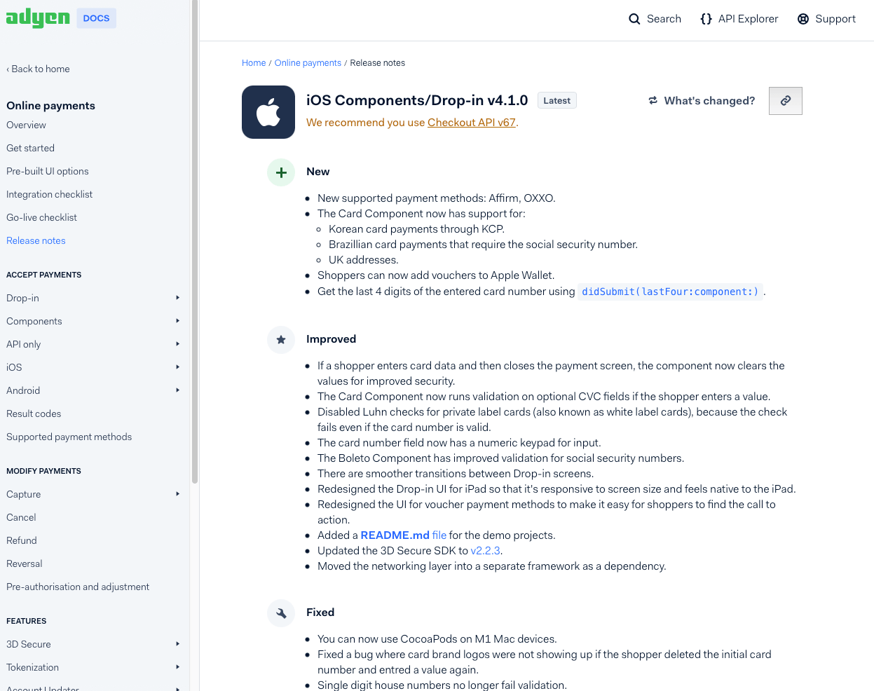
Does this release note example look too boring?
Well, such release notes are created for developers who don’t need loud words —they are well aware of functions and their advantages.
Focus on features
Each month, Canva publishes a rundown of very end-user-friendly updates (new features, collaborations, etc) in its blog on Medium. After the heading and subheading, they get straight down to the list of features accompanied by:
- Explanation of benefits for users
- Pictures and GIFs
- Links to more detailed guides or pages with the tools
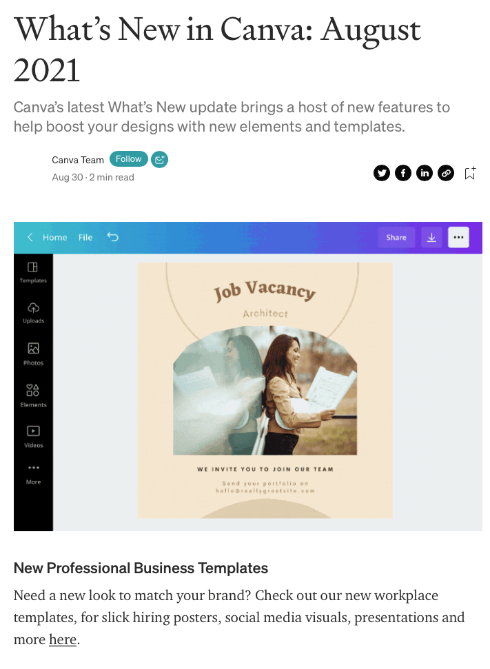
The visual part is particularly great because it displays use cases for a new tool and explains where the new buttons can be found.
Canva’s release notes are short but very easy to comprehend since there is no technical jargon. This software release notes template is a great choice for B2C companies.
Read more:

More in-depth approach
After numerous experiments, our Dashly team has realized that users don’t read release notes because there is no explanation of how exactly new features can benefit them and how they can be used in practice. We have started creating more customer-oriented release notes, and it seems to work better than anything else before.
Take a look at one of our blog posts:
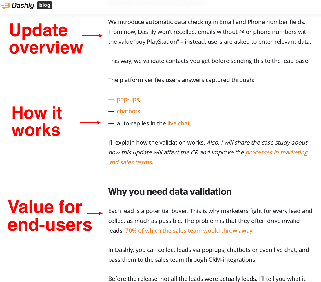
Instead of simply mentioning the feature, we dig deeper and focus on:
- How the product/feature works
- New opportunities it brings
- Why users need this feature and what can be improved by implementing it
- Previous problems and reasons for improvements
- Challenges and tasks solved by the updates
- Product applicability: use cases, how to leverage it, etc.
We focus on the practical side and show readers how a product can serve them.
Besides, release notes are jam-packed with examples, infographics, statistics, links to useful resources and to the new products themselves: such release note format encourages further research and involvement.
Read more:

How to write release notes?
Look at this release note:
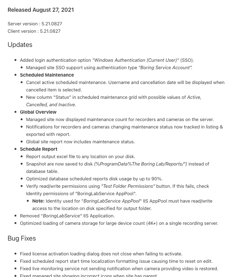
There is nothing to lay eyes on. Nor CTA buttons, nor highlighted links, nor images.
Just a plain list of text.

Now look here:
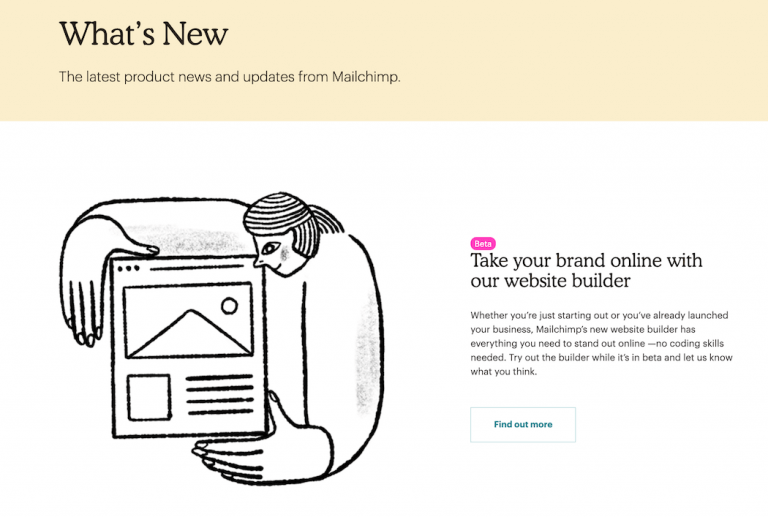
It’s different, isn’t it?
I’m barely keeping my hand from clicking that button.
Want to write cool release notes that raise viewers’ interest? Follow these rules.
Thanks! Now check your inbox.
Use catchy titles
Instead of making users scroll and search for updates, you can introduce them right in titles. Keep them short, simple, and ample. Here are some templates:
- [feature name] added!
- Introducing new [feature name]
- Try our new [feature name]
- [feature name] is out!
- Boost revenue with [feature name]
- Automate tasks with [feature name]
- [Feature name] is here to increase your social media traction.
Some companies come up with action-oriented titles that offer readers to do something with the new feature. It looks like:
- [feature name] enables you to [action]
- Change the way you [action] with [feature name]
- Get/do more [action/goal] with [feature name]
Focus on the value to the customer
Release notes should be about users, not your product or brand. Explain how the new feature or update will benefit the reader.
Better use ‘you’ instead of ‘we’.
When working in the product team, you risk getting deeper into technical details and losing connection with readers because that’s not what interests them.
Keep it short but exhaustive
Explain changes in a few words and if you want to provide additional information, you can place relevant links. This way, texts will be easier for readers to digest.
Compare:
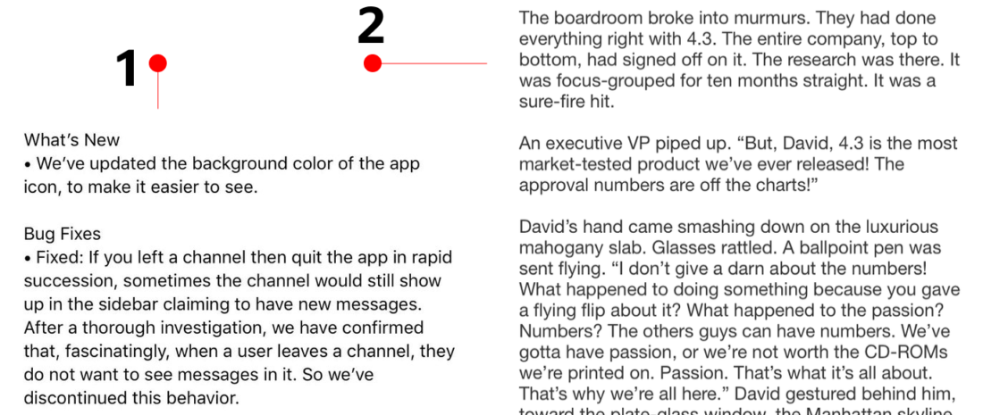
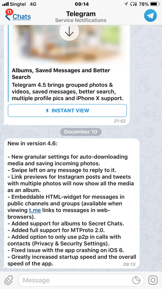
The first is a typical release notes size. The second was an experiment with a storytelling format of the Twitter update release note.
Avoid technical jargon
Unless your information is provided for developers, try to write your software release notes without complicated terms. Do not forget about languages and geographical locations because some vocabulary might not resonate with customers. Here are a few examples of specific words:
- Dev (s)
- Patch
- Staging
- Front/back end
- Log (s)
- Python, Java, etc
- Framework (and their names)
- Master
- Specs
- Depreciation
More visual content
Include images, gifs, videos — anything that showcases your product and helps viewers understand the information better.
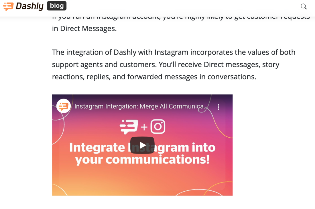
In Dashly, we try to add visuals wherever it’s possible. When pictures are not enough to explain the updates, we use GIFs.
Videos are perfect when the update is large and people would surely like to learn more about it.
Group releases
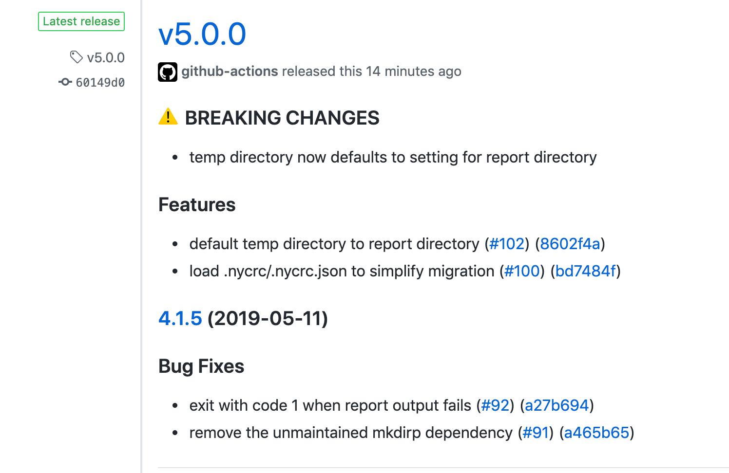
You can post texts in sections like ‘New Features’, ‘Improvements’, ‘Bug Fixes’, etc. so that readers can focus on what interests them most.
Provide additional context
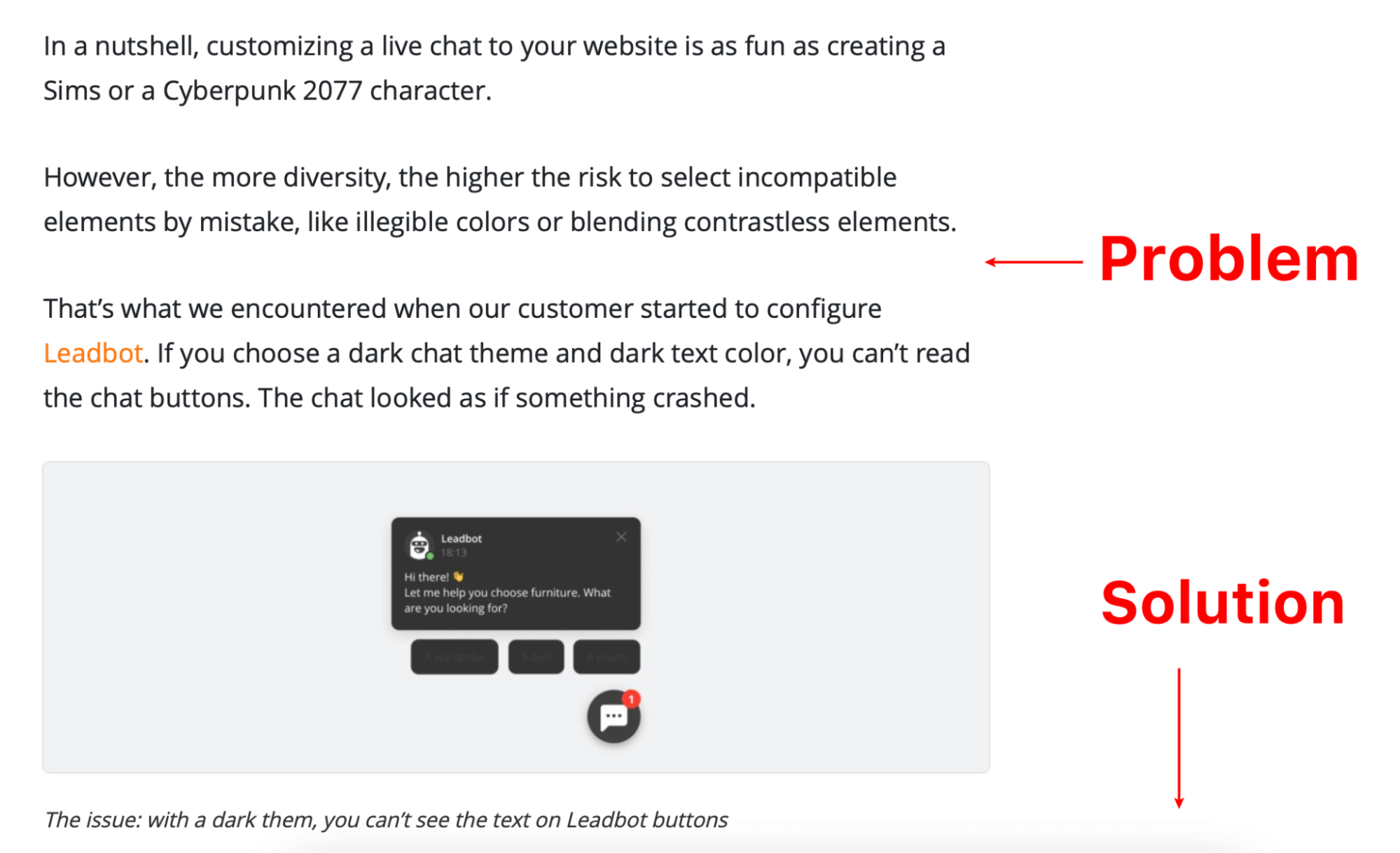
Think about what customers are likely to ask you next. Explain why you’ve decided to make the changes, what was wrong. Walk readers through how to access and exploit the new feature. Additionally, you should mention that they can contact customer support if there’s something left unclear.
Add Call to Action
Another reason why visitors don’t read release notes is that they don’t know how to apply new features. Guide them by adding CTAs: this tool incentivizes the goal action. Stick to two rules when adding a call to action:
- Keep it clear and relevant. Avoid general phrases like “Read more”. Instead, offer readers to ‘Test the new interface’ or ‘Click here to learn more about automatic integration’. This phrase should be short and intriguing.
- Lead to the right source. Make sure that the content shown upon clicking the CTA is related to the topic and will be useful. For example, it may lead to a tutorial, demo, or a page where it can be activated. If you just lead to a generic blog post without practical value, readers are likely to be disappointed.
Here are the best CTA templates categorized according to the target action:
- Invitation to read more
Use phrases that look inviting and encouraging:
- Click here to see how [feature name] works
- Take a look at [feature name]
- Read about [feature name]
- Learn to use [feature name]
- Be the first to benefit from [feature name]
- See what [feature name] can do for you!
- Action-focused links
This content leads users to app sections (cart, interface, settings menu, etc) rather than blog posts.
For example:
- Click here to activate [feature name]
- Enable [feature name] now
- Activate [feature name]
- Promotional CTAs
This type of CTA promises users something like a discount, a trial, or a demo:
- Contact us to request [feature name] trial
- Try our [feature name] for free
- Claim your [discount] for [feature name]
- Click here to get [feature name]
Where to distribute release notes?
Any software release notice should generate engagement, so it’s crucial to find a suitable channel for that. Most often, updates are announced via in-app notifications, blog posts, email, and social media. Each channel has pros and cons, so you should choose accordingly.
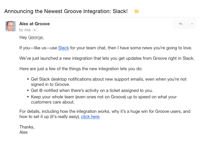
By emailing users, you can re-engage them because they will log back to see what’s changed.
App Store
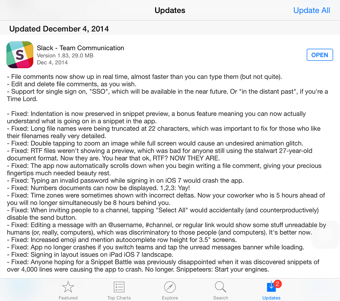
A short description of the latest updates will show new users that your product is constantly being improved while existing users know what’s new and how the app is different.
Blog Posts
Blog posts give you more space for going into details.
Your texts are not limited in volume, so you can explain the reasons behind updates, how to use the new products and features, and explain the benefits of changes.
Moreover, some companies divide release notes into updates, bug fixes, product launches, etc. for a better user experience.
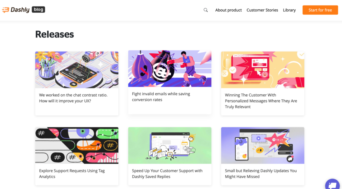
By the way, if you don’t run a blog on your official website, consider creating one on Medium — this is a common practice for SaaS companies.
Read more:

Social media
Social media is the fastest way of distributing information. There, you can spotlight new features, raise hype and provide a sneak peek into the updates. Then, add links to more detailed resources for viewers to click and learn more. That will generate more involvement.

In-app messages
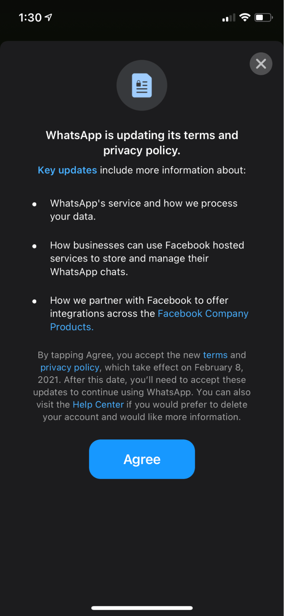
In-app messages are more likely to be read because users get notifications right away. They can be sent to anyone or targeted at specific customers. Such release notes have an optimal length, but at the same time, can feature links to external sources.
Dashboard (Admin panel)
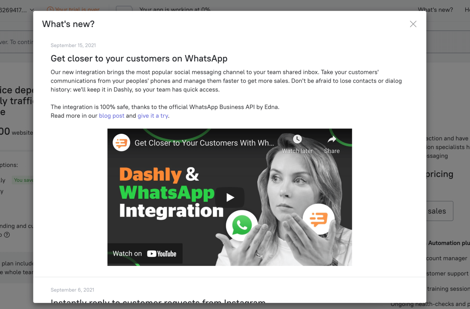
As an alternative to in-app release notes, a company can publish updates right in the dashboard. For example, Dashly puts them in the ‘What’s new’ section, giving users easy access to first-hand information.
Since you want your release notes to be read by as many people as possible, consider posting them in several channels to target different audience segments. Also, think about timing: critical release notes should be distributed directly, i.e., via emails, messengers, or automatic in-app notifications.
Thank you for subscription!
