20 product led growth examples to inspire your team [expert edition]
![20 product led growth examples to inspire your team [expert edition]](https://www.dashly.io/blog/wp-content/uploads/2023/09/20-product-led-growth-examples-to-inspire-your-team-expert-edition-1440x634.png)
Ready to get the lowdown on product-led growth and why it’s shaking up the SaaS B2B space? I’m about to take you on a journey through 20 scorching examples of companies who’ve cracked the code.
These companies aren’t playing the same old sales game anymore; they’ve reshaped their strategy, and it’s all about the product. Yep, they’re driving user acquisition, retention, and even expansion, fuelled solely by their product power. We’ll see how they’ve slashed sales costs, sent growth into hyperdrive, and dialed up their user experience. And we’re going to deep-dive into their tricks of the trade, pulling back the curtain on some game-changing insights around user segmentation, the power of trials, and dynamic pricing strategies.
This tour isn’t just about dipping your toes, it’s about diving in headfirst into a treasure trove of product-led growth practices. You’ll be in awe when you see how the product can be more than just a part of your portfolio—it can be the driving force of your entire business.
So let’s buckle up, lean in, and discover how to let your product lead the way to growth!
Personalize your starter guide
Personalizing the starter guide during onboarding is crucial, as it anchors the user’s first interaction with your product. A personalized guide addresses the user’s specific needs and preferences, enhancing their engagement and comprehension of your product’s value.
Here is how to do this:
- Segment your users based on their industry, role, objectives, or product usage patterns.
- Then, create tailored onboarding narratives for each segment, highlighting the features and benefits most relevant to them.
Remember, the ultimate goal is to help each user reach their unique “Aha!” moment as swiftly as possible. This level of personalization can significantly improve user satisfaction, product adoption rates, and eventually, retention.
Dashly growth strategy example for product-led companies
Dashly is a conversational platform that satisfies the needs of marketing, sales, and support teams. All thanks to versatile website conversion tools, you can implement and test different strategies and compare them without a developer. Here are just a few:
- chatbot to capture, qualify leads, and automatically engage them in the conversation at different stages of the funnel;
- live chat to create a direct communication channel between your agents and customers;
- pop-ups to target various segments with specialized offers;
- triggered email campaigns to reach out to those who left your website;
- A/B testing to compare different CRO strategies and find out which one works best;
- 30+ integrations to fit Dashly into your tech stack.
Sure thing, clients don’t need all of these features. For example, support team’s priority is a live chat, marketers’ tend to use chatbots and popups, sales managers — user tracking.
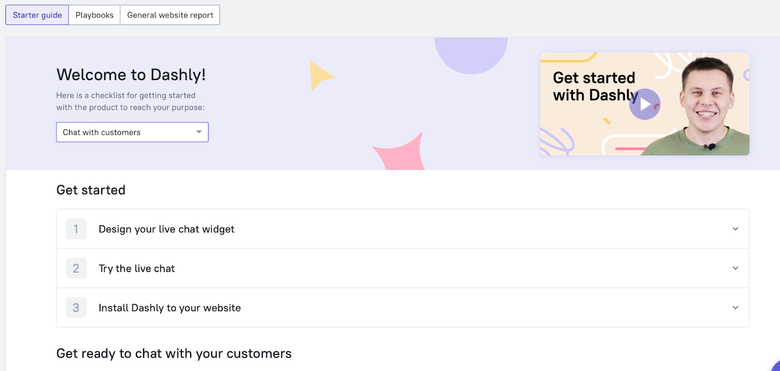
To help users master the platform faster, we implemented a short survey at the start of their onboarding journey. It asks people about their purpose and changes the onboarding guide accordingly:
- This is how the starter guide looks when user chooses “Chat with customers” as a purpose.
- This is how the starter guide looks when user chooses “Increase website conversion” as a purpose.
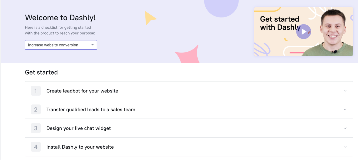
In such a way, users master the platform faster. It is easier to get the product value with such a personalized features’ advice.
Test our user onboarding yourself 👇
Humanize your processes
Alright, folks… this piece took some serious elbow grease to put together. Throughout, I couldn’t help but notice that WAY too many companies are rolling more like “Emperor Economy”… than actual human beings.
A large part of this behavior seems to hinge on unnecessary obstacles. Now, think about our day-to-day lives. Where do you typically encounter such futile hurdles? Probably when dealing with massive, impersonal businesses, or entangled in some kind of red tape.
The bottom line here is that no one enjoys tackling these tasks — they feel purely laborious. It’s tiresome, a duty you MUST carry out rather than want to.
It’s almost as if there’s a concerted effort to put us in chains with email confirmations and paywalls, when all we’re trying to do is get a taste of the darn product. As a growth marketer at Dashly, my goal is to help our product break away from these frustrating user experiences and choose an accessible, straightforward strategy that places the user at the center.
Real-life example from Basecamp
Ever since the word go, Basecamp has been championing Time-Limited Free Trials, allowing teams to test the waters with their project management platform. Does it match their unique needs? The trial gives them the answer.
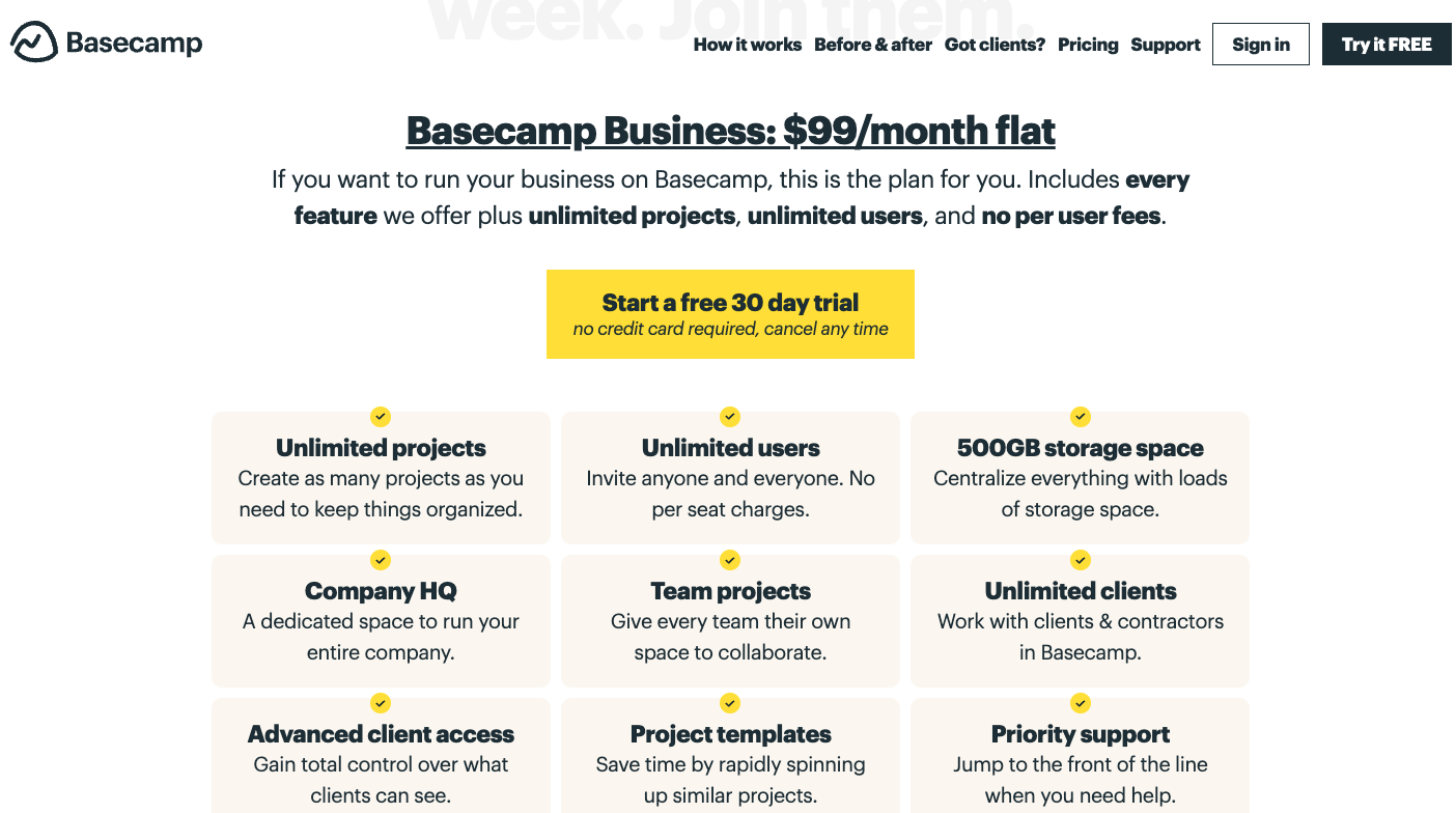
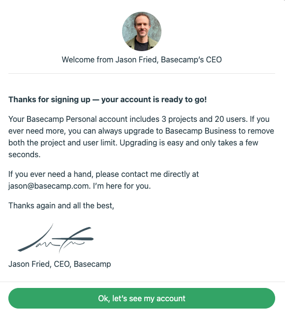
The simplicity of the sign-up flow is commendable. But there’s more: a letter, personally signed by Basecamp’s CEO, awaiting new users. It lays out the roadmap ahead and offers a friendly line of communication for any questions one may have.
The whole experience felt intimate, more relational than transactional.
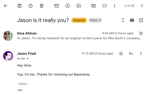
I found myself thinking, “They can’t expect me to believe that the CEO will respond to my email. It’s all part of the sales theatrics.” But, guess what? An answer landed in my inbox… and quicker than I ever imagined.
Now, is it feasible for every business to have the CEO answer each inquiry personally? Not really. But what Basecamp reminds us, here at Dashly, while charting our own product-led growth, is the importance of making users interactions warm, personalized, and less business-like.
Kudos, Basecamp, for keeping the ‘human’ in business intact. And inspiring us to do the same.
Provide social proves to achieve product led growth
In the realm of influence tactics, there’s a phenomenon called Social Proof. First put on the map by Robert Cialdini in his brilliantly insightful book, ‘Influence’, it outlines how we tend to mirror others’ actions in specific scenarios to fit in.
There are six prominent manifestations of social proof. Let’s unravel them:
- Validation from a Subject Matter Expert
- Vouching by Celebrities
- Seal of Trust from Trusted Entities
- Empowerment through Data
- Feedback from Genuine Customers
- Independent Reviews
Leveraging social proof as an integral part of the user experience is a product growth strategy greatly appreciated in the best product-led companies, something we at Dashly are also keenly observing and incorporating into our growth playbooks.
Here is how Notion implemented this advice
Notion, a workflow management software, is stirring things up with its visually rich, kanban-esque layout that enables teams to collaborate, sketch out, strategize, and arrange tasks effortlessly.
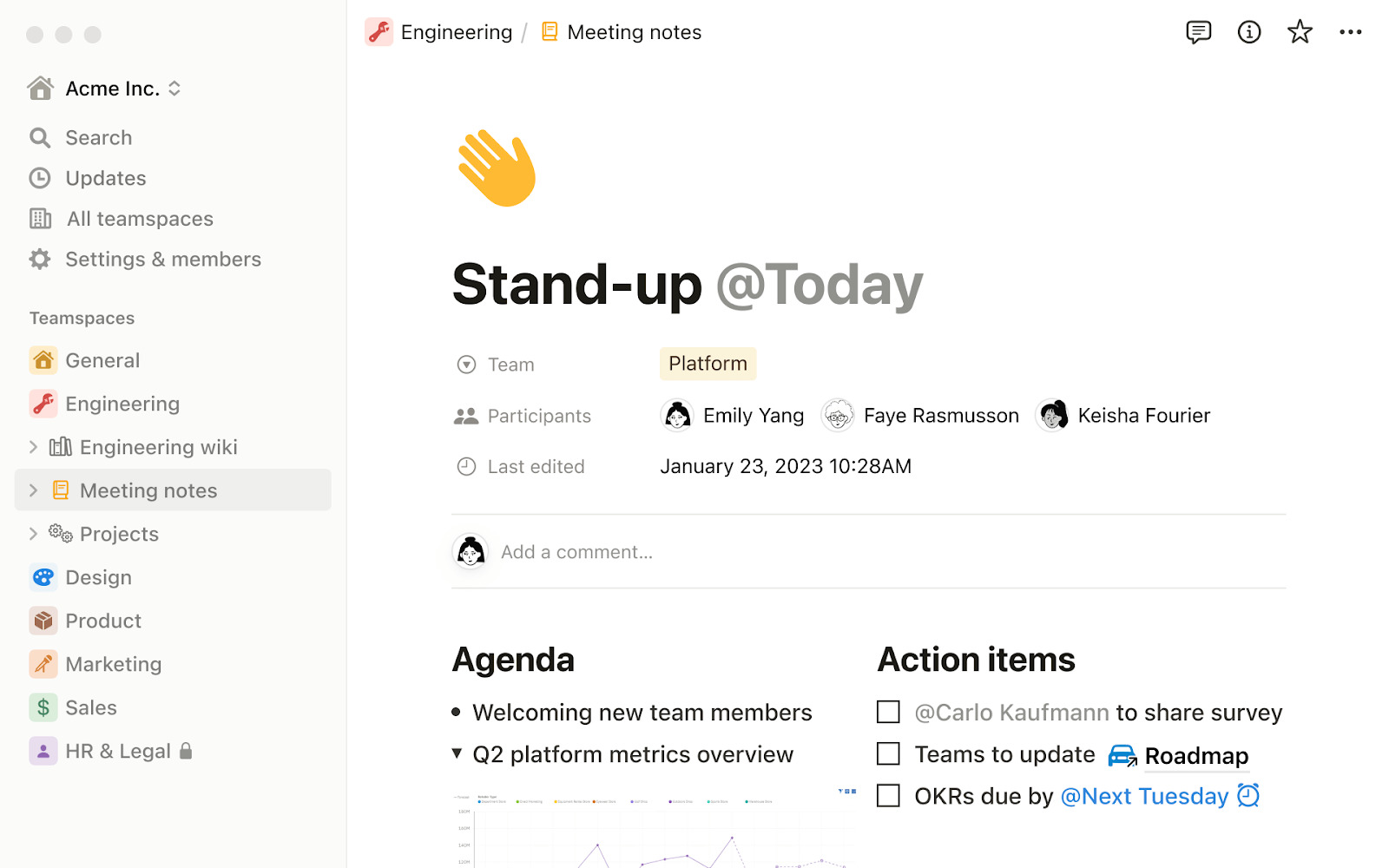
A tour of the Notion platform reveals clever sprinklings of social proof throughout its pages. You can’t help but ponder: are these well-recognized, successful apps attributing part of their triumph to Notion?
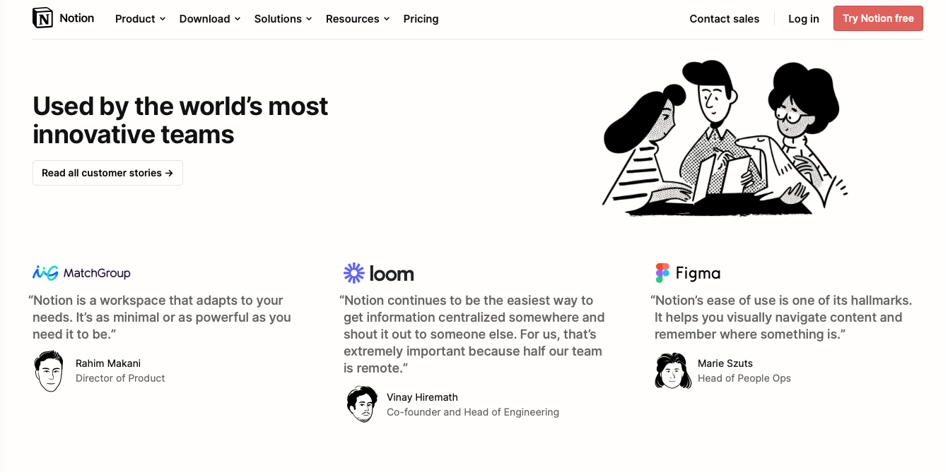
Further down, we encounter more social proof, articulated through testimonials given by personalities leading celebrated software firms. An entire page stands testament to the ways Notion has addressed customer pain points.
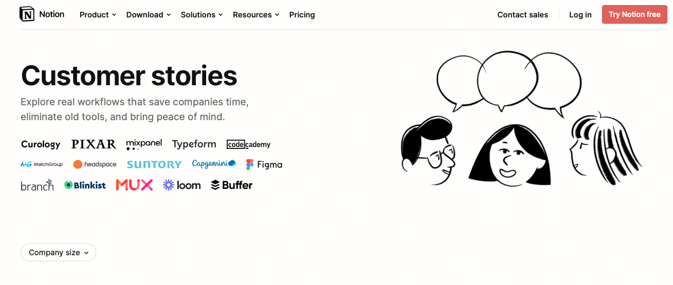
And if that wasn’t enough, data is then showcased citing their continuous high rank as an industry leader on G2 — a third-party platform purveying genuine software reviews.
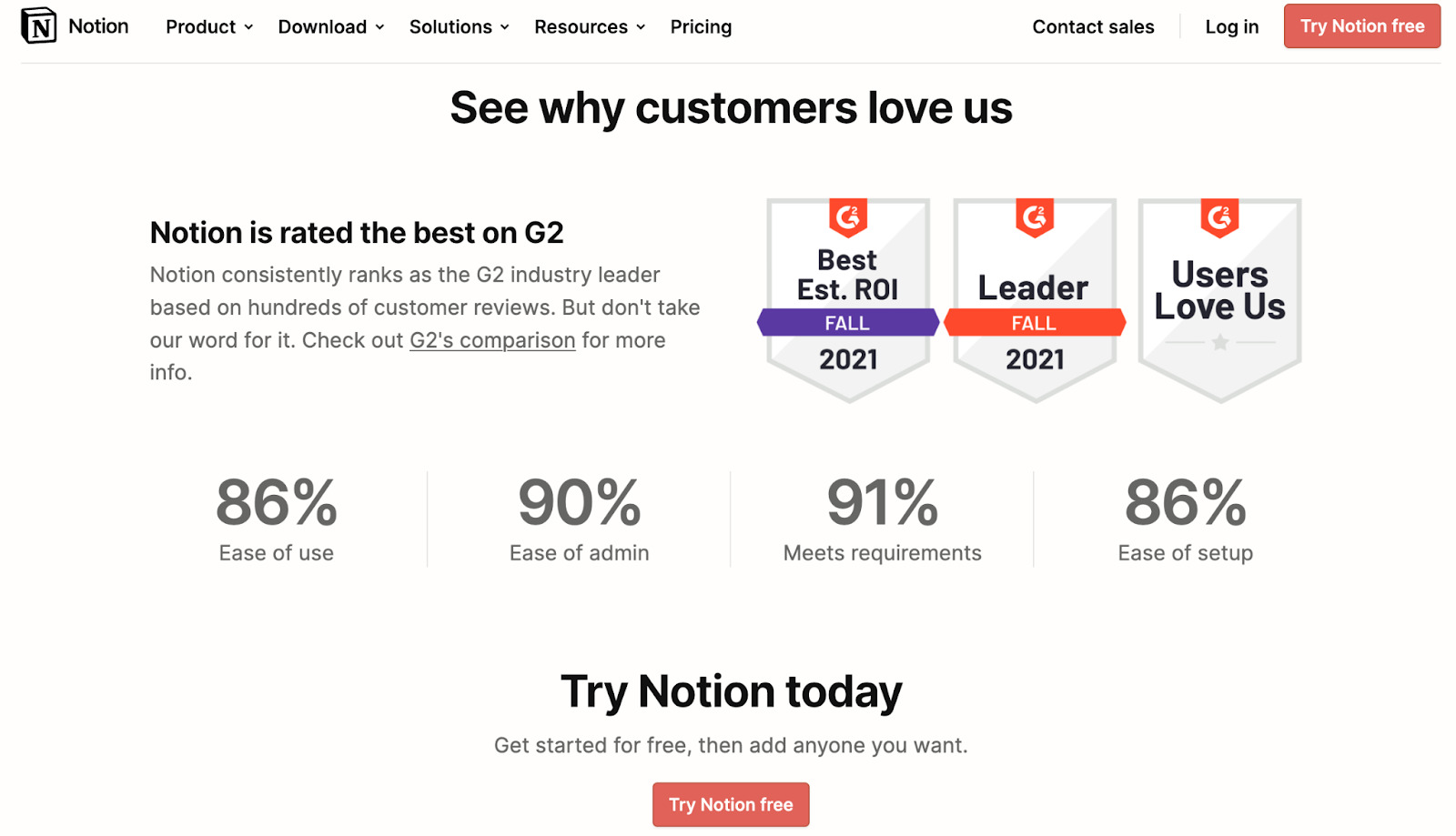
In these four interface displays alone, Notion ticks all the boxes representing the six variants of social proof.
Deliver value to achieve users growth
“Recurrence of Value” is a foundational principle for a successful product-led strategy. This principle underscores the need to routinely deliver value to users, bolstering retention and encouraging user engagement. A product is successful when it solves a problem consistently and provides constant value, encouraging users to keep coming back.
Take Gmail for instance, an email platform with a straightforward proposition: managing your email communication. Gmail integrates well with other apps, offers ample storage, and filters spam, consistently delivering value. Now, consider a user who finds Gmail beneficial for day-to-day inbox management; the user will return repeatedly experiencing Gmail’s recurring value.
This continuous value delivery is what turns an occasional user into a daily user and a daily user into a loyal one. The “Recurrence of Value” principle, hence, is crucial in a product-led growth strategy, particularly when focusing on cultivating long-term user engagement and loyalty.
Company doing it right Company Doing It Right: Miro
Miro, a collaborative digital whiteboard platform, excels at bringing creative brainstorming experiences to distributed teams.
Distinguishing itself from the crowd, Miro’s patented whiteboard technologies offer smooth adaptability across a range of platforms, exhibiting both flexibility and swift integration.
Central to their product-led growth strategy is being laser-focused on a particular audience segment. They get the principle that attempting to keep everyone happy might instead satisfy none. Miro has established real-time feedback channels to keep up with their users’ changing needs and priorities for continuous product refinement.
Why does this matter? Because tools like cheat sheets and platforms for brainstorming are vital cornerstones for numerous processes. Miro allows you to combine these elements and present them to your team or your clients.
Need to recall the latest process? Whip out your Miro board. Worried about straying off track? Let’s assess the situation on the Miro board. Pitching to a client? Your Miro board has your back.
Such a handy cheat sheet helps everyone keep in sync, visually highlights any gaps in the process, and serves as a reliable reference in defining the process itself. This ensures Miro consistently delivers value, keeping users engaged and returning for more.
Improve your sign-up page with reverse trial
A reverse trial is an innovative approach to traditional product trials. Instead of giving potential users access to the full product for a limited time (like in standard trials), a reverse trial offers limited capabilities for an indefinite time.
The idea is to keep users engaged by progressively unlocking more features as they interact more with the product. This can encourage a deeper product exploration of the product’s benefits and keep users engaged for longer, often leading to higher conversion rates to paid plans. It’s a great strategy to demonstrate continued value to users, gradually enticing them to upgrade for a more feature-rich user experience.
Example from Trello
Trello, a visually-driven project management tool, is turning the conventional to-do list on its head. With its adaptive software and instinctive, user-friendly interface, Trello stands true to product-led growth principles. And guess what? They’ve cracked the issue of improperly segmented users entering the wrong sales funnel via the ingenious application of the Reverse Trial.
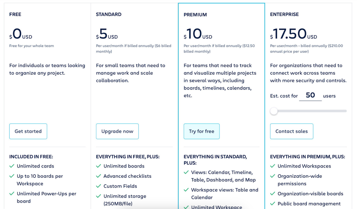
The journey usually begins with a click on the Freemium Plan. While the Freemium Product is impactful, Trello’s intent is to familiarize you with the premium plan’s comprehensive functionality. Thus, the next step in the process takes you precisely there.
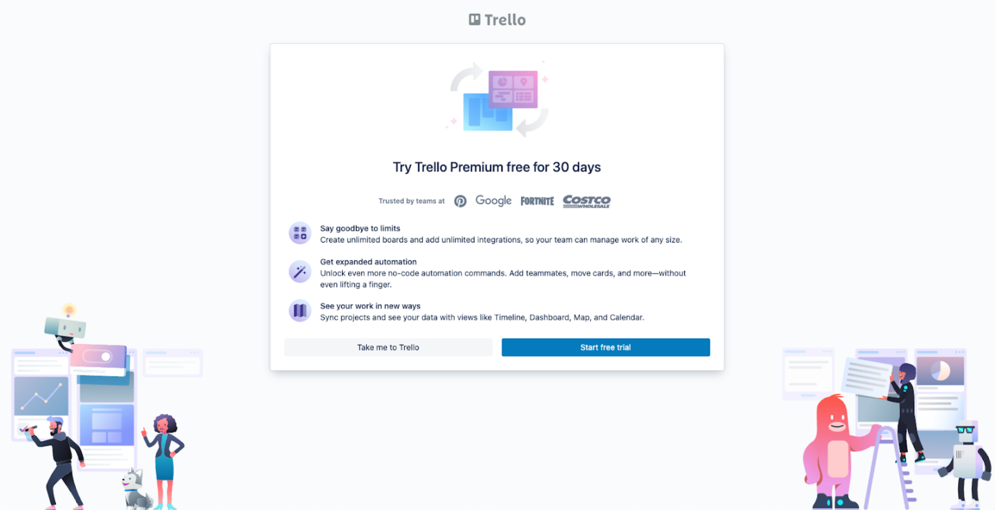
This part of the process is designed to get users to pause and mull over the benefits of the Premium Product. Yet, if you’re an ardent Freemium user, a direct “Take me to Trello” button is available.
And, for those long-standing Freemium users who, in an over-caffeinated moment, accidentally click the “Start Free Trial” — there’s no need for panic!
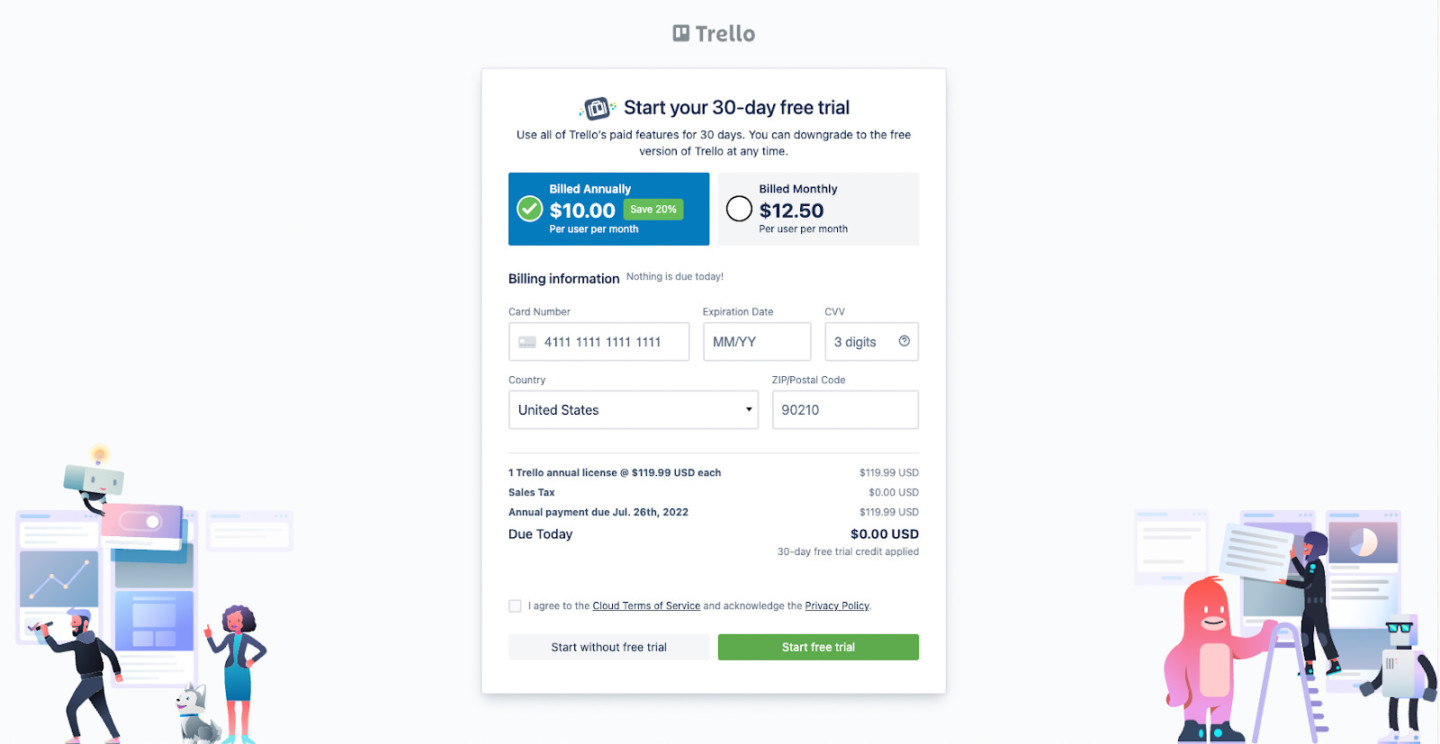
Relief greets you on the next page with a friendly “Start without free trial” button.
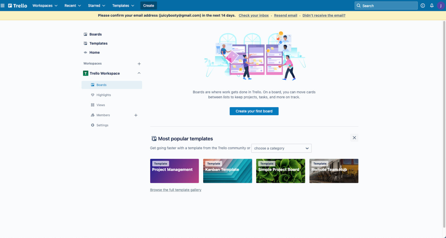
One click and voila! You’re smoothly navigated back to the Freemium Product. As smooth as it gets, with no fuss.
Boost your product growth by segmenting users
Segmenting users is critical for successful product-led growth strategy, because it helps companies understand their user base on a deeper level. Each segment often exhibits distinct behaviors, needs, and expectations from your product. You can segment users based on various parameters such as:
- user behavior,
- engagement levels,
- job roles and more.
It helps better tailor your product experiences, communicate effectively, and deliver targeted value propositions for each segment.
This process helps increase user satisfaction, encourage usage, and, ultimately, drives growth. Moreover, in-depth user segmentation empowers you to identify which segments are most likely to convert to paid customers or users likely to churn, allowing you to shape your strategies accordingly. It’s all about giving the right product experience to the right user at the right time.
Example from Pendo
If you’re steering towards a product-led growth strategy, the odds are you’ve come across Pendo.
Pendo is a user-centric product analytics tool, providing critical data to both employees and customers. The platform offers key insights on user onboarding and product adoption that help software companies accelerate their users’ journey towards realizing their product’s value.
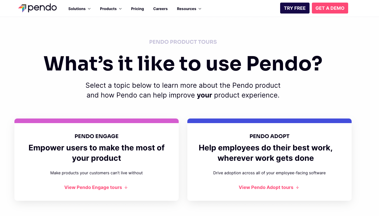
One of Pendo’s main tenets is that their interaction with users is intertwined with both the problem at hand and the user segment they’re guiding.
That’s precisely why the sign-up process immediately nudges you to express your intent: are you focused on user adoption or engagement? Post this selection, you’re directed to a meticulous, custom-made information page that takes you on a comprehensive walk-through of the product — a testament to Pendo’s persistent effort to balance user needs with their distinct product offering.
Share helpful info in empty states
“A helpful empty state” refers to the design approach for showing users a screen that would otherwise be empty, usually because they haven’t yet taken any actions. By including helpful prompts, tips, or calls to action in these empty states, companies can effectively guide users towards taking meaningful steps within the product.
For example, a project management tool might show an empty task board with a prompt to “create your first task”. This can be exponentially beneficial when combined with instructional content that guides the user towards the next logical step. These empty state designs not only aid in user engagement, but they also enrich the user experience, making the platform more intuitive, user-friendly, and ultimately fostering a smoother path to user adoption and retention. In essence, it turns an otherwise lost opportunity into a strategic interaction moment.
Company doing it right Heap
Though a relatively fresh face in the industry, Heap is a digital insights platform designed to demystify the intricacies of how and why customers interact with your product. Leveraging data science, it roots out concealed opportunities ripe for user onboarding.
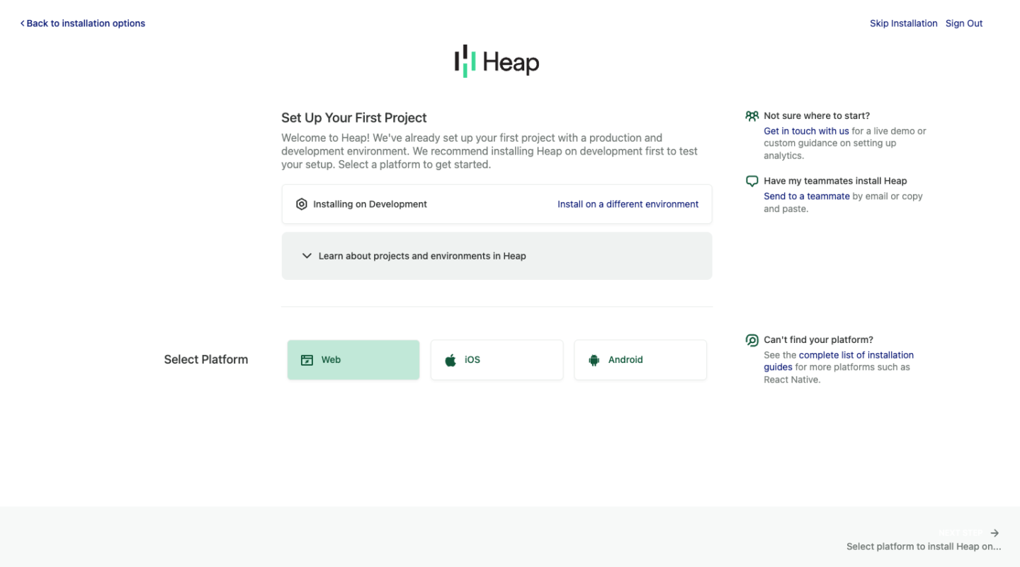
Given that Heap necessitates installation, it deftly guides users through the more tech-heavy parts of the journey, step by step. Should users need any additional assistance, readily available resources reside on the right-hand side of the screen.
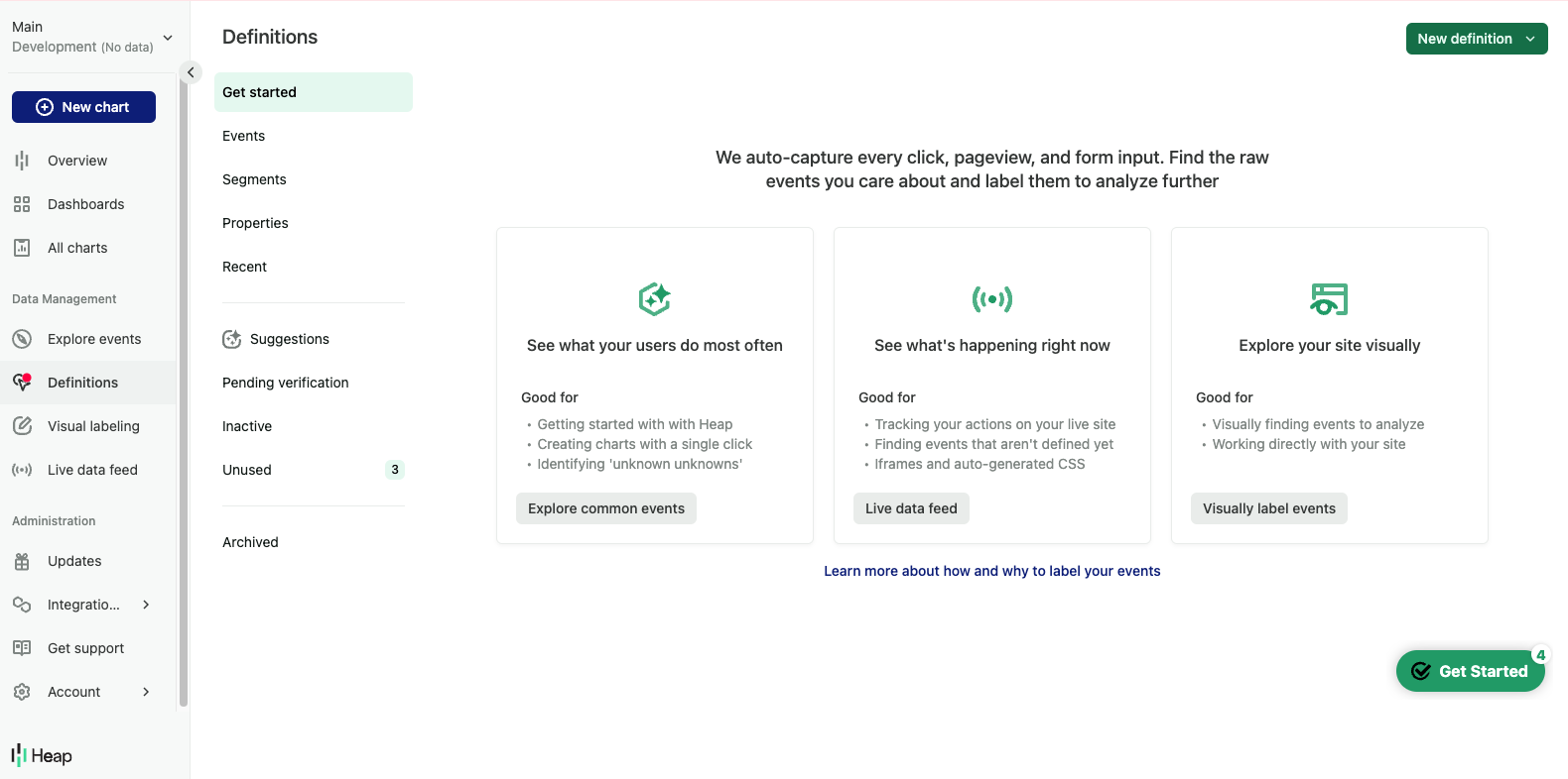
Following these steps, users land onto a personalized dashboard bedecked with pop-up guides and explanations on how to extract maximum utility from the product. Heap leverages these practices effectively, embodying the essence of a product-led growth approach while ensuring that their platform continues to resonate with users’ changing needs, providing a user-centered and engaging experience overall.
Frictionless Signup Experience
The Frictionless Signup Experience refers to the process of making the user registration or sign-up as effortless and straightforward as possible. The idea is to eliminate any barriers that may discourage potential users from completing the sign-up process.
This may involve simplifying the design, reducing the number of steps, asking only necessary information, integrating social login options, or providing clear instructions and immediate value upon sign up. A frictionless product signup experience aims to increase conversion rates by making the first interaction with the platform a positive experience, thereby encouraging users to explore the product further.
In a highly competitive market, the ease and simplicity of the signup process can play a significant role in user acquisition and eventually, user retention. Hence, a frictionless signup experience is a critical aspect of a platform’s overall user experience strategy.
How Zight doing it for SaaS companies
For those individuals who lean towards visual communication, Zight steps up to the plate with DIY gifs, screencasts, and annotated visuals to stimulate engagement and convey information effectively.
One standout aspect of Zight is its stripped-down sign-up process. Nothing excessive — just right. They’ve perfected this process by making the transition from sign-up to app download and engaging with the product utterly fluid.
There’s no need for email verification at the sign-up stage (a breath of fresh air, indeed). Post sign-up, you’re directed to a screen to pick your preferred app download method.
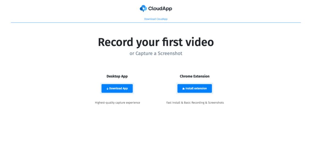
The download happens in the blink of an eye, and you’re all set to dive into the product. In a matter of minutes, you’re registered and already creating delightful gifs via a desktop Chrome extension.
Explain why users need your product features
In the throes of introducing new features, companies often overlook sharing the excitement with their users. They miss communicating the ‘why’ behind these updates.
Instead, product-led companies adopt a different approach. The emphasis is on illustrating precisely why these features are notable and how they’ll navigate users towards problem resolution. This strategy helps maintain a user-centric stance, facilitating the connection between product innovation and user benefits. It’s all about underlining the relevance of these solutions in catering to user needs.
Example of product led service doing it right — Oyster
The post-pandemic hiring landscape, punctuated by escalating interstate and international recruitments, has posed new challenges for HR, particularly around compliance with global contracts and labor regulations.
Enter Oyster — a solution conceived to streamline every crucial part of international or local hiring. With Oyster’s support, SMBs can effortlessly tap into a globally dispersed, hyper-connected talent pool in the new normal.
Following a smooth sign-up, users are greeted by a comprehensive checklist for hiring, complete with a timeline and reasons for each step’s necessity. The initial step requests users to submit their proposed package for a compliance review.
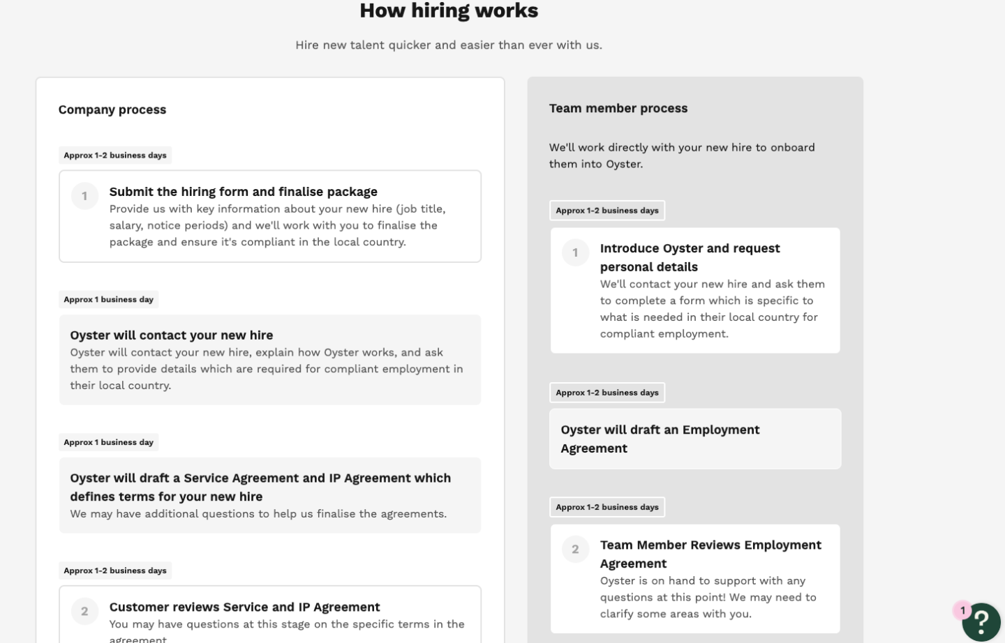
Each subsequent step outlines the actions Oyster will undertake and a timeline for completion. This methodologically educates users about potential hiccups they weren’t even aware of, serving as an excellent platform for fortifying trust throughout the user journey underpinning their product-led growth strategy.
Offer complementary products
Offering complementary products can significantly enhance a product-led growth strategy by creating a more holistic, value-added user experience. Here’s why:
- Upselling and Cross-selling Opportunity: Complementary products provide an opportunity for upselling and cross-selling, which can increase the average transaction value and improve profitability.
- User Stickiness: Users are likely to engage more with a platform that offers a suite of products that work well together, increasing retention and user satisfaction.
- Improved User Experience: Complementary products can enhance the user experience by providing solutions to related needs or problems. Instead of juggling multiple unrelated tools, users can solve various needs within one product ecosystem.
- Competitive Advantage: A comprehensive product portfolio can set your company apart in a crowded market, making it harder for competitors to emulate your offering.
- User acquisition and growth: By offering complementary products, you can attract different customer segments who might need one or more of your products, fueling user acquisition rates and overall growth.
Rather than focusing only on improving their primary product, companies must consider how supplementary products can fulfill additional user needs and contribute to their product-led growth strategy.
Product led strategy example from Cazoo
In 2018, Cazoo burst onto the automobile scene in the UK and Europe, revolutionizing the way used cars are sold. Their platform empowers users to hunt for a preloved car from their home comfort, get it delivered to their doorstep, complete with a 7-day money-back guarantee and a 12-month warranty.
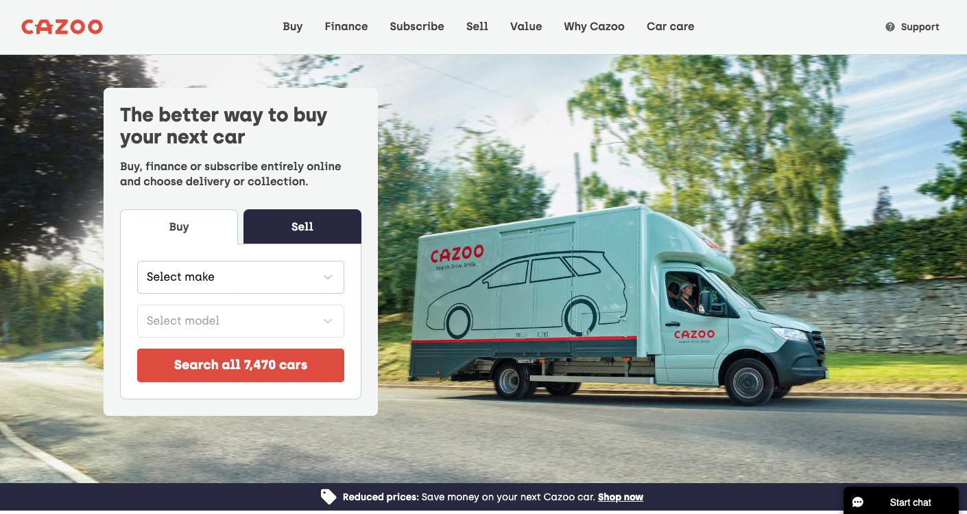
Sure, scoring a decent second-hand car at an attractive price point is appealing on its own. But Cazoo spotted an opportunity to introduce a tandem product addressing the pain points users face in their car trade-in journey.
Picture this: you want to trade in your old ride before securing a new one. But what if your existing car is beyond repair?
Cazoo’s answer? Their part-exchange service. It provides users with an immediate valuation on their old runabouts or completely wrecked cars—effortlessly uncomplicated, incredibly handy.
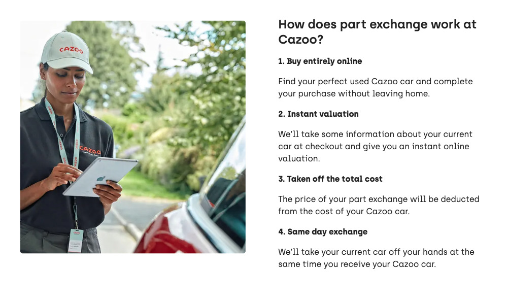
Additionally, they maintain service centers where users can have their cars serviced, mended, spruced up, even prepped for sale.
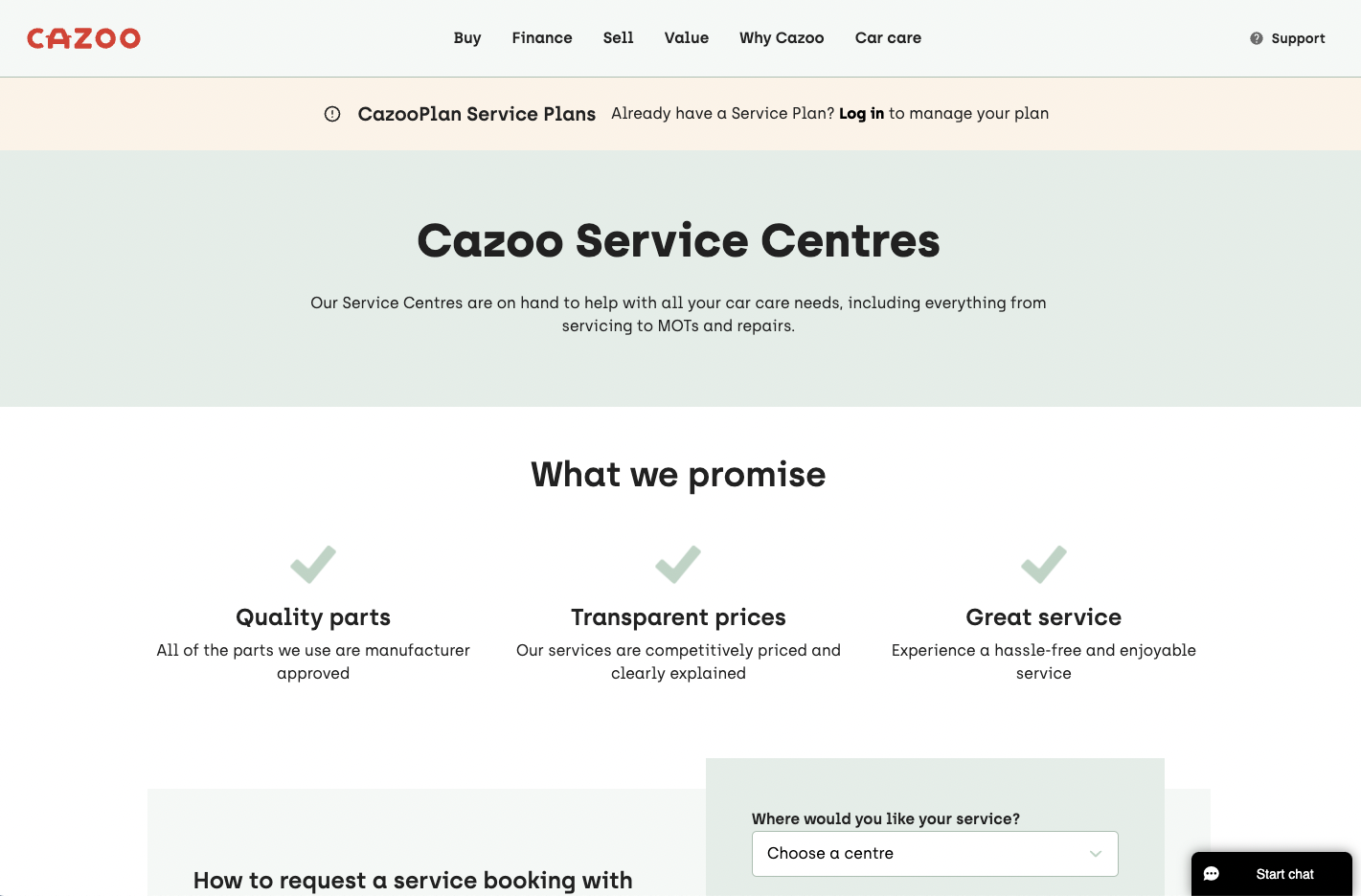
These synergistic services reside within the same platform, simplifying both selling and buying processes and enhancing the user experience. Testament to Cazoo’s product-led growth strategy, it demonstrates how introducing complementary services can enrich the overall user experience.
Don’t verify new users’ emails
The email verification blockade can be quite a damper on an otherwise impressive product-led approach (brace for a bit of a rant).
You might be reigning supreme in the product-led domain on your website, but resorting to SPAM-like tactics of sales-led firms can swiftly negate all the positives.
I’ve even had an encounter where a “support team member” tried to connect with me on LinkedIn. Let’s be clear; that’s not product-led, that’s sales. And evidently, that’s the old-school approach people are moving away from. The sales role should be poised to support, not inundate me with emails daily… well, rant over.
But let’s pivot away from personal opinions and look at what the data suggests. As per onboarding expert Ramli John:
- A significant 30-50% of users don’t confirm their email — it’s detrimental to conversion rates.
- For one organization, eliminating email verification promptly pumped up their MRR by a stunning 20% within weeks.
- Unverified emails do take up valuable server space. Fortunately, there are remedies. For instance, companies offering a Freemium Product often provide a fixed timeline to confirm your email, offering a balanced strategy that respects the user’s time and attention.
Product led strategy example from Shopify
Shopify, a prominent ecommerce platform, empowers merchants to market their products with ease. Yes, there’s been plenty of talk about Shopify, but stick with me as we view it from a unique lens — their user onboarding process.
It’s effortless to get started with Shopify. A simple email signup, password creation, and voila — you’re all set to establish your online store and start generating revenue.
Perhaps the most noteworthy facet — zero email verification required to start. Now, that’s rather telling, isn’t it?
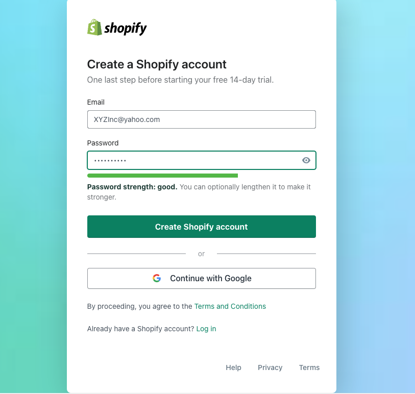
Consider this — if a mammoth platform like Shopify, engaging 2.3 million daily users, can effectively manage sign-ins sans email verification, it’s surely feasible for others as well.
So here’s a clarion call to all the product-led growth enthusiasts out there — Email verifications can be aggravating, time-consuming, and undeniably friction-inducing. It’s high time to put an end to this needless hurdle.
Personalize product according to users goals
Onboarding centered around users’ goals propels them towards designated actions that align with their objectives, enabling them to appreciate your product’s value at a faster pace.
This trait is among the simplest to demonstrate in a product-led strategy. It emphasizes understanding the user’s goals and steering them swiftly towards the product’s beneficial aspects, consequently enhancing user satisfaction and product adoption rates.
Crunchbase example
Crunchbase is an insightful platform equipped to deliver a deep dive into the cosmos of both public and private companies. Its distinctive essence is derived from a unique algorithm capable of detecting promising business opportunities.
Imagine it like Spotify, but instead of musicians and listeners, the platform orchestrates a match between potential buyers and sellers.
From the outset, the sign-up process is undemanding:
- punch in your email,
- set a password,
- and voila, your account is ready to roll.
Nevertheless, what truly sets the tone is the subsequent stage where they ascertain your intended use of the tool:
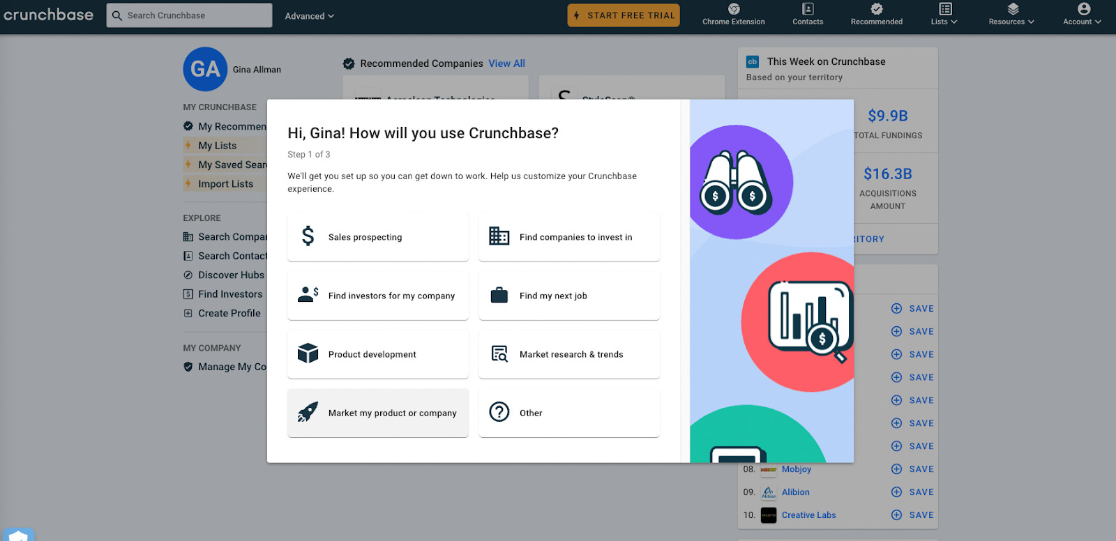
Instantly thereafter, it’s time for a tailor-made roster of firms that might pique your curiosity.
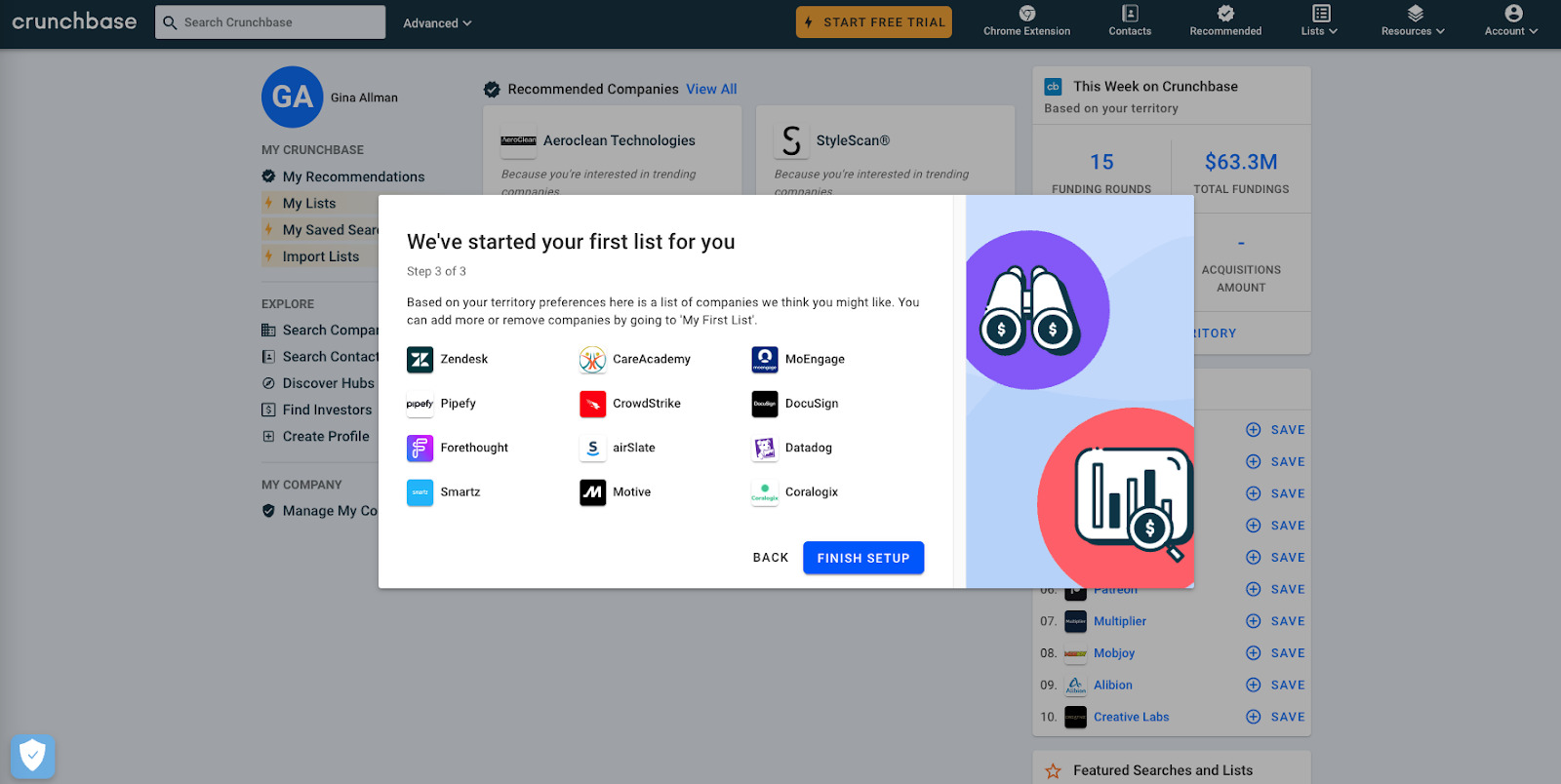
No time wasted, Crunchbase immediately showcases its worth, affirming its stance in fostering a product-led growth approach and delivering notable value to its users.
Make your pricing transparent
When it comes to user experience, making pricing elusive or ambiguous can significantly increase the risk of user drop-off. Pricing information should be readily accessible, detailed, and lucid about what each package entails. One crucial manifestation of a successful product strategy is the elimination of the need for users to communicate with the sales department to uncover such information. The easier the pricing discovery journey for your users, the higher your potential conversion rates.
Product led example from DooFinder
DooFinder is an advanced site search engine tailored for ecommerce sites, leveraging AI to deliver highly personalized results for users right from the landing page.
A user-friendly feature in their platform design is the easily navigated pricing page included in their main menu. Once you arrive there, every plan is clearly depicted, with the price upfront, followed by a rundown of features. To further assist, they’ve even highlighted their most popular plan.
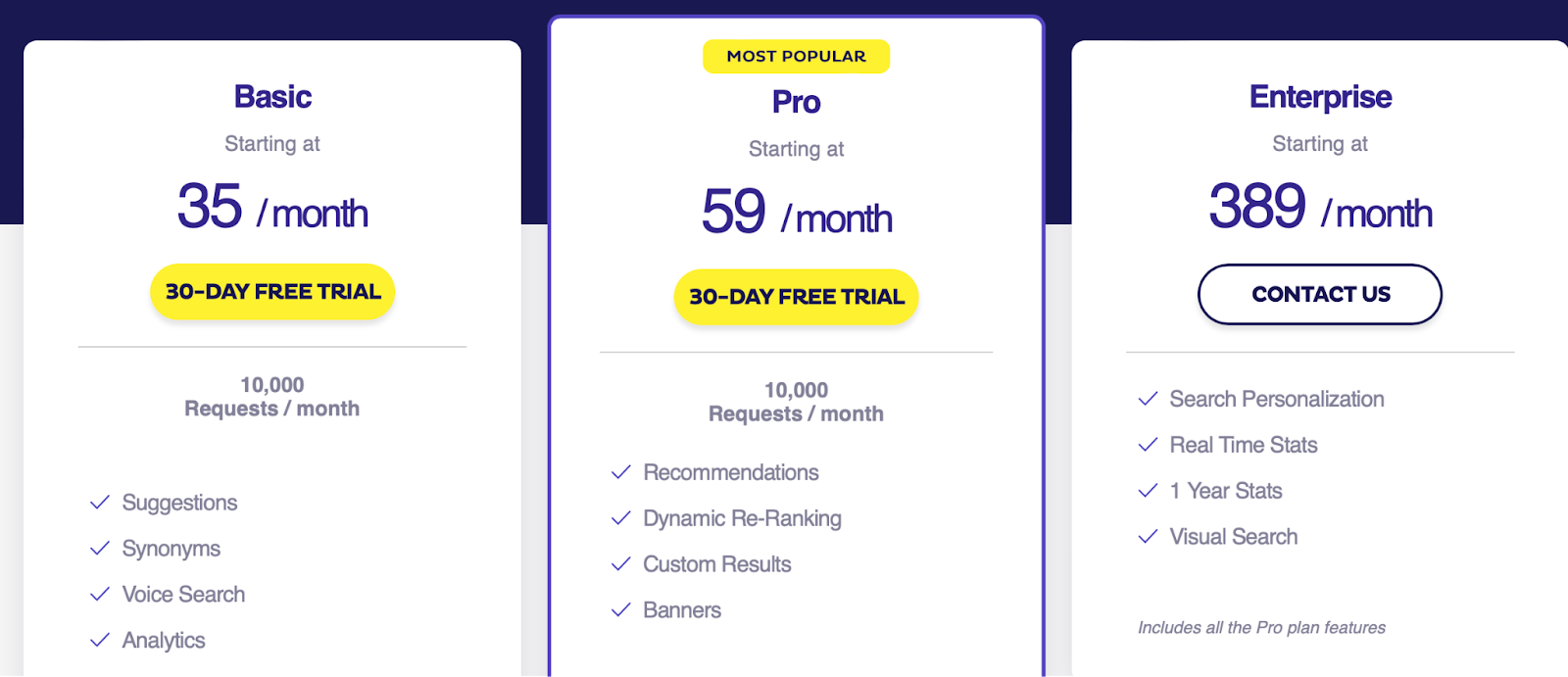
Such transparency enables users to make an informed decision about which plan aligns best with their requirements. This clear communication of pricing and features is a crucial tenet of product-led growth, enhancing the user experience and decision-making process.
Collect users feedback
A well-managed feedback loop is essential in garnering actionable insights from diverse user segments to refine and enhance your product.
Segmenting your user base is a key step in this strategy. The categorizations should typically involve:
- New Users
- Intermediate Users
- Advanced Users (or your power users)
Breaking down your users into these segments empowers you to pinpoint and resolve any friction, communication gaps, or pain point specific to each segment. Deconstructing and interpreting the feedback within the context of these segments can drastically improve your product strategy and overall user experience.
Zapier example
Zapier is a digital tool designed to take the heavy lifting out of workflow automation between apps. Boasting over 4,000 app integrations, this platform is equipped to handle multi-step automations, all without needing developer intervention.
Anyone who has attempted to establish a customer feedback loop knows how challenging it can be to gather necessary insights quickly enough to effect meaningful changes.
Zapier, however, managed to integrate effective feedback loops into their product to tailor it to user needs. They do this by conducting surveys on forthcoming features. The collected data is then swiftly “zapped” into an Airtable spreadsheet.
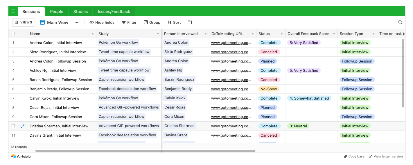
When the data qualifies certain specific conditions, it is transported into a separate Airtable spreadsheet that compiles a list for personal interviews.
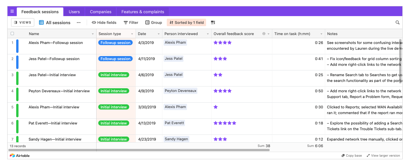
With this streamlined approach, Zapier is able to gather user feedback swiftly. This enables them to refine their features optimally, catering to their core user type, an essential aspect of their product-led growth approach.
Help clients experience “Aha!” moment
The “Aha Moment” refers to the point when a user realizes the value of a product—when they experience firsthand how the product can assist them. It’s a crucial stage of the user journey, typically resulting in a switch from a casual user to an engaged one. The “Aha Moment” is essentially, user enlightenment, when they understand why they need your product in their lives, significantly increasing their chances of becoming long-term, loyal users.
In the context of Dashly.io, a multi-channel customer messaging platform for business growth, the “Aha Moment” could be
- when a user discovers how easily they can initiate automated messaging campaigns across different channels,
- or when they see the value of using dashboards and customer data to have personalized and timed communication.
Typeform aha moment example
Typeform is a prime example of one such robust platform. It takes standard forms and injects an element of fun in them via inventive customizations and vivid language constructs — a clever strategy towards user engagement that encourages insightful responses and amplifies completion rates.
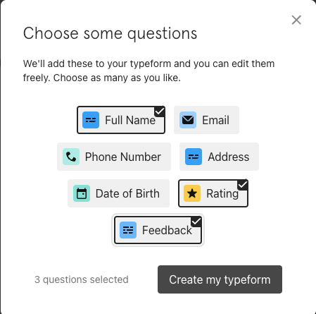
Typeform’s onboarding process isn’t just about subscribing to the platform but about involving the user in creating their product during the onboarding journey. They start by laying out the fundamentals. Next, they delve into industry-specific parameters to ensure Typeform aligns effectively with the user’s needs.
Straight out the gate, you have the freedom to pick the fields you want on your survey.
Then they ask what the survey is going to be used for.
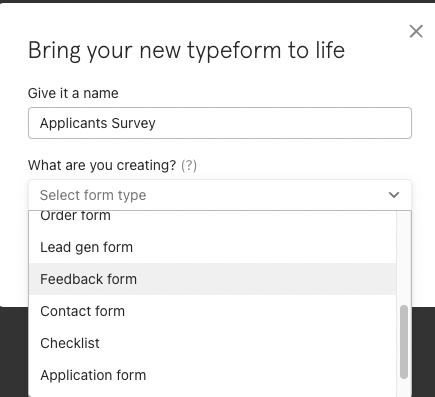
They then inquire about your survey’s intended use. You’re given complete flexibility to opt for a template, create your own, or even have Typeform craft the survey on your behalf. The entire onboarding process is swift, clocking in at approximately 2 minutes, and leaves you with a half-filled survey on a personalized dashboard.
The approach is refreshingly non-transactional — there’s no mention of pricing. The focus is solely on highlighting the value of the platform swiftly, steering the user towards their “Aha!” moment. It’s a unique product-led growth path that influences their sales and growth in an email-centric world.
How to use friction in onboarding
When it comes to user onboarding, the prevailing notion is to eliminate friction as much as we can. But, surprisingly enough, sometimes friction can be beneficial.
As explained by John Ramli, an expert in the field, the “DAD framework” guides us toward the “right kind” of friction. It consists of three central questions that every product strategy should consider during the onboarding process:
- Does the additional step accelerate your user’s journey to discovering your product’s value?
- Can it boost and personalize the onboarding experience for the user?
- Does it elevate the users’ enthusiasm and generate excitement about the product?
This counterintuitive approach transforms friction from an obstacle into a pathway—it’s not just about smooth sailing but about enriching the journey while steering users towards the destination more quickly.
Product led example from Twilio
Let’s dive into an example from Twilio — a cloud communication platform that offers programmable solutions, orchestrating seamless communication with clients via voice, SMS, or email.
Twilio uniquely omits requirements for a credit card during sign-up. They understand that this doesn’t necessarily accelerate the user’s journey to their “Aha!” Moment.
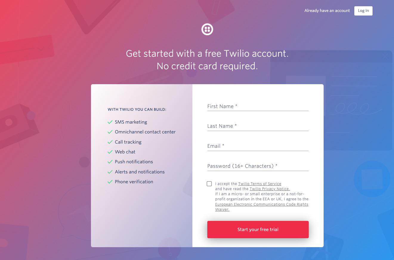
However, they do utilize a touch of helpful friction. They present strategically posed questions, complemented by a range of potential answers within a dropdown list.
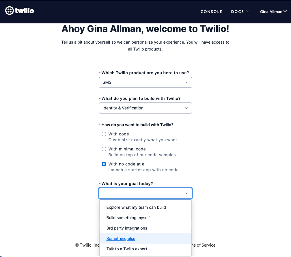
This seemingly straightforward series of questions serves a more significant purpose, as it enables Twilio to segment their users. This aids in personalizing their platform to suit the unique needs of each user, allowing the company to swiftly deliver value. It’s a clear example of friction with a mission.
How to focus on users actions in product tour
Product tours may seem dreary at first glance, but when artfully paired with pertinent actions, they can serve as cornerstones for value discovery for your users. Such strategies can wield immense power in helping the user discern high-value features, ones that they might miss or fail to fully grasp without a gentle nudge in the right direction.
Thus, these product tours, far from being dull, become instrumental in easing the user into understanding and appreciating the product’s unique offerings. They’re a prime example of how a well-orchestrated strategy can turn every aspect of the product into an exciting discovery trail for the users.
Zendesk example
As a Dashly growth marketer inspired by various product-led growth businesses, one visionary construct that stands out is Zendesk. Launched in 2007, when social media was gaining significant momentum, Zendesk has reimagined how companies respond to inquiries and complaints on platforms like Facebook, Twitter, and Tumblr.
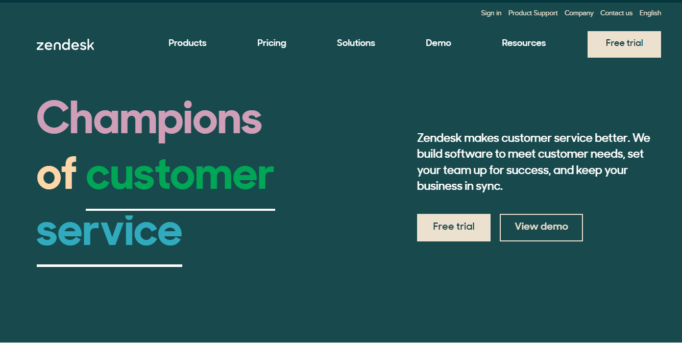
Zendesk’s platform is equipped with a vast array of features. To ensure new users don’t get overwhelmed by this abundance, they’ve devised an action-based product tour. This dynamic tour introduces each feature effectively to the users upon their first login.
Upon login, you’re ushered to a dashboard where a catalog of functionalities resides on the left-hand side. Clicking each function reveals either an actionable task or an insightful video.
Efficiency personified — as you complete each task or watch each video, a gratifying checkmark materializes. This dual-purpose tour not only empowers you with the requisite knowledge to operate each function but also guides you in tailoring those features to your specific company needs.
Another way to personalize user onboarding
Many companies initially adopt the ‘one-size-fits-all’ onboarding strategy tailored to the ‘average’ new user. However, as a product evolves and expands with new features, the concept of an ‘average’ new user becomes more fragmented. In today’s diverse digital ecosystem, you’re likely welcoming several ‘averages’.
That’s precisely where the power of a personalized approach shines through. By carefully curating the onboarding process to resonate with diverse user segments, a company can effectively address specific needs, leading to a higher user engagement and favorable impressions about the product.
Thus, evolving your user onboarding strategy in tandem with your product’s evolution reflects not just empathy for your users but also an astute understanding of their evolving needs.
Example from MongoDB
MongoD is a platform characterized by its scale-out architecture — an ideal choice for crafting scalable applications apt for evolving data schemas.
Aware that MongoDB can cater to various use cases, the team strategically guides users towards realizing their individual objectives. This approach ensures that users can rapidly extract value from the platform.
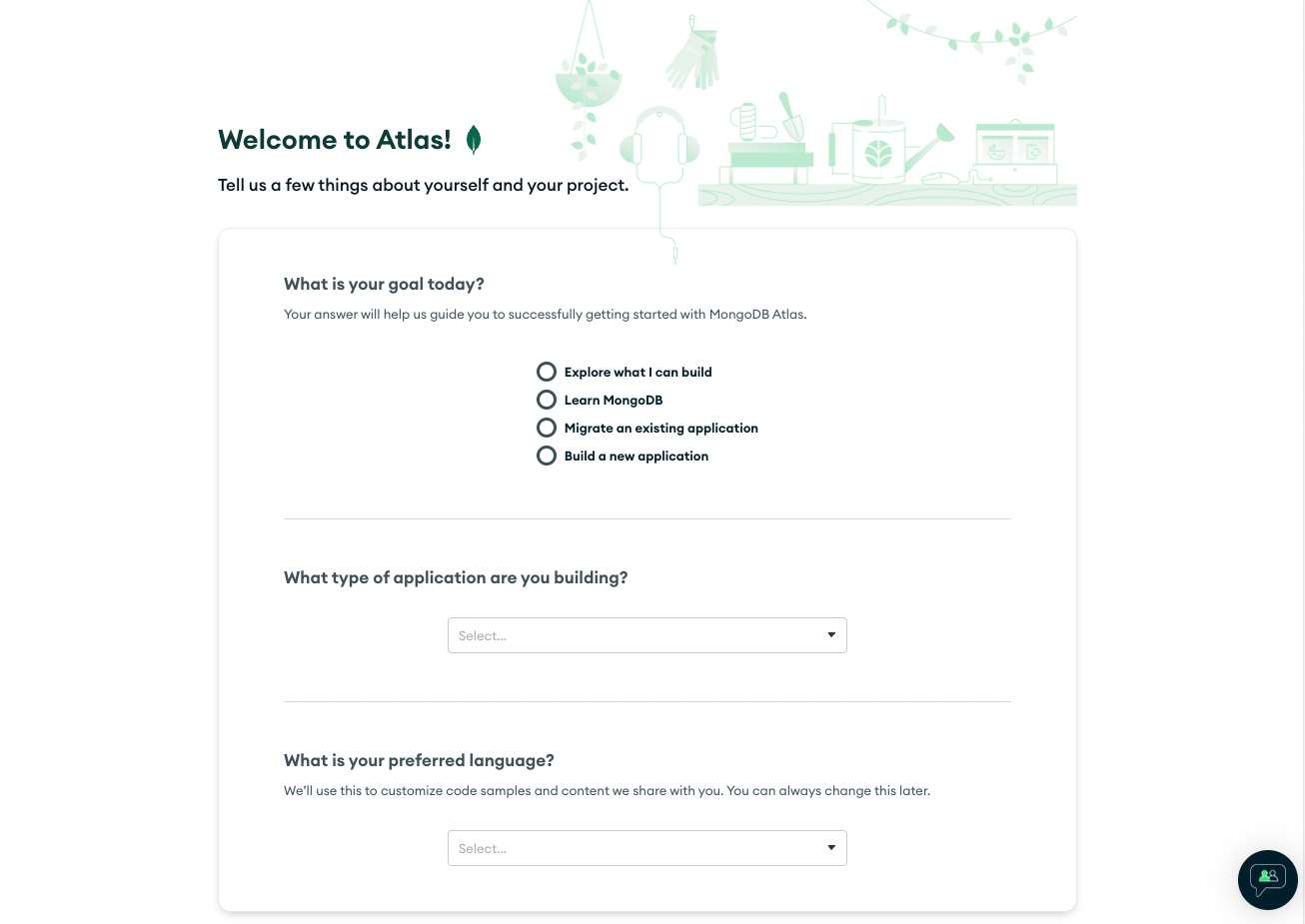
Delving more deeply, MongoDB offers specialized, granular guidelines to equip users with the necessary tools to thrive.
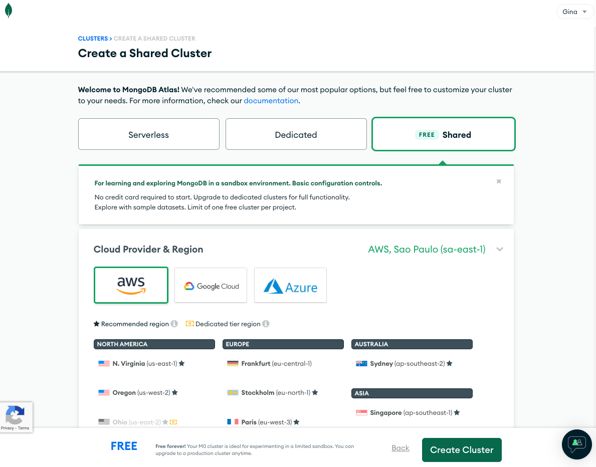
After selecting your system configurations, you gain immediate access to start working. Alternatively, you have the liberty to choose the basic setup and engage in a Sandbox trial run before fully committing.
This innovative approach to user orientation helps MongoDB boost sales and enhance growth in a product-led growth landscape. This foundation of delivering quick value to users moulds an email system into an engaging platform, fostering user satisfaction and serving as a beacon of inspiration for us at Dashly.
Try before buy principle in SaaS
Traditionally, to access a Freemium Product or start a free trial, users typically need to provide some basic details, such as an email address and password to create an account. However, the Rapid Prototyping strategy turns convention on its head.
In this approach, users immediately start interacting with the product straight on the landing page, bypassing the typical registration process. Even though the prototype typically features fewer options than a full Freemium Product, it still offers enough to pique users’ interest.
If users find themselves drawn to the product’s functionality and potential, this experience can serve as a powerful incentive for them to sign up for the full feature set offered by the Freemium product. It’s a clever strategy to engage and convert new users while providing them with immediate value.
Example from WebPageTest by CatchPoint
WebPageTest is an intriguing example — an open-source platform dedicated to enhancing webpage speed and SEO. Since its inception, the platform’s evolution has been largely guided by its active developer community, contributing to the product’s current form.
This invaluable tool offers comprehensive front-end performance testing for free, including visual representations of your website’s loading dynamics.
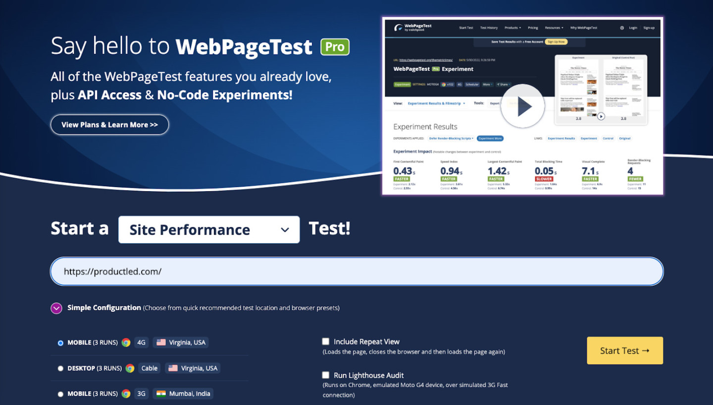
The user experience on WebPageTest is thoughtfully designed across different stages, tailored to match users’ evolving needs to optimize performance:
- No sign-up needed (free)
- Sign up to access additional value-adding features (free)
- Subscription options (monthly/annual) for premium features (paid)
To top it off, users can run tests from the site’s prototype without any requirement for signing up. Useful data from these tests are stored for a month, alongside other features such as insights on global connections, browser usage, and connection speeds.
WebPageTest’s Freemium product extends all prototype features plus bonuses such as data storage for 13 months, complimentary zero-code A/B testing, among other features. For those seeking additional value, the Premium Product includes all Freemium features plus other enhanced functionalities.
Experience instantaneous value from WebPageTest by simply entering your website address on the landing page. Minutes later, a comprehensive performance report for your website is at your fingertips.
Provide free solution for priority users’ pain points
One effective method to achieve this is by incorporating tools into your product that not only enhance its utility but also resonate with the tools your users regularly employ in their daily lives. The key is to ensure these tools are easily accessible to all your user segments.
In essence, it’s about cultivating trust and setting your product apart from the competition. A well-executed product-led growth strategy does more than fulfill the immediate user needs—it fosters a relationship between the user and the product, based on mutual benefits and sustained value. This strategy forges a connection, turning a simple user interaction into a long-lasting advocacy for your product.
Example from DigitalOcean
Despite growing significantly over time, they have stayed true to their customer-first approach. Caring for their developer community, they provide six invaluable developer tools, available for usage by anyone, conveniently located on their resource page.
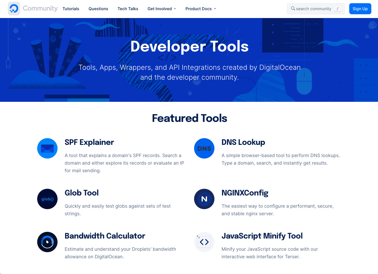
These six tools are designed to save developers’ time in an array of processes. Users just need to engage with the tool and feed in the necessary data. The user-centric and immediate value delivery approach resonates with the product-led growth philosophy.
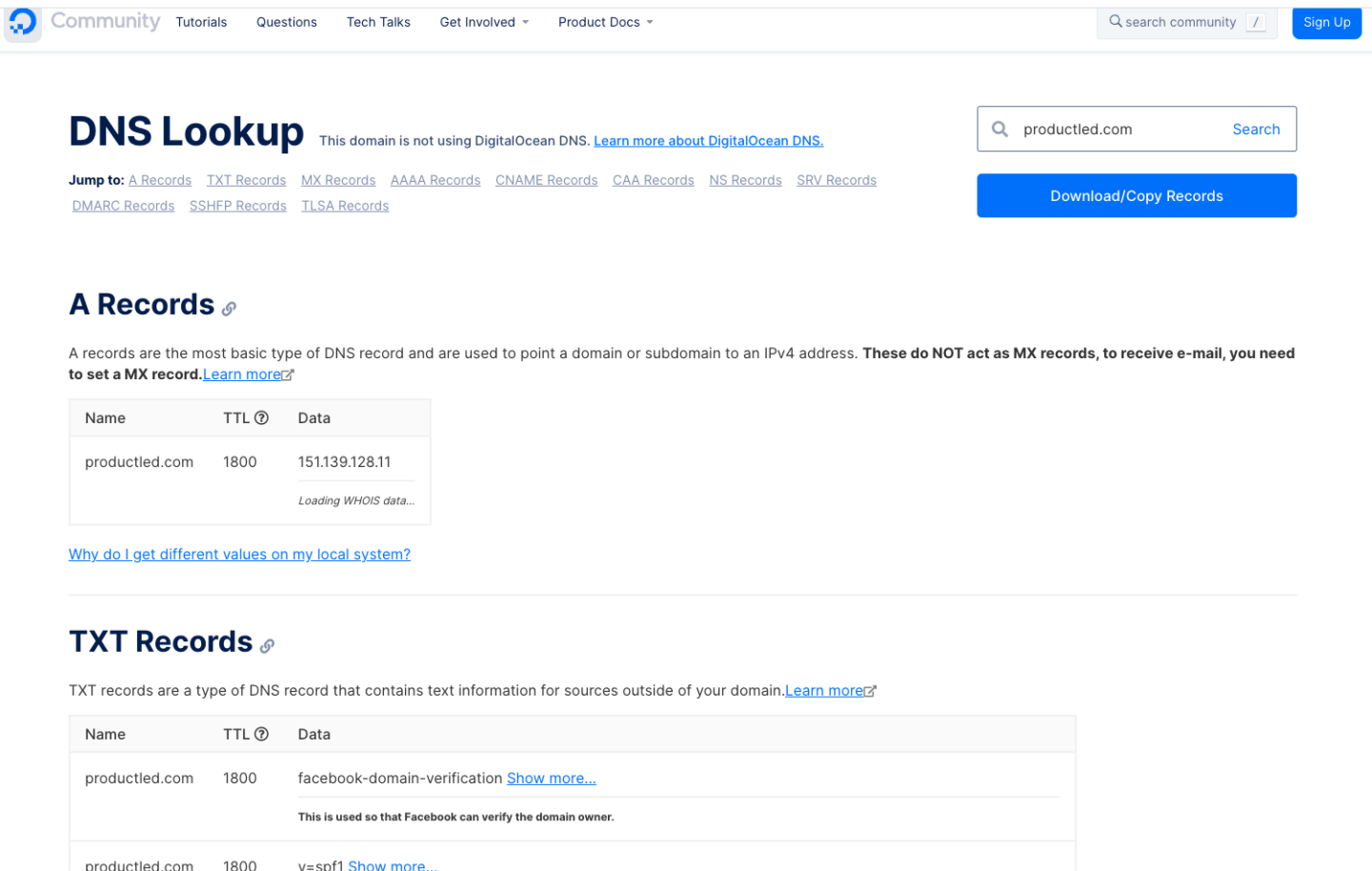
I personally tested the system with the DNS Lookup tool. In seconds, I had a comprehensive report at my disposal — no fluff, no hindrance, just straight-up value.
Offering such ready-to-use tools not only aids in boosting sales and growth but also helps in building a loyal user base in the long run, reinforcing the effectiveness of adopting a product-led growth strategy.
Conclusion
The evolution of product-led strategies has transformed how businesses engage with users. These examples illustrate how prioritizing users and personalizing experiences fosters user loyalty and contributes to long-term growth. Incorporating tools that users can readily utilize, delivering immediate value, and designing friction with a sense of purpose all resonate with this approach. Invariably, the key to an effective product-led strategy lies in understanding the diversity of user needs, reflecting that in your product, and ultimately, turning users into staunch advocates for your product.
FAQ on product led growth examples
How does product-led growth strategy influence the growth of a platform?
A product-led growth strategy centers around delivering immediate value through the platform, thereby incentivizing users’ engagement. Through this approach, the platform can experience enhanced sales. Strategically timed and personalized email communications further aim to retain users, leading to sustainable growth for the platform.
How can a product-led growth strategy impact sales and overall business growth?
A product-led growth strategy influences sales and overall growth by focusing on delivering immediate value to users. This approach is known to drive sales as it resonates deeply with user needs. Combined with effective email communication strategies, it can lead to long-term user retention and sustainable growth.
Provide some examples of product-led growth strategies influencing sales and overall growth?
Sure, companies like Slack and Dropbox are excellent examples of product-led growth strategies positively influencing sales and growth. By prioritizing user needs and delivering immediate value, these companies managed to drive immense user growth. Effective email communications served to boost engagement and enhanced long-term user retention, contributing to overall business growth.
What differentiates a product-led product from other products in terms of affecting sales and growth?
A product-led product focuses on delivering immediate value to users, creating a strong incentive for them to engage with the product. This not only leads to increased sales but also fosters customer loyalty. In contrast, traditional products often rely on sales and marketing strategies for growth while possibly overlooking the practice of delivering immediate user value.
What are some leading product-led companies?
Some leading product-led companies include
- Dashly,
- Slack,
- Dropbox,
- Zendesk,
- and MongoDB.
These businesses have leveraged product-led growth strategy to deliver compelling products that provide immediate value to users, driving overall business growth.
How does a product-led strategy contribute to the growth strategy of a business?
A product-led strategy is instrumental to a business’s growth strategy as it emphasizes delivering immediate value to the user. Understanding and fulfilling users’ immediate needs bolsters user retention and loyalty, driving sustainable growth and securing the product’s position in the competitive marketplace.
Read also:
- Growth Product Manager: Charting new frontiers in product scaling
- 20 AI sales tools: Boost your sales strategy with revolutionary technologies
- 15 customer retention tools: find out the best software to return your customers
- Top 10 best product marketing tools for your tech stack [expert review]
- 15 best user behavior analytics tools [software features & pricing]
- 16 best CX customer experience tools: software features and pricing
