SaaS company case study: how to gain $9 000 working with every funnel stage

This case is of our customer who decided to stay anonymous. We respect that, but the conversion rates here were insanely good, so we just couldn’t keep it to ourselves. Sharing is caring, you know. Important disclaimer — we had to hide figures and other sensitive customer’s info in the visuals used in the text. But we still hope that you’ll get the idea and the value. Enjoy.
Summary
Business: B2C SaaS
Functionality: it helps collect items in DotA 2.
Objective: convert users from a free plan into a paid one.
Start of implementation: 27.02.2018;
End of implementation: 28.03.2018;
What we launched: three campaigns, 2 A/B tests;
Results: 16 000 emails were collected; 1516 people made at least 1 payment;
$9000 in revenue generated.
User data collection
To establish a competent communication with website visitors, you need to know as much about them as you can because this way, you are able to make personal offers and guide a customer through the funnel, from lead generation to repeat purchases.
Setting up data collection in SaaS is always more complicated than in online stores because some data cannot be collected from the website and must be transferred through the API. We compile a detailed requirement specification and a checklist to make this task as easy as possible for developers on the customer side.
We do our best to minimize the customer’s load, therefore, we independently collect all information that can be collected from the website using Dashly tools (page visits, clicks on elements, form completions, and page scrolls to the end).
The customer was sending us some basic events that we needed to build our campaigns on; they were either triggers or simply helped us segment the users:
- A user signed in;
- Activated the free mode;
- Played in the free mode;
- Viewed balance;
- Joined the cashback system;
- Won in [Game name];
- Topped up their account with money (and we record this revenue from a user).
Customer interaction campaigns
The first thing we do is determine a common strategy. It’s important to see all the campaigns and understand how they work together. Here’s the campaign map we prepared for our customer:
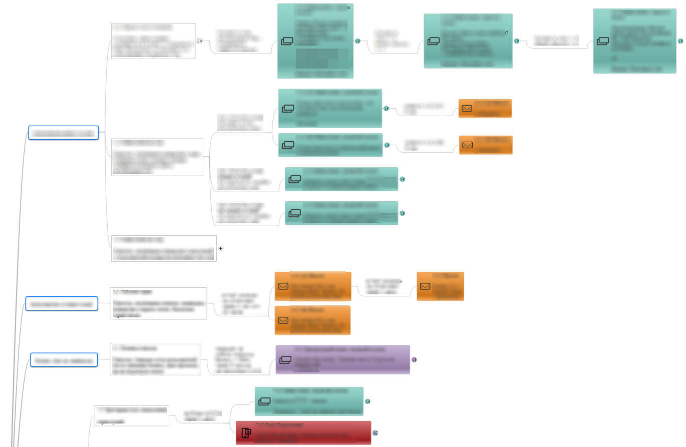
The map always changes as we move along it, but we try to keep to the point.
Read also:
👉 Live Chat Best Practices: 20 Hacks to Make Customer Service Better
👉7 Best Live Chat for eCommerce: Boost Conversion on your Website
👉 Top 5 live chat mobile app: find the best fit for your business
👉 Live Chat: How Online Chat Tool Can Help Your Business
👉 20 Best Live Chat Software for your website chat service
👉 Acquisition funnel marketing: Grow customer conversions at each step of user journey
👉 The top 15 inbound marketing tools: harness digital power and elevate your business
👉 10 best website personalization tools to deliver top-notch visitors experience
👉 7 best email capture tools: features and pricing compared for 2024
Increasing the conversion rate from visiting the Free section to making a payment
Our major task is to convert a user from using the free mode to the paid one. Therefore we configured three pop-ups that are shown to those who played in the free mode. And we’ve also divided the audience into three parts:
- Those who played in the Free section for the first time;
- Those who played in the Free section more than twice and started more than one session;
- Those who played in the Free section more than 4 times and started over three sessions.
Notice how messages become more tense one by one:

Here are the configuration details for the first pop-up:
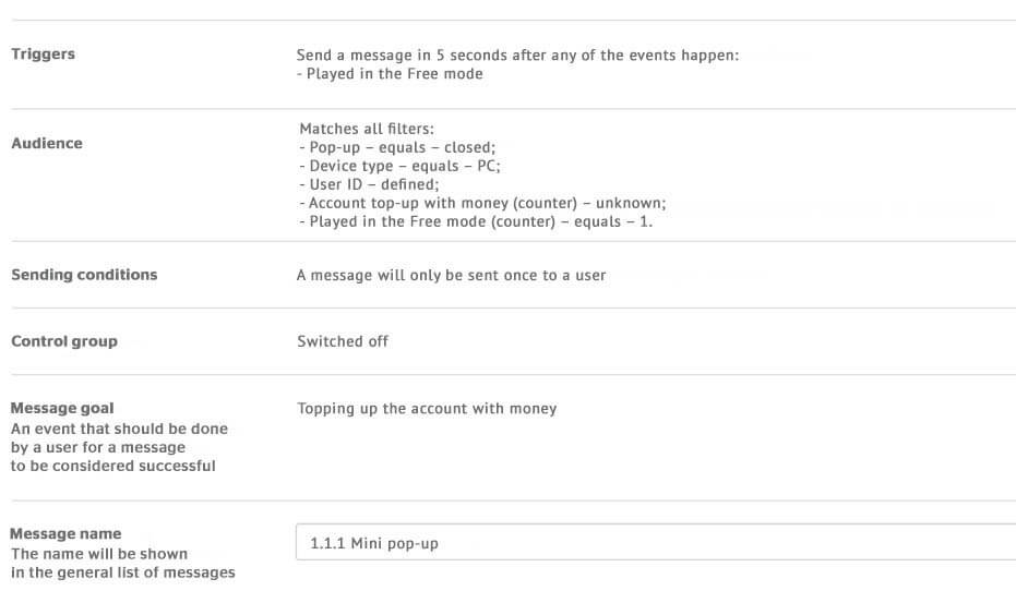
Please note that the message goal is “Topping up the account with money”. That gives us two great advantages. Firstly, the goal helps us build the funnel before the stage of payment (after clicking the button, the user gets to the payment section, and we can only know whether they paid or not by the event transferred via the API). Secondly, the payment amount is recorded as the goal value, therefore, we can calculate how much we earn on a particular message. Here’s a screenshot with the statistics on the third pop-up:

The statistics showed covers the whole period since the launch. You see the period of 37 days because we’re tracking monthly performance, and pop-ups were switched off to be readjusted during that period. Anyway, you must admit, the amount generated is nice.
Please note one detail. The income from these three auto messages cannot be added up because the goal could have been reached after one, two, or all three were shown, which means that the amount may increase in the statistics of all three messages.
This is the general funnel of the campaign:
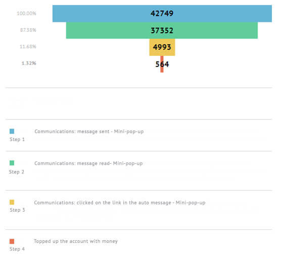
1,3% of payments (of all auto messages sent) is a great result. 13,3% of users who saw the message visited the payment page.
It’s clear that every next pop-up was shown to a narrower but a hotter segment of the audience. It’s no surprise that the third pop-up turned out to be the most successful; its performance is amazing as it brought 70% of all payments from this campaign.
Increasing the conversion rate to a lead
Leads are always valuable. If we know the person’s contact info, we can always contact them and get them back/upsell/offer them something. If a user didn’t top up their account and left, a red flag comes up in our heads; what if they don’t come back at all? Such a segment should be primarily converted to leads. The best strategy is to offer to send a bonus via email. We’ve run an A/B test and tested the offer: in the first option, we offered a free ride, and in the other one, we offered winning tactics for one of the games.
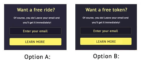
The conversion rate of option A with the free token was 26%;
The conversion rate of option B with the content was 23%.
Both campaigns performed great, but an offer of the free ride performs better.
The story of the option with hints is more interesting. All users who left their email addresses got emails with 4 hints and an offer to top up their accounts to play the game.
The open rate of this email was 50%;
The CTR was 17%;
The conversion rate to payment after visiting the website was 12%.
As a result, 1% of all users who left their email addresses in the pop-up topped up their accounts. This proves that educating people and giving them information can be as beneficial as offering free bonuses.
Previously, our customer was not collecting emails at all, therefore, we may state that we increased the rate of those who left their email from 0 to 26%.
Thank you! The map awaits you in your inbox.

Email marketing (working with the collected leads)
We’ve been sending two types of emails to those addresses that we collected:
- Game descriptions with an offer to top up an account;
- Cashback program story also with an offer to top up an account.
We’ve launched an A/B test for the first email: we sent the option A in 1 hour after an email was changed, and the option B — in 12 hours. Both emails showed nearly the same result, though not very good.
| Option A | Option B | |
| Sending time | In 1 hour | In 12 hours |
| Open rate | 14% | 11% |
| CTR | 9% | 8% |
| Conversion rate to payment | 8% | 7% |
We needed to work better on the email content and its subject to reach the audience more precisely and increase the conversion rate.
The email about the cashback program was sent one day after the email was changed to those who hasn’t topped up their accounts yet. This is one of the emails in the welcome campaign targeted at a large segment. The email lists the program’s advantages and explains how to join it.
- Open rate — 10%;
- CTR — 7%
- The conversion rate to payment — 3%.
We can work on the sending conditions and note if a user joined the cashback program or not. The segment will become smaller, but the open rate and CTR will go up thanks to a more precise segmentation.
Regarding both email campaigns, we can conclude that we need to work on email marketing better. We are sure that the open rate may reach up to 50% just like emails after pop-ups, we just need to run more tests and reach out to the audience.
Converting users to joining the cashback program
There’s a cashback program in the service that helps users get money back for ads in Steam, but not all users know about it. To fix that, we’ve decided to show a pop-up to users as they try to leave the website, provided that we already know their emails (so that this campaign doesn’t overlap with the previous one), and, of course, to those who have not yet joined the cashback program.
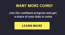
The conversion rate to clicking the pop-up was 55%. 10% of users joined the program. Interestingly, we’ve targeted the same campaign at those whose emails we didn’t know. That segment was less responsive. Obviously, those who left their emails are more involved. This relates to the importance of studying your audience and their behavior.
Reducing the user churn rate
Churn is the major issue that heads of SaaS projects are fighting. The longer a user stays with you, the more money they bring you (or can potentially bring you). That’s why it’s so important to retain them on the website for as long as possible and return them constantly. This is what one of our campaigns is all about.
If the user’s balance has dropped to a minimum after the game (below 500), we risk losing them. To prevent this from happening, we send them a pop-up, thank them for playing, and offer them bonuses for topping up their account.
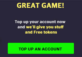
Here are the configuration details of this campaign in Dashly:
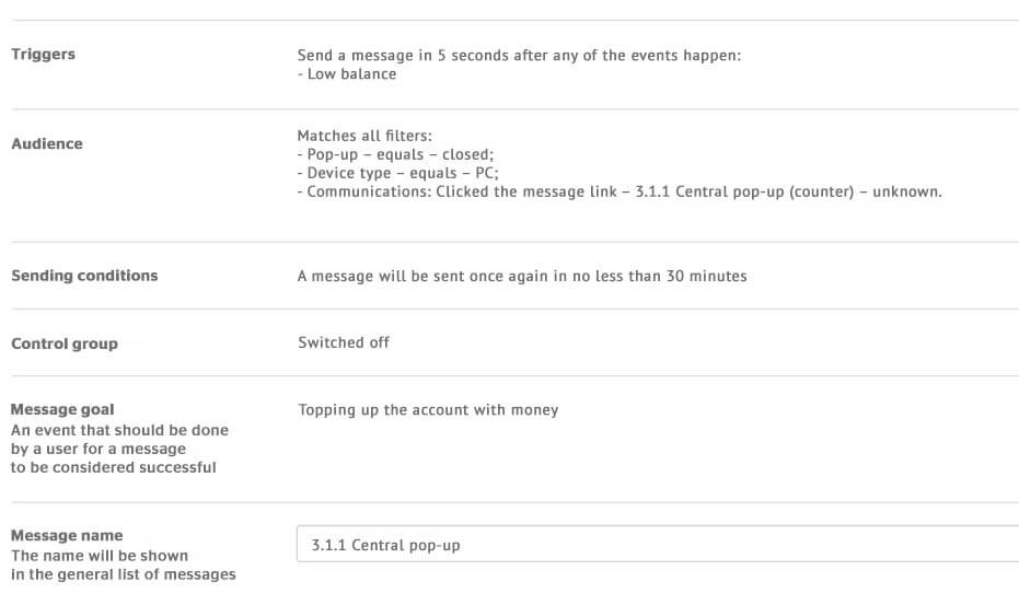
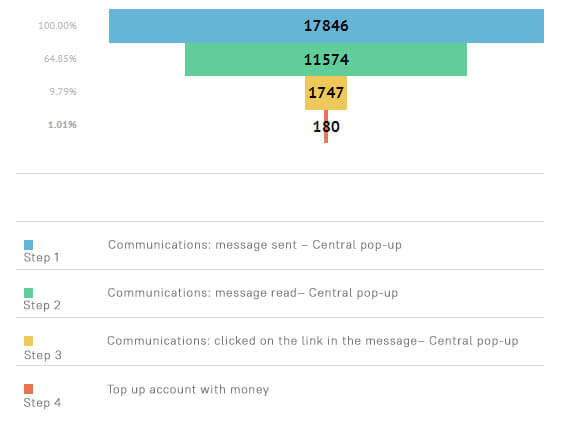
The conversion rate to reading the pop-up was 64%. 15% of all who read it clicked the link, and then 10% of them made payments. Here’s how the campaign funnel looks:
And this is monthly statistics:

Conclusion
We’ve obtained great results both in separate campaigns and in the overall chat. Let’s go over them again:
- Collected 16 000 emails
- 1516 users made at least 1 payment after interacting with the campaigns;
- We helped the company earn over $9 000.
All this happened thanks to flexible but easy segmentation and interesting designs of auto messages which we used to speak to customers in the same language.
Customer review
Thanks so much to Dashly guys! With your assistance, we’ve increased our project’s turnover thanks to the correct implementation of the tools we didn’t use before. We liked the approach itself and the working process very much. Be sure to try Dashly — they’re worth it, and you won’t regret it! Dashly team, you’re great!


![10-step Guide on How to Create a Chatbot for your Website [Build without code]](https://www.dashly.io/blog/wp-content/uploads/2022/06/How-to-create-a-chatbot-to-automate-conversations-with-your-website-visitors-720x317.png)


![La guía definitiva de growth marketing [explicada por un growth hacker]](https://www.dashly.io/blog/wp-content/uploads/2023/04/The-ultimate-guide-to-growth-marketing-explained-by-a-growth-hacker-720x317.png)
