Top 7 Engagement Tactics To Convince Your Visitors Buy During First Session

Hi, I’m Roman. It is a fourth year like I’m helping e-commerce websites convert visitors into buyers. Each of 500 clients I’ve worked with had the same problems: high bounce rate, abandoned carts, etc.
To offer the best solution, we’ve discussed their business goals, pains, valuable insights. That helped us to grow an expertise Dashly team refers to working with every new challenge.
Time to share it with you!
What hurts e-commerce conversion
Have you noticed a tendency: With the increase of marketplaces, there is a decrease in brand conversations with customers.
There are hundreds of potential customers who came to my website. 1K, 10K, 100K, and I still have a low conversion. I mean, people aren’t doing more than visiting and leaving.
Sounds familiar, isn’t it? That’s the truth every e-store face daily. I heard it almost at every call with our clients.
What’s the reason?
The competition grows as well as customers’ expectations.
71% of all respondents now expect companies to communicate with them in real-time and look for two-way dialogue.
When people are looking for real-time, two-way conversation with a brand, the last one offers just contact forms and discount pop-ups. A little mismatch, heh?
One-way engagement elements with sale intent lose efficiency. Gaining trust is a new engagement priority.
What is website engagement? It is a measurement of what potential customers do on your site, what elements they click on, share, download, and whether they ultimately convert into a paying customer or a subscriber. The goal of website engagement for e-com is sales. But it also can be subscription, downloading a lead magnet, share on socials, etc.
Let’s back to customers’ trust. How to get it?
Via conversation. Use conversation website elements to assist your customers and provide an in-store experience.
Thanks! The map is already in your inbox
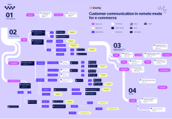
Buyers want the same intimate experience online as they get in-store.
I mean gentle assistants ready to help any time, products you can examine, etc. But online provides even more engagement opportunities. There is a list of “good e-store attributes” helping to make a first impression and gain customers’ trust.
Start with real-time assistance via live chat
61% of e-commerce stores are currently offering on-site chat.
Especially those who offer specific or expensive products. Live chat is beneficial for troubleshooting like:
- Product features details,
- Refund,
- Order status, etc.
That’s easy with automation tools every professional solution has. Only one click and a live chat window show the customers a card with relevant info like FAQ and order status.
It is also used for highlighting product recommendations based on the customer’s choice.
To boost engagement, e-commerce uses a proactive welcome message to qualify a customer request and route it to a relevant agent.
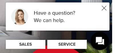
It also can be an eye-catcher, clicking in which website visitor see communication options FAQ, call, live chat:
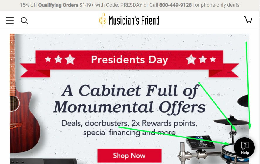
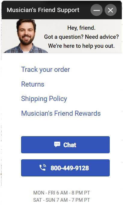
The last but not the least job is to capture leads. For example, some live chat can ask customers to leave contacts, and only then provide help when others offer instant chat without asking anything:
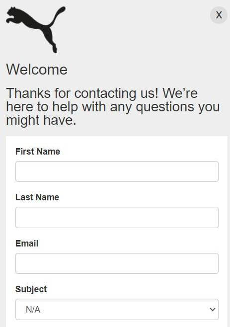
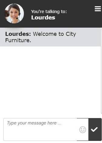
If you don’t have any of them, hurry up. Because your competitors do, for sure. Why? In addition to the assistance function, live chat is an image attribute.
More than 75% of people don’t buy from stores that don’t have a live chat.
For a customer, it means that a brand is open to dialog. The opportunity to get an instant reply in the form of a face-to-face conversation with a real person. That means fast and effective service giving a sense of security of purchase online.
How to create it?
Try Dashly. It is a powerful live chat software with rich automation features like fast replies, chatbot, personalization, integrations, user tracking. It is also one inbox for chat, email, messengers, and social network communications.
Don’t lose your customer when you’re offline. There is a chatbot who can assist them with simple questions.
Provide 24/7 customer support even when you are offline with chatbot
Imagine your website visitors need help immediately. But clicking on live chat, they see next:

Don’t make your website visitors fill out the contact forms and wait for an answer too long. Equip your live chat with a chatbot and interact with buyers in real-time.
Remember a story about proactive messages from the previous paragraph?
This also calls lead qualification:
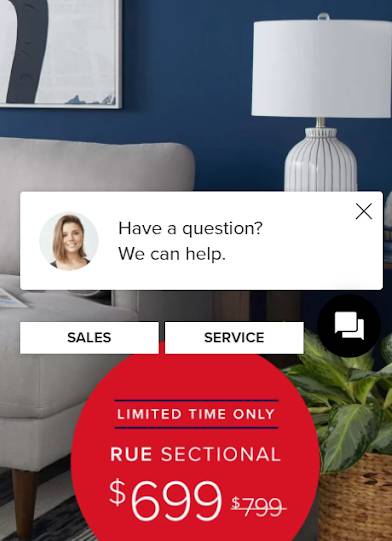
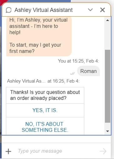
When customers choose one of the options, the chatbot routes them to the specialist in this the relevant field.
But that is only the beginning. Its mission is to assist website visitors without a human. Chatbot instantly answers simple queries and reduces the number of support tickets.
These articles will help you work with the chatbot:
- Dashly chatbot: automate lead processing and increase the conversion rate
- 7 website chatbots for marketing, sales, and support teams
- Lead qualification guide
- 25 welcome message ideas
Here is how & why chatbot gets 2nd place among the best website engagement techniques.
- Instant answers with FAQ are an excellent feature chatbot uses to deliver a better customer experience.
- With trigger messages, it engages visitors in proactivity on the website.
- Analyzing potential buyer journey on the website, chatbot personalizes the text of the messages.
- There are no extra resources needed to scale the chatbot number when there is a high customer queries volume.
Let your buyers find answers by themselves with FAQ
It is a set of info your buyer asks repeatedly. These questions may be about your product, delivery, payments, and so on. Traditionally, it is placed in the footer section of a product and its main page. Thus, your site visitors can find it quickly at any time.
When visitors are concerned about the product delivery, payment, or details, there is no need to wait for the agent’s response. With FAQ self-service, they can find a solution instantly.
There are two additional advantages from FAQ section on your website:
- It lowers the customer support load.
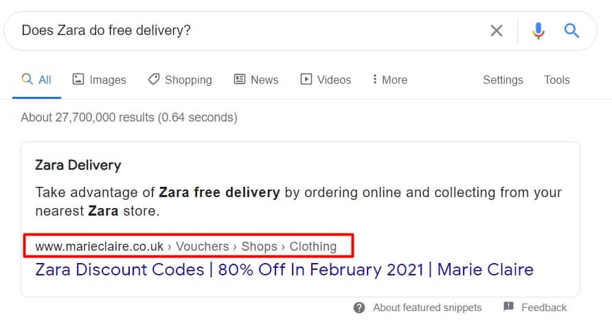
- It’s great for SEO. Look at how marieclaire.co fashion site did it. There you can find a FAQ section about ZARA. When someone asks Google, “Does Zara do free delivery?” its snippet shows an answer from mariclare.co FAQs with a link to the website:
It is essential to keep the FAQ section relevant to the product page. For example, at a mattress e-store website, you can find that pillows and mattress pages have different FAQs.
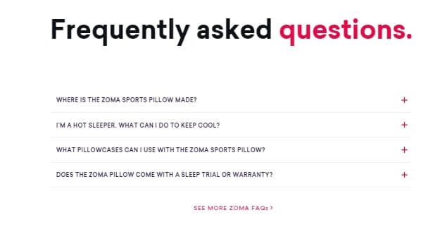
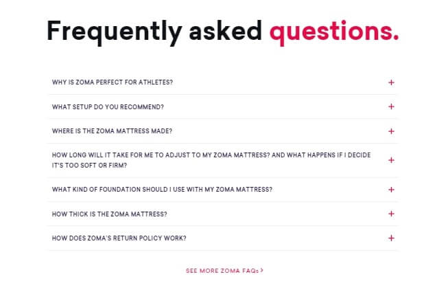
But still, there is a special page that includes all these FAQs in one place also.
Now it’s time to move to more interactive ideas.
Go virtual and show your product live
Buying online is Russian roulette. There is no 100% warranty that a product on the pic is the same in real. Even a small difference in color, textile, the decoration can discredit you as a brand. Manage customers’ expectations.
#1. Provide a “try before they buy” experience by showing your product live
On the product page, you can embed a demonstration of how it looks in real life. I mean natural lighting, a model wearing outfit, testing tools, etc. It can be a record of the video, a live stream on YouTube answering questions in real-time or even a VR model.
Here is how Sephora uses video for hair dryer demonstration. Numerous how-to videos are showing how it works for different hair types:
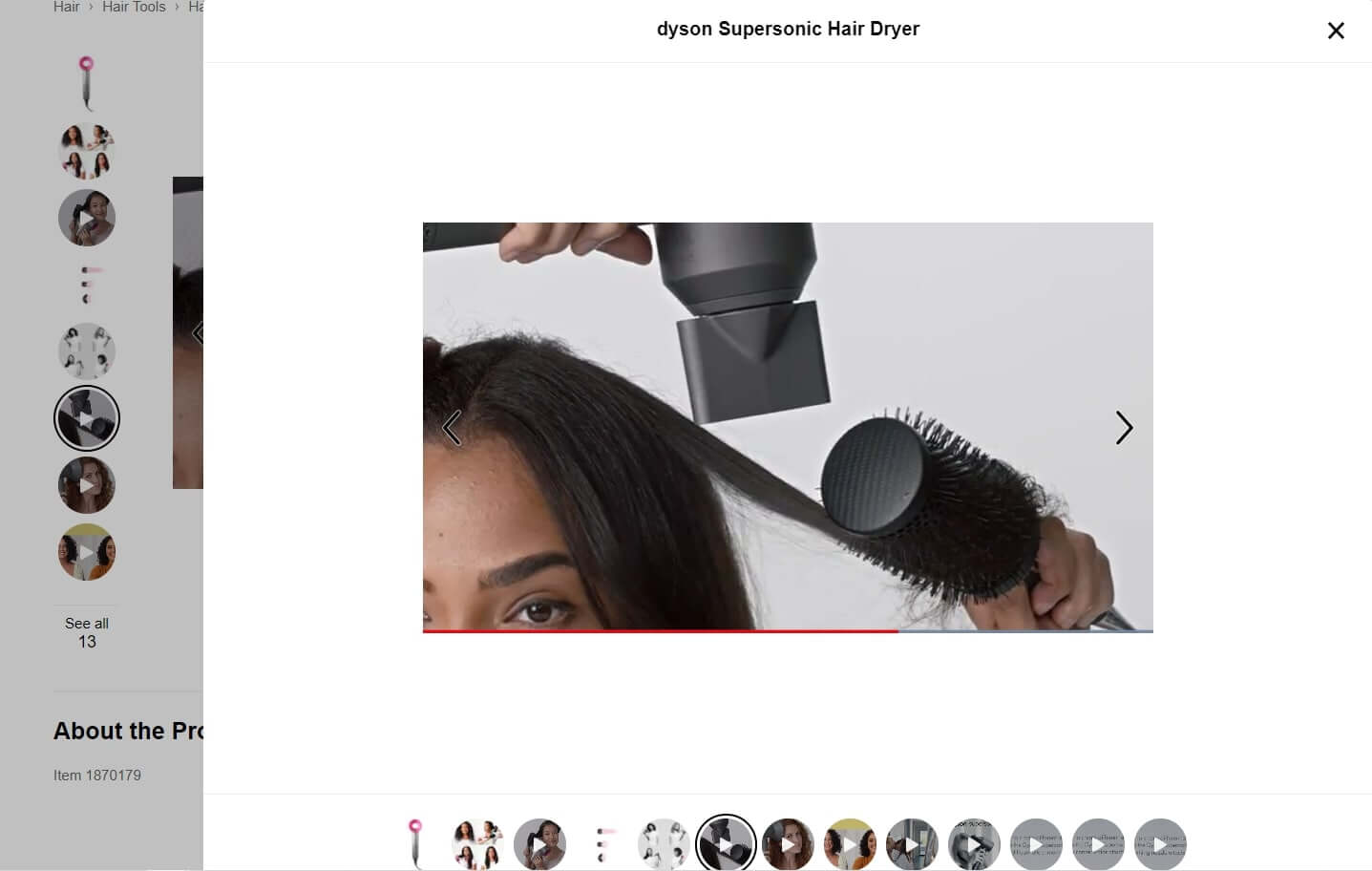
It shows the product in use. That is perfect for helping customers make a 100% information based purchase decision.
#2. Provide an in-store experience by online product testing
The “Try before you buy” technique is already in use by many brands, from furniture and interior design to makeup and hair.
Look how NYX Cosmetics uses interactivity to let website visitors see how their products, eye pencils, for example, might look on their type of skin.
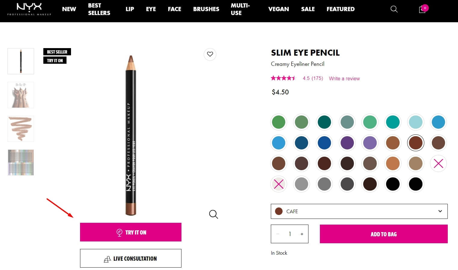
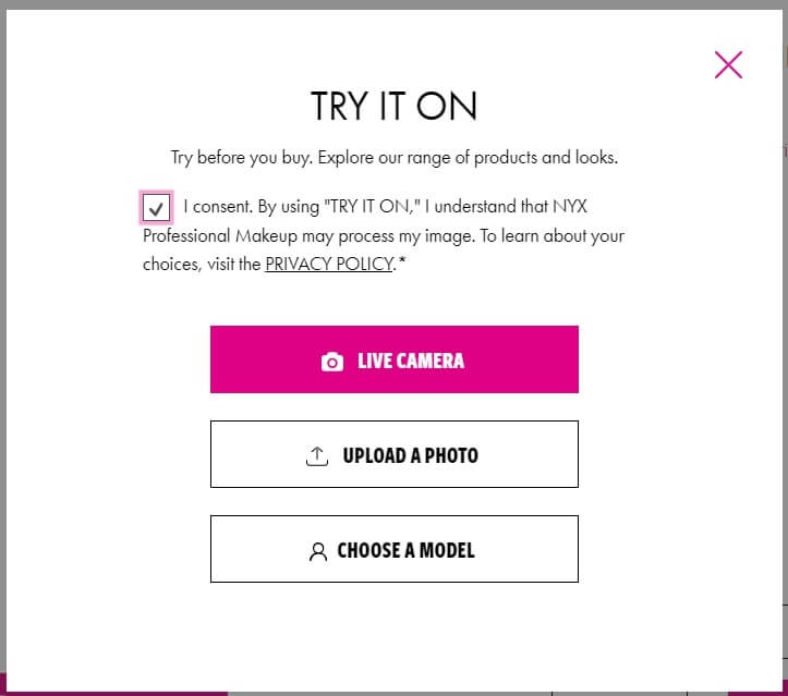
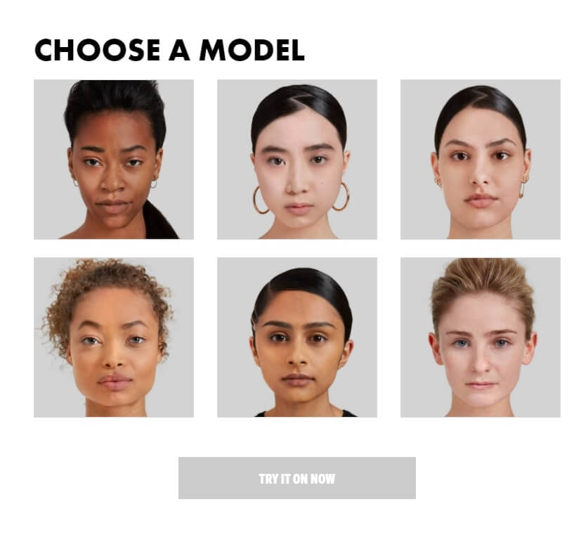
To try it on, a customer can upload a photo, use a camera or choose one of the models. It engages visitors to interact with the website, spend more time there, and, most importantly, choose the best option.
#3. One more way how e-commerce uses video is through live consultations
Let’s back to the previous example from the NYX Cosmetics website. In addition to the “Try it on” feature, it offers video consultation with a human agent:
The personalized, face-to-face conversation helps resolve customer issues faster and helps choose a product that best fits the customer’s need. This virtual in-person experience has the most substantial impact on customer satisfaction and trust in your brand.
Recommend products based on the visitors’ info
Gamify this process with product match quizzes. It is not for fun, but to find out potential customers’ needs and help them choose the best product here and now.
For example, how Murad cosmetics website uses a quiz to choose skincare products:
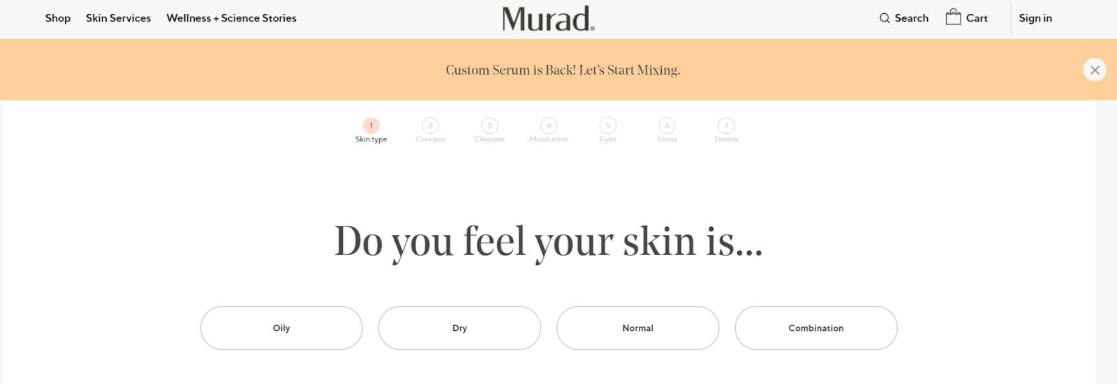
And the results:
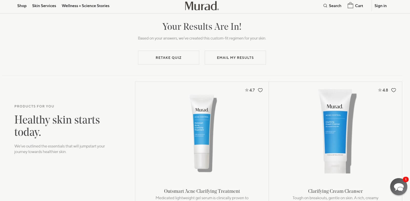
Notice, there is no need for a customer to leave their contacts to get the result. If you want to provide “here and now” help, do it.
It is a good idea to collect data from that quiz to understand what products are on demand.
Another way to collect data is user tracking. Know your visitors to offer them personalized offers only.
Increase customers trust with social proof
There is so much junk under the mask of good quality product pictures selling online. It’s not surprising that people don’t trust so easily. There’s nothing better to prove e-store trustworthiness than its buyers.
Yes, I’m talking about reviews and how to increase their sales potential.
#1. Show how your buyers use a product with UGC
True photos work better than text. Track what content buyers post about your brand on socials, and repost the best to your website. I mean an in-store shoppable gallery. Just look how Vivadogs does it:
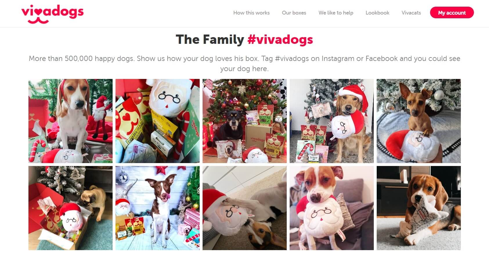
The opportunity to view the products in a real-life context and discover how others like them use your services is a kind of quick search by clicking on the embedded links and inspiration.
Here is how GoPro uses the last intent:
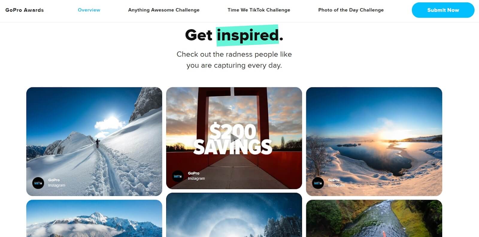
To boost the number of such posts, they announce thematic contests on GoPro cameras’ best content.
How to post UGC on a website? It is simple. Just find the “embed” option in the post settings and copy-paste the code to your website. Or use special plugins from WordPress, for example.
#2 Involve buyers to answer the FAQ
Interactive FAQs are a useful customer engagement tool. Allowing them to upvote the most popular questions and commenting helps you create a community around a product.
Just look how Amazon implements this feature:
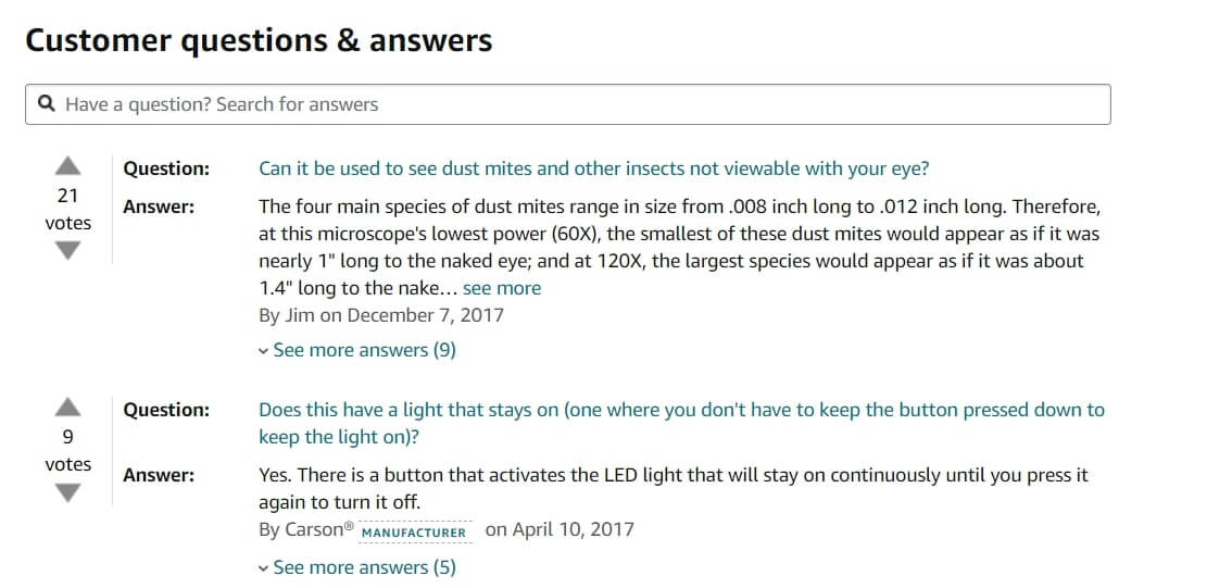
This customer-to-customer conversation tool works for trust as well as for website conversion.
Speaking about the last one, there is nothing better to increase sales than traditional pop-up notifications.
Focus customer’s attention on the best deals with smart pop-ups
Saying smart, I mean personalized notification based on visitors’ segmentation.
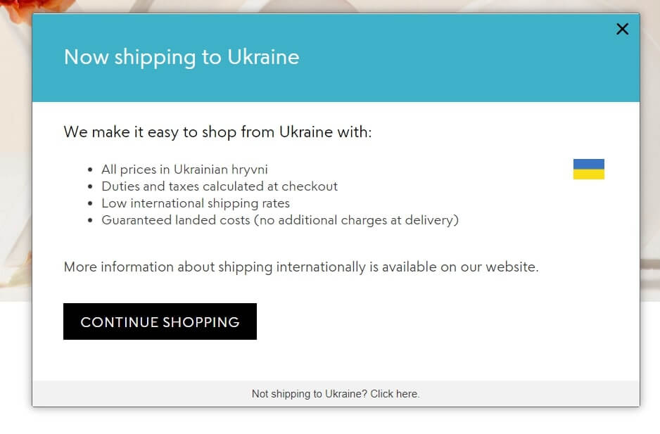
Let’s start with personalization. For example, if you are an international brand, it makes sense to highlight shipping info pop-up based on visitor location via IP address.
For example, I used a VPN tool to visit one of the US e-stores from a Ukrainian IP address. And here is what pop-up I saw:
Notice! We won’t talk about personalization by name because of this article about the website’s first-time visitors.
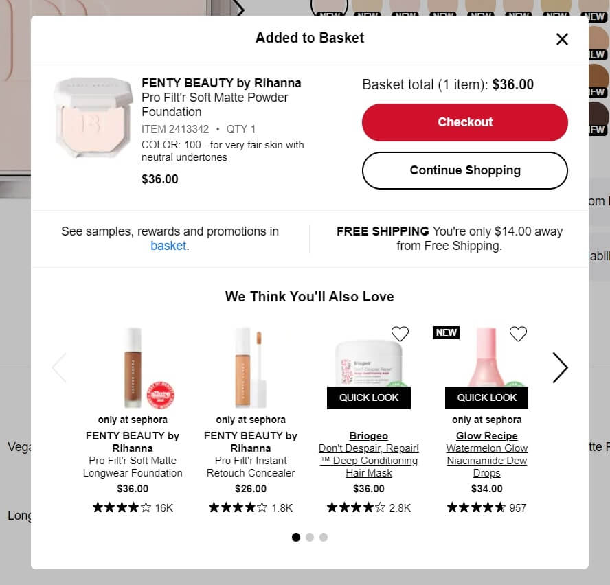
Another way to help customers is to recommend the best-fit product based on their choice. When visitors add some items to the shopping cart, it is good to show them relevant products. For example:
- “Customers Who Bought This Item Also Bought” or “You may also like this” pop-up recommendations are suitable for every type of products
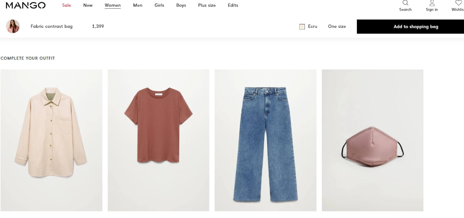
- Complement the look pop-ups used in the fashion industry. Here is what mango fashion store visitor see when chooses a bag:
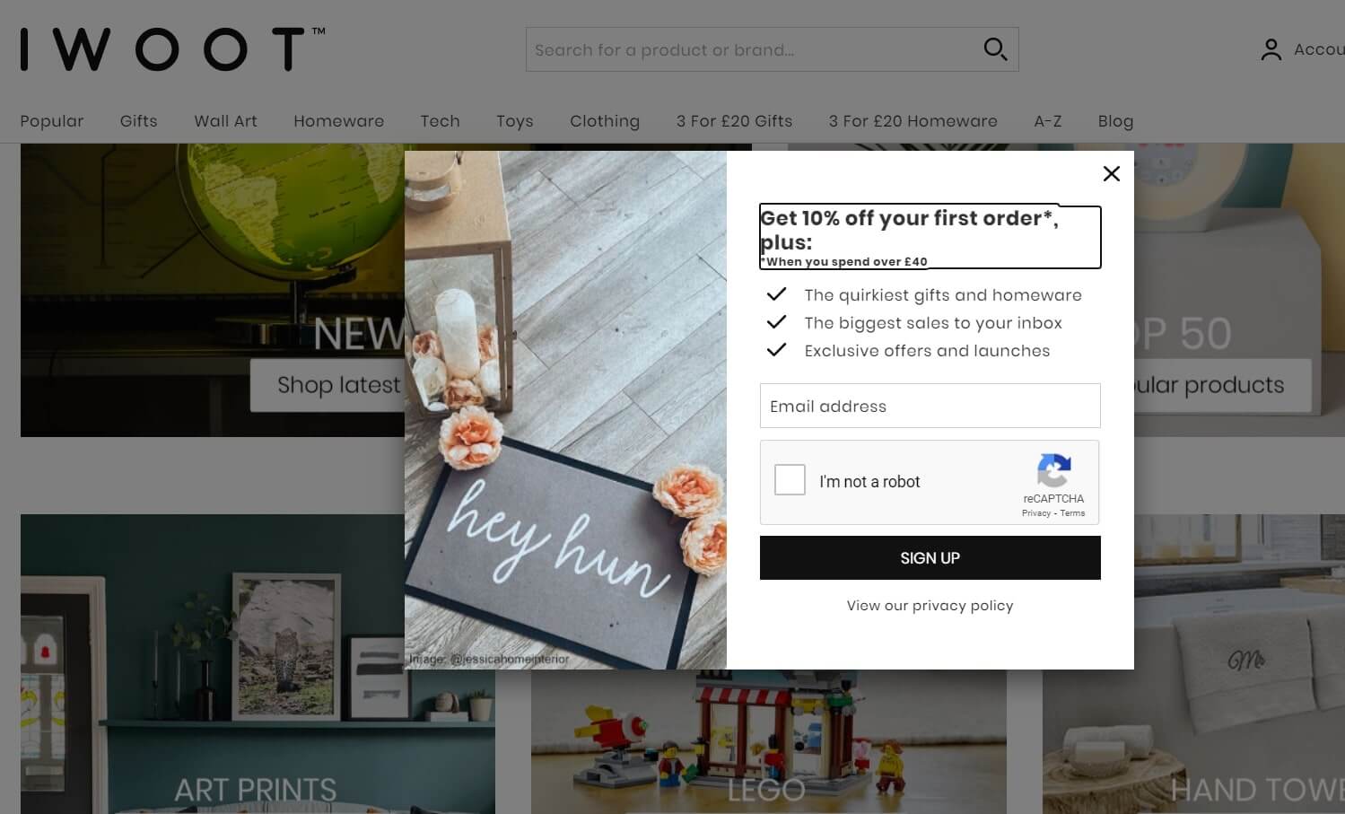
- Talking about behavior-based notifications, I can’t avoid mentioning a welcome pop-up. Traditionally they are used to highlighting special offers leading to the product page or capture leads.
Find more creative pop-up ideas in the article ”Black Friday & Cyber Monday best practices and pop-up examples to boost your sales.”
But people who are new to your website usually don’t trust you enough to share contacts. There are more creative and personalized ways to get buyers to opt-in before you give away revenue.
For example, make the same but in two steps: 1st offering the agree/disagree answer options to your question leading to the offer you highlight in the 2nd lead capturing pop-up. It provides a kinda intrigue and imitation of the dialog.
The most popular type is exit-intent pop-ups. In terms of e-commerce, they are about abandoned carts usually.
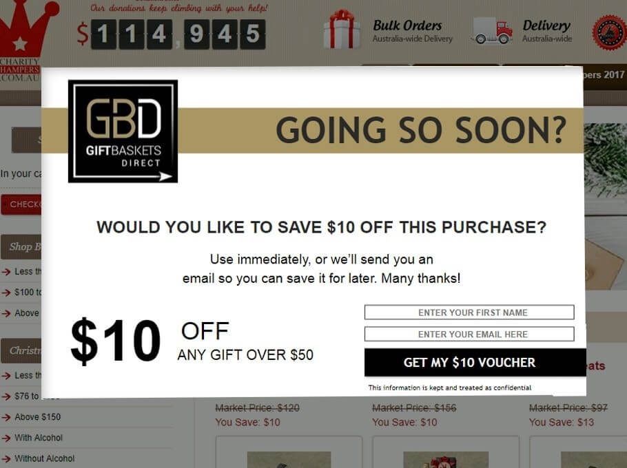
And most important, don’t forget about segmentation!
Track website visitors’ behavior to offer relevant deals only. For example, offering a lead capturing pop-up with a guide on minimal furniture style customers interested in sofa made in minimalist design.
Save up to 65% of traffic with mobile optimization.
Mobile accounts for 65% of all e-commerce traffic. That’s a fact. But some online stores still ignore it.
Thus, their pop-up text is too small to read, or the picture is too big to fit the mobile screen. A responsive website includes the same content and information on mobile devices you access. In terms of previously mentioned elements, it means:
- Good quality images that look good on desktop as well as on mobile or tablet.
- Button sizes should be at least 48×48dp to click it easy without magnifying glass help.
- Text input sizes should be at least 16px.
That is far the end of all the requirements.
If you don’t want to care about that manually, choose tools that automatically optimize pop-ups, live chat widget, lead, and subscription forms.
Feel the benefits of the automated mobile optimization of website elements with Dashly for free. 7 days test all the features with no limits!
Wrap up
Customer engagement tools are still the same. But it is essential to change the sales intent to assistance first. Talk to your customers and reply to their needs instantly — that is the key to gaining trust.
Good website engagement makes your customers loyal and stays with you for a long time.
Increase engagement with professional tools from Dashly!
Free expert insights to boost your marketing strategy and raise conversion to a target action by 10%

Read also:
- Acquisition funnel marketing: Grow customer conversions at each step of user journey
- The top 15 inbound marketing tools: harness digital power and elevate your business


![10-step Guide on How to Create a Chatbot for your Website [Build without code]](https://www.dashly.io/blog/wp-content/uploads/2022/06/How-to-create-a-chatbot-to-automate-conversations-with-your-website-visitors-720x317.png)

![The ultimate guide to growth marketing in 2025 [explained by a growth hacker]](https://www.dashly.io/blog/wp-content/uploads/2023/04/The-ultimate-guide-to-growth-marketing-explained-by-a-growth-hacker-720x317.png)

