How to bring more visitors to sign up: IQ Option + Dashly
IQ Option is an international platform for investors. Their clients sign up in the product and look for the best stocks, options and forex. It is a somewhat that may be called an aggregator, where client monitors the perfect deals according to the parameters needed. Platform works all over the world with traders from 150 countries.
Our main goal with IQ Option was to increase the number of sign ups. The hardship was that there’s no Dashly script on the sign up page, so we couldn’t track the number of this page visits. Dashly was installed only on a blog and that was another thing that made us show power of invention. For fairness’ sake it needs to be mentioned that a great number of traffic comes out of there.
Important to note that we worked only with sign ups, we didn’t warm the leads up or calculated trial to payment conversion, there was only one metric that we were focused on. Let’s see how the story about fighting for only one metric goes.
Action 1: the beginning
We started from the buttons. There are two of them in the blog that lead to sign up form:
Plan was as follows:
- Measure the effectiveness of these two buttons
- Launch a pop-up to make visitors sign up
- And measure its results
This was just a testing period, to show what Dashly can do for IQ Option.
In order to test we launch our pop-ups only on two counties — Great Britain and Spain, not on all 150. Moreover, we included a control group and therefore 50% of Spanish and British visitors didn’t see our pop-up.
Those who got lucky to be in an experimental group were also divided into two — we launched an A/B test for a pop-up.


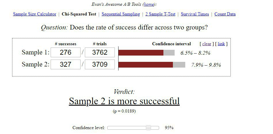
Just a couple of days and time to check the results. On a picture below there numbers for Sample 1 and 2.
Yay! That was our first success — people who saw pop-ups tend to sign up more. As you can see, small pop-up is a winner, but the difference is insignificant.
And a little note about that buttons: green one is much more effective than the orange one, but our button in the pop-up still bits it. That button in a pop-up allows visitors to pass over to the sign up page without scrolling the whole article to the bottom.
Hey! The map is in your inbox!

Action 2: first fail
During the next iteration we deleted the control group and let everyone see the pop-up. Also because our small pop-up was a winner, we translated it into 5 languages and launched to all other countries. Orange and green buttons were still there — we still let them work.
But at this moment something went wrong. From the moment when we launched our pop-up on all countries nothing significant changed in the statistics. We had to think about what to do next and how to change the situation.
And here we came up with… ABCD-test!




Time to place your bets 🙂
And the winner was… the fourth pop-up! With a big breakaway. The conversion was 7,28%. We can’t really say what was the reason — the Atlantic ocean or free video tutorials, but does it really matter if it works. 🙂
Read also:
⭐ 2025 Guide: How to Create a Powerful Email Sales Funnel [11 Examples Included]
⭐ 6 Proven Ways to Plug the Gaps in Your Leaky Funnel
Action 3: time for experiments
But that was not the end. We know that a lot of blog readers come from Google search, so we decided to show our pop-up with the Atlantic ocean only to visitors who came from Google. Again, we included a 25% control group, who didn’t see the pop-up and had a chance to sign up only using orange and green buttons on the website. So we launched and relaxed for a week.
And again — our pop-up worked! It led to a sing up of the biggest number of people that buttons did. Here are the results:
| Total visitors | Made a target action | Conversion | |
| Control group | 2703 | 271 | 10,03% |
| Experimental group | 6029 | 750 | 12,44% |
Therefore because of our pop-ups IQ Option got 145 additional sign ups during the week.
What is the most important?
When you have a specific goal, don’t go a long way to reach it. Break it into small iterations and react quickly.
At the beginning we had to launch a pop-up that will lead visitors to sign up. To launch each of the tree iterations made we spent a couple of hours. When we saw that something goes wrong, we came up with a new idea and changed it.
Here are the conclusions we made because of this case with IQ Option:
- Visitors want to see an understandable call to action. Pay attention to the itles of your pop-ups — visitors have to know where the button in a pop-up will bring them. CTA should be short and succinct.
- In order to find what visitors will like, you need to test. Don’t hesitate to make two or even more alternatives, but don’t wait that you will see a significant difference in their results.
- Include control group in order to estimate results on every step. When we are talking about a certain metric, control group allows to understand if you’re on a right way or not.
- When you see some good result, think about how to make it better. For example, when we decided to show our pop-up only to visitors from Google search, we hit the target audience and brought a lot of them to sign up.
- And the last, but the most important thing — don’t be afraid to do something wrong!
Read also:
👉 Live Chat Best Practices: 20 Hacks to Make Customer Service Better
👉7 Best Live Chat for eCommerce: Boost Conversion on your Website
👉 Top 5 live chat mobile app: find the best fit for your business
👉 Live Chat: How Online Chat Tool Can Help Your Business
👉 20 Best Live Chat Software for your website chat service
👉 Acquisition funnel marketing: Grow customer conversions at each step of user journey
👉 The top 15 inbound marketing tools: harness digital power and elevate your business
👉 10 best website personalization tools to deliver top-notch visitors experience
👉 7 best email capture tools: features and pricing compared for 2024


![The ultimate guide to growth marketing in 2025 [explained by a growth hacker]](https://www.dashly.io/blog/wp-content/uploads/2023/04/The-ultimate-guide-to-growth-marketing-explained-by-a-growth-hacker-720x317.png)
![10-step Guide on How to Create a Chatbot for your Website [Build without code]](https://www.dashly.io/blog/wp-content/uploads/2022/06/How-to-create-a-chatbot-to-automate-conversations-with-your-website-visitors-720x317.png)
![4 steps as Chief Marketing Officer at a new company [Expert guide]](https://www.dashly.io/blog/wp-content/uploads/2022/10/4-steps-as-Chief-Marketing-Officer-at-a-new-company-Expert-guide-720x317.jpg)