9 Attributes Of a Reliable Online Store In 2025
“What’s in a box” is a successful gift e-store with 10 000 loyal customers all over the US. Sounds cool, heh? Especially when, just a year ago, it was on the verge of bankruptcy.
With a vast network of dealers, this brand fell victim to the Pandemic. Since physical stores were closed, unlike the average order value, the return rate was high as ever before. The brand was near bankruptcy when Steve, a Product Marketer, decided to revive the idea of a website — the one he has been putting off for the next season for years.
And not without reason.
There are Gift Tree, Prezzybox, GiftBasketsOverseas, and other popular online gift stores people already know. How to compete with them and gain the audience’s trust?
This is a question we’ll reveal in the article. Read about 9 website elements shoppers pay attention to when visiting an online store.
Time to back to Steve and rewind his nine steps on the way to an army of loyal customers.
Let’s start with the last task his team worked on.
9. Mobile-friendly design
The fact that 72% of eCommerce revenue today comes from mobile shoppers can’t afford us to ignore an e-store presentation on the mobile web.
There are key things buyers pay attention to when visiting online stores from mobile.
- Check out.
- It’s way easier to input and review info when the check-out window has no scrolling.
- Breadcrumbs help understand what check-out step customer is and make it easy to go back to the necessary page.
- Express your gratitude to registered customers by saving their time by auto-completing check-out fields with the data you know.
- Add a validation asterisk to mark the fields where they made a mistake.
- Don’t force mobile visitors to register for purchase. Offer guest checkout alternative.
- “Invalid zip code” or “Expired card” error description will make your forms much more transparent.
Implementing these elements helped Steve save 58% of shopping carts from benign abandoned by potential mobile shoppers who are rather critical of the fast payment process.
- Easy to click buttons apply not only to check out. Their size should be at least 48×48 DP on the mobile version of your website.
- Mobile navigation means a sweet and short path to the desired product. To achieve that, Steve limited the top-level menu options to four items (but it is possible to use up to eight), placing the most important pages first.
It is also good practice to make the mobile menu labels as short as possible. But don’t forget to keep them clear. - Optimize product images, text, and videos for mobile. Avoid videos autoplay, mind the content sizes, and reduce the on-page text amount with the help of drop-down elements.
- Ads and Pop-Ups. There are two things about these elements: don’t be invasive and optimize a design.
As for the first, not to show visitors pop-up windows they’ve closed, Steve implemented user tracking on-site. It is also a good idea to limit the number of bright ad banners on each page and pop-ups.
As for the second, mind your pop-ups and banner ads to fit the various mobile screen sizes.
The eighth place in Steve’s list goes to …
8. Personalization of the customer experience
I mean, using the data about visitors previous actions, behavior, demographics, and other personal info in website dynamic content, welcome chat messages, pop-ups, and specific offers.
91% of consumers are more likely to buy from companies who remember them and provide relevant offers.
First, it increases visitors’ engagement. But it isn’t the primary goal of the Steve team, who know how personalization improves Repeat Purchase Rate, CLV, and Sales conversion rate.
So the task is straightforward: to treat every e-store visitor like a VIP customer.
The question is, how?
Easy. Just look at five personalization strategies every reliable e-store uses on a website:
- Personalized homepages for returned visitors
Invisible spies are watching every step of your visitors on-site and bringing you their interests to further marketing. Simply put, cookies.
For example, there are several store locations on Steve’s site. If during a first visit customer goes to the NY section, cookies track and remember that. Next time this customer won’t see the main page for everyone but will be automatically redirected to the NY store page with the relevant items.
It can be applied to the e-store section your customers visit, for example, women or men.
Read also: 5 ways to track user data for newbies and tech-savvy
But speaking about location-based personalization when you choose the US store from the top menu and visit a product page, this is what you see. The currency is, of course, US Dollars, and the size information is based on US shoe sizes. But if you’re browsing from the UK, the size information changes into UK sizes.
This helps customers to shop without any distractions.
- Personalized shopping assistant
With the help of a chatbot, you can initiate a conversation with a site visitor asking him or her about the preferences, defining the needs, and offering personalized solutions.
That’s what Steve did. He created a chatbot offering visitors help in the choice of a perfect present.
With the help of five questions about the recipient’s gender, personality, and customer’s budget, chatbot defines visitors’ needs and routes them to the relevant landing?

- Display recently viewed items
No matter how you trust the visitors’ memory, it’ll be an excellent move to remind them of the items they have checked. But you can go further and use that info to add in this list new products to explore, based on visitors’ recent browsing activity.
- Personalize on-site messages based on the user behavior
Offering first-time visitors and loyal customers the same thing is a lazy strategy. Just look how Steve engages first-time site visitors with a pop-up window offering a 15% discount:
- Messaging
When you know the number of a visitor’s name, pages/items she or he looked through; you can use this info in your automated communications.
For example, personalization by name in chatbot welcome message:

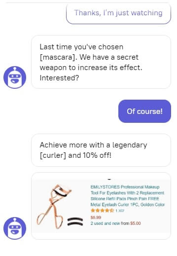
The personalized cross-sale tactic every e-com can use with the help of a chatbot
Read also: Winning The Customer With Personalized Messages Where They Are Truly Relevant
- Product recommendations
31% of e-com revenue comes from personalized product recommendations.
So, there is nothing new in suggesting similar or complementary items on product pages. It’s almost a must-have for an e-store. But Steve preferred the abandoned cart tactic instead.
Based on the info about the items in the product cart of logged-in visitors, his team launched a personalized window that pop-ups on the main page when a customer visits a site next time.
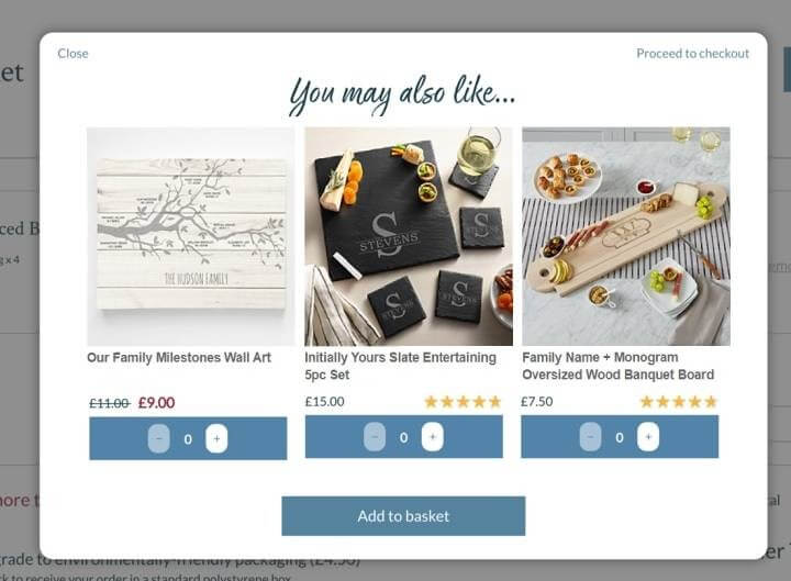
People have obviously liked the items they added to a cart, so they’ll most likely be interested in these products, too.
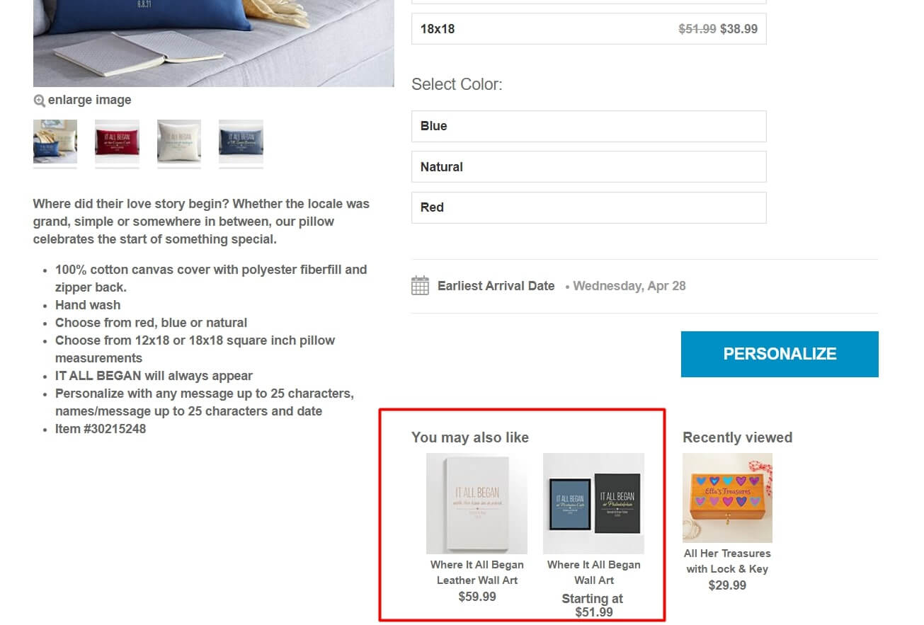
In addition, every visitor sees a list of relevant items on the product card.
7. Product content
Don’t judge a book by its cover is good advice. People hardly listen to it in real life. In terms of e-commerce, it works the exact opposite. The first impression based on the product images and descriptions on your website is the crucial factor that rules online store conversion.
No matter how professional your sales and support team is, if the product you offer looks bad.
It’s all about poor descriptions, reviews, and low-quality photos.
Ensuring you’re describing your product accurately and in a way that speaks to customers is essential for discovery. Imagine you’re selling a bike, but you describe it as two-wheeled vehicles instead of a bicycle; no one would be able to find your product!
To avoid this, first, Steve’s team hired a professional product photographer. And second, they created SEO-optimized product descriptions addressing what the product will do for a customer.
For example:
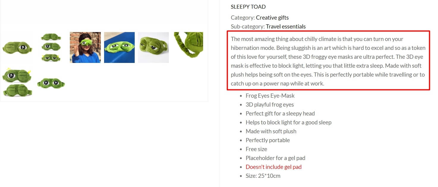
In addition to the essential characteristics of a frog, the eye mask description has a description part that appeals to the visitor’s imagination. Proper descriptions can go a long way in fighting customer dispute frauds in e-commerce, as customers are less likely to return a product if it was described appropriately.
6. Shopping cart
A simple basket in the upper left corner of a site leading visitors to the items they chose is a must for each e-store. This is a time-saving solution that “holds” items while potential customers wish to purchase until they check out. There are many shopping cart solutions, but it is better to opt for a hosted shopping cart, as it will allow you to enjoy several benefits, including seamless integration, reliable security measures, and hassle-free maintenance.
For signed-up customers, its advantages are way more significant. When the last ones visit their carts, they can check all their previous/current orders. This is a secret weapon every e-store uses to increase conversions:

In terms of marketing, a shopping cart is also a valuable source of data for automated personalization. Owners of such accounts receive special discount offers and participate in different promotions or sales.
5. Site load speed
What can be more annoying than a slow website? You have only two seconds for customers ready to wait for your site to load. Otherwise, they’ll just leave.
Read also: SEO research or how live chats influence page ranking and loading speed
Plus, a slow website can drag your search ranking down, and you’ll lose your potential customers and sales day in and day out.
Your brand isn’t what you say it is — it’s what Google says it is.
Chris Anderson, CEO at TED
Even a 0.1-second improvement of mobile site speed gave Steve about an 8.4% increase in conversion rate after he has worked out this issue with an SEO specialist.
4. Multiple payment methods
E-store visitors are more likely to go through with their purchase if they have a chance to pay using the method they prefer.
After a short research Steve’s team find out that their competitors usually offer:
- credit and debit cards,
- PayPal, Payoneer, Venmo, Stripe,
- Apple Pay, Google Pay,
- gift vouchers,
- cash on delivery.
Just look how one of the e-commerce giants cares about better customers experience on the checkout:
It isn’t such an easy task, so the Steve dev team currently finishes the last fifth payment method on the check-out.
3. Instant support 24/7 with a live chat
Access to customer support is one of the most important attributes of a good e-store, primarily if the products sold by the store can be classified as high-value items like furniture and so on. This helps people to trust the brand, knowing that the support is available one click/call away.
Have you noticed a shopping dilemma: there is always a naughty consultant ready to advise you even if you don’t need it in a physical store? Still, you can almost hear a tumbleweed running a desert website when you need some help in an online store right now.
The ability to get instant support 24/7 is one of the key customer service requirements nowadays.
The solutions are hotlines, contact forms, and live chats to solve the pre-sale and after-sale questions. Thus, you give your customer an alternative: to talk or to chat.
The opportunity to consult with a support rep via live chat
can bring you a 3X sales increase.
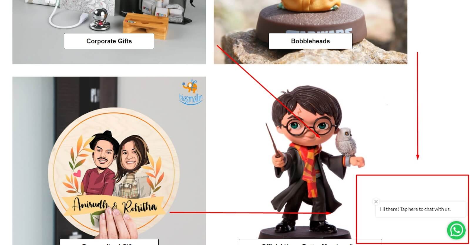
After evaluating of the best website chat software, Steve visitors can see a live chat widget engaging them in a conversation:
It is easy. You can do even better!
2. Product ratings and reviews
63% of e-store site visitors are more likely to trust it if product reviews are on a site.
It can be written on the site, like this one, for example:
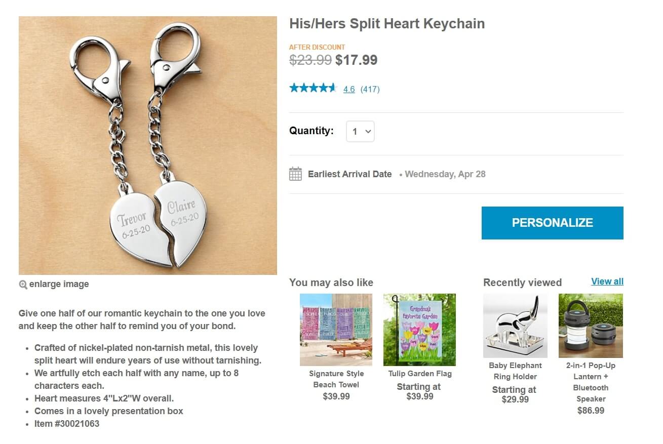
At the same time, it is way better when your reviews are integrated on a site as user-generated content from socials or other review platforms:
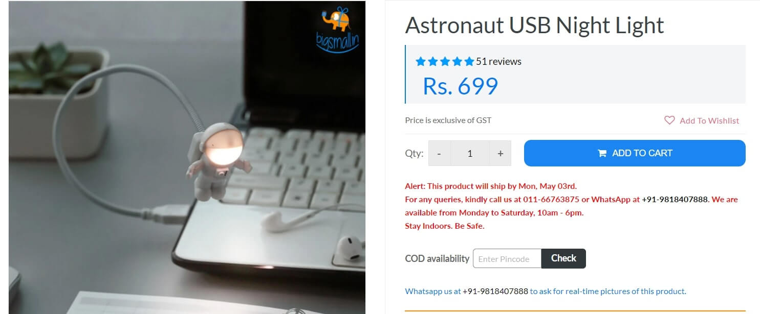
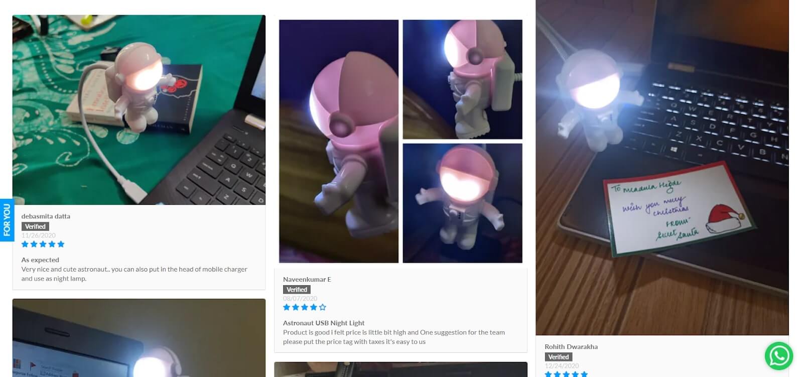
But it’s not enough to build trust.
When an item only has 4 or 5-star reviews and barely any 1-3 star reviews, plus, when the reviews are written around the same period is typically a sign that there’s something shady going on.
So what does an ideal product review block look like?
- The recent comments are on the top.
- There is an opportunity to filter reviews.
- It contains both positive and negative feedback.
- It includes photos.
- Has Verified Purchaser mark.
- Includes a part summarizing all the reviews in a percent.
- Provides site visitors with the opportunity to rate the helpfulness of a review.
- Includes a store owner reply.
- Offers easy functionality to leave a comment.
Even now, when the tech part of their displaying on the website from popular review channels is finished, the Steve team continues working over the strategies of engaging customers to leave reviews on their purchases.

1. Website search and navigation
Exactly these two elements define whether visitors continue browsing your site. That is simple logic. If online store navigation is bad, customers won’t find the needed product.
Finally, it feels like:

After several minutes of search, they just leave.
Search bar workflow, breadcrumbs, site’s taxonomy, page structure, and how menu design on mobile and desktop. These components impact the overall end-user experience and conversions, search ranking, return visitors, bounce rate, time on site, page views, and time on site.
So what details Steve as a product marketer should pay attention to in terms of the site navigation:
- Place your categories right.
- Limit the number of levels in your site hierarchy.
- Use short and descriptive labels.
- Don’t confuse shoppers with too many buttons. Limit the number of categories on the top menu bar to 7 or 13.
Just like The Sock Drawer did it on his site:

- Take advantage of the drop-down menus with subcategories.
- Use your home page for highlighting popular products, recently viewed items, and ongoing sales.
- Recommendations, and bestsellers on the product page are also a part of e-store navigation.
30-60% of e-commerce visitors conduct an on-site search, and those who do are 2-4 times more likely to convert.
Andrea Polonioli
Product Manager at Coveo
There is also a list of requirements for a search bar. For example:
- Make sure your site search understands typos and autocorrect.
- Offer synonyms to help shoppers find the products they’re looking for.
- Mark your search bar with a basic magnifying glass for visitors to find it quickly.
- If the search gives no results, offer relevant or popular products instead.
- Apply it with autocomplete feature.
It sounds not as tricky until you start implementing it technically. But all these elements are a must for building an e-store trust.
The proof?
Look at the most important attributes of the online shopping experience according to shoppers in the United States:
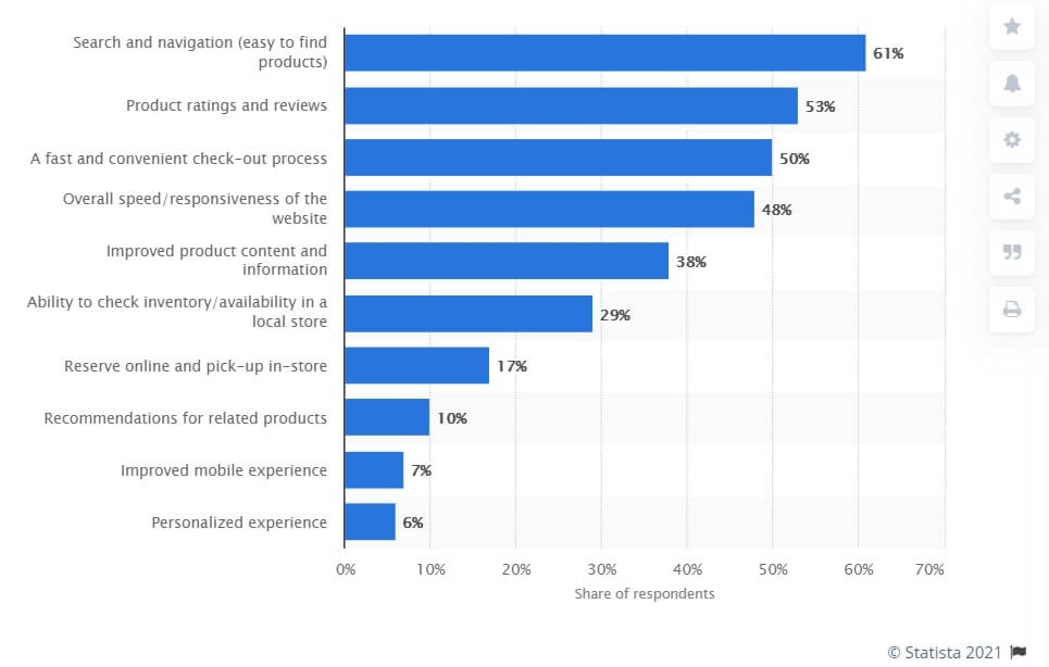
They are most important, but by no means do all the customers’ requirements websites have to meet to get the status of a reliable e-store.
It’s almost impossible to implement all these steps simultaneously. Thus, there is a list of things Steve will have to improve in the near future.
Other 6 e-store attributes customers also pay attention to
- Promotional Programs
Having a reward system for your store has always ensured my employer or clients’ loyalty to the marketplace. Knowing that the essential shopping mall of your product is doing what it can to recognize and help facilitate your success is a true asset.
Doug Liantomio
Marketing Outreach Analyst
- No Barriers to Payment
When your customer selects a product, adds this to their cart, and then begins the checkout process. You need to ensure this process is as seamless as possible! If there are any pop-ups in these sections of your site, you will force exits and lose out on revenue for your business. Likewise, if there are too many forms to fill in, or the checkout process takes too long to complete, you are also going to lose money from your bottom line here as well.
Ryan Jones
Land of Rugs
- Security
This always has been and always should be a top priority in the e-commerce industry. As users turn to digital platforms to fulfill their shopping needs, hackers and online fraud schemes are also rising.
Consider how you’ll take payments, and opt for either a trusted e-commerce platform or bespoke development to ensure transactions are made safely and securely. An SSL certificate is also a priority. This encrypts messages sent out from your website, and seeing the HTTPS in the URL gives your users that extra boost of confidence.
SamOrchard
Edge of the Web
- Clear policies
Often most e-store owners are making a significant mistake: they are not putting exact and appropriate policies in their store. This will be given a negative impact on your store among the users.
Fay Hao
Head of Marketing at Ourpcb PTY LTD
- SEO Optimisation
Use long-tail keywords to drive more traffic to your e-commerce store. They are not only more targeted; they do two more things right. They help stop keyword cannibalization among home, catalog, and product pages. That will allow all pages to rank independent of each other despite using the same primary keyword. Simultaneously, long-tail keywords tend to be more niche and less competitive, and so are easier to rank higher on SERPs.
- Reasonable shipping prices
Customers wouldn’t waste a huge chunk of their money paying for expensive shipping fees. Make your customers loyal by giving them an affordable or free (when they reach the minimum amount) shipping fee.
Martin Seeley
Chief Executive Officer at MattressNextDay
The tips above will help you to turn your e-store into the perfect go-to page for potential customers. That will take time, but the suggestions Steve followed here are basic for every online store.


