23 Ways to Increase the Conversion Rate of Your Online Store
The Internet is awesome, you can buy anything there. You can get a truck full of bricks or water from an alpine spring delivered right to your door. The competition among online stores is very high, and everyone wants to make good money. So let’s talk about how to increase the conversion rate of your online store and become a star in your segment.
First, let’s outline what you should strive for. The average conversion rate (the ratio of the number of orders to the number of visitors) of an online store lies in the range of 0,3-8%. You have to keep in mind that 8% is awesome, but 0,3% is also not bad. But the sky is the only limit.
Keep your eyes on the prize!
Now that we got the benchmark, let’s get going. First, measure your current conversion rate and set your first target. If your current conversion rate is 3.2%, aim to reach 3.5% in 2 months.
Then, you need to define the toolkit you’re going to use to improve your conversion rate. Let’s talk about the most effective ways to increase the conversion rate as we see them.
P.S.: we’ve recorded two videos where we discussed these 22 ways to increase the conversion rate. Watch them if you don’t have much time to read the article to the end:
1. Work on your traffic
A couple of paragraphs above, we said traffic is not the main thing. You can have a nearly null conversion rate at 10 000 daily visitors. We’re not talking about the traffic volume, it’s all about quality. It’s much better if you acquire a few really interested visitors who are more likely to make a purchase than a crowd of random people.
2. Personalize descriptions
Visual content is very important, but don’t forget about texts. Product descriptions tell their stories. Just like quality TV advertising makes you buy something, a good product description shapes your emotions, trust, and an idea of a better life.
Use descriptions to tell your potential customer:
- how your product looks in a certain color;
- how it smells;
- how much it weighs and how it feels;
- and other details that you can’t tell from just a picture.
A good description sells benefits, not functions.You don’t have to write a poem, but do your best to communicate the value of your product to a customer and show use cases.
Don’t be afraid of longreads. If your customer likes the very beginning of it, they’ll finish it. Though it’s better to have two descriptions: a short and a long one.
3. Optimize your checkout
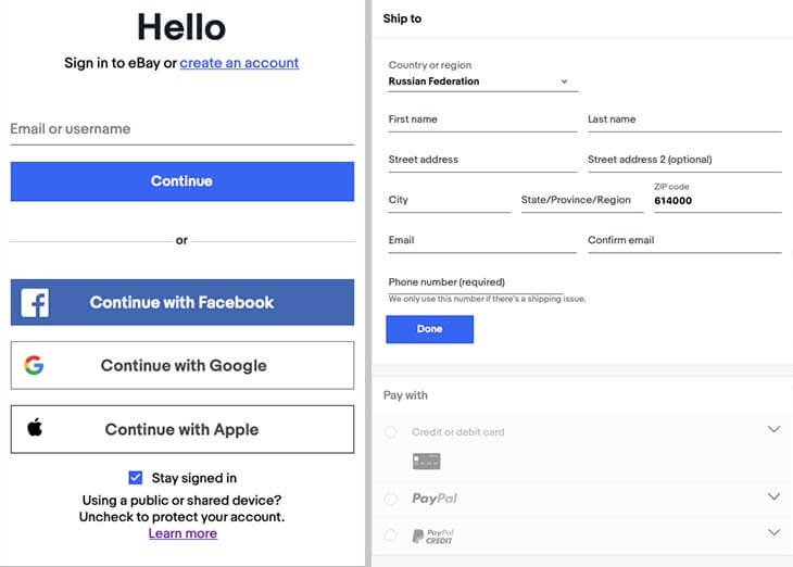
An inconvenient or unclear checkout is one of the reasons users abandon their shopping carts. Here are some tips on how to make checkout in your online store convenient and seamless.
- All necessary information and data fields should be located on one page. First, it’s more convenient. Second, a customer will immediately see what info you need from them.
- Don’t ask your customer for the fax number, the mother’s maiden name, and the name of their pet; only ask for the essential data.
- Shorten the checkout as much as possible. Don’t ask a user to sign up. Offer a one-click checkout to those who have already signed up and bought from you: the system should remember user data at the first payment and no longer ask them to enter it.
- Configure as many payment methods as possible. VISA cards or Paypal accounts are not your last resort here. Add several payment methods (Mastercard, PayPal, etc) as this will allow you to reach for a larger audience.
Read also:
⭐ Unlock the Power of Email Sales Funnels in 2025: 11 Real Examples to Follow
⭐ How to Seal the Leaky Funnel: 6 Strategies to Save Your Sales
4. Ensure security
Econsultancy’s survey revealed that 58% of respondents quit placing their orders because of security concerns about payments. On average, the conversion rate to payment on the checkout page is 32%: improving this rate will help you increase conversion rates significantly. Design your funnel to see how many users stop interacting with your website on the checkout page — maybe it’s a bottleneck you didn’t think existed?
It’s essential to make customers feel safe about paying to you. Make sure your online store has the following:
- logos of worldwide known payment systems: VISA, Mastercard, PayPal;
- the https — it ensures better security than http;
- a public offer specifying in detail all touchpoints of a merchant with a customer;
- a separate section with refund policy as customers basically choose products blindfolded and always keep in mind the refund option if a product doesn’t fit them.
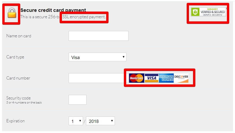
Not everyone pays attention to these things, but it’s essential to adhere to them. Without them, there’s no trust, so customers will be less likely to buy.
5. Work on website navigation
You won’t sell anything if users simply can’t find what they need. Website navigation is often the first thing that customers pay attention to when coming to you for something specific. Complicated navigation can cost you a lot of lost customers.
Although there is no one-step solution for all online retailers, we can give you some recommendations.
Replace the dropdown menu with the catalog if you have a lot of products
In case you have a very wide product range divided into categories and subcategories, you might want to consider a separate page for it. Otherwise, you will find it hard to find what you need in the huge menu.
Structure your dropdown menu if you have many products in just a few categories
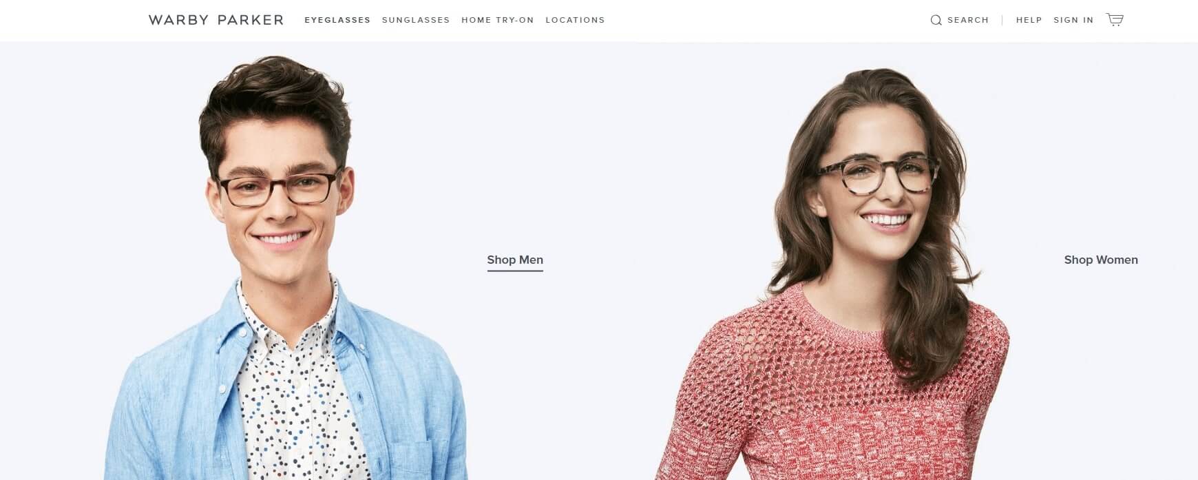
The online eyewear store Warby Parker has made a very smart move. Their entire range is divided into just two large groups: glasses for eyesight and sun protection. If you select a group, a menu will open showing glasses for men and women. See how great it looks:
Add a large footer
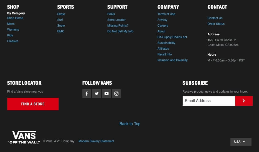
Adding all sections to the main menu is definitely not a good idea. A footer will help you. It allows you to make important information available to your customers without interfering with their shopping.
Arrange sections wisely
Customers usually pay attention to the beginning or the end of the list. Make use of this trick and don’t arrange menu sections in a chaotic order.
Highlight what’s important
Sometimes customers don’t buy just because they can’t find the “Buy” button. Step back and make sure all buttons are visible to avoid losing customers.
6. Make the website search convenient
Users don’t have time to master your website navigation looking for what they need. According to a study by the Online Marketing Institute, 85% of potential customers leave websites because of unsuccessful design, and 83% leave because they have to do too many things before they can find what they need. Make sure you have configured a convenient navigation and website search if you want to increase the conversion rate. Here’s what you should set up first.
Visible search bar
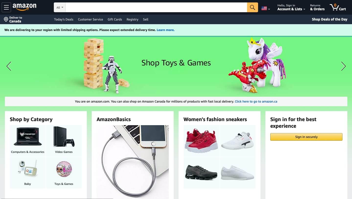
If you have a large product range or most visitors have a clear sense of what they need when they come to you, the website search is the first thing you need to configure. Make sure the search bar is visible, otherwise it makes absolutely no sense.
Bookstore customers are often looking for a particular book or interested in a particular author or genre. Amazon designed the search bar in a way that it’s impossible not to notice. Very convenient, don’t you think so?
Work on the search functionality
Though it’s important, not all websites appreciate the capabilities of search engines. Make sure to configure:
- product search by name or its article in the catalog;
- product search with typos and auto corrections;
- showing similar products if nothing is found by a particular query;
- product search with symbols and abbreviations.
Auto completion
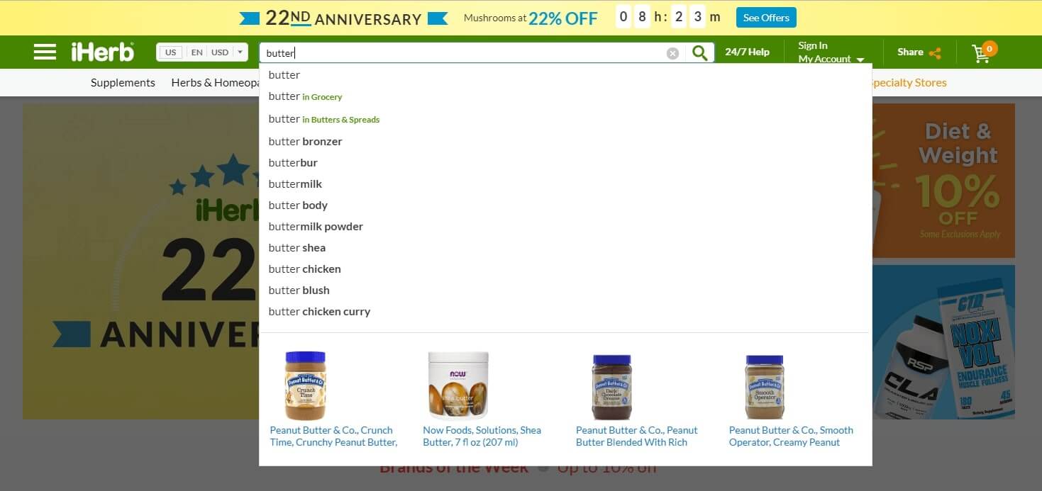
Make search faster and easier with auto completion. It works like this: a user starts typing a word and a dropdown list with the matching products appears. It’s great if you can display not only the name but also the image on the list. Here’s how it’s done in the organic cosmetics online store iHerb: first, popular products are displayed by a given query, and then similar products with pictures.
Category search
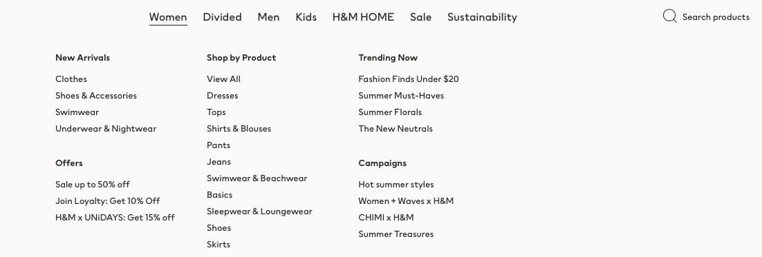
This feature is particularly relevant for online clothing and footwear stores. A user can specify through a special interface what kind of thing they are looking for, their size, the desired material, and color. This option significantly shortens their journey to placing an order. Take a look at how H&M did this.
7. Collect user-generated content
Make sure you collect customer feedback and convert it into content for your website and your social media.
The beauty gadgets online store Vanity Planet publishes Instagram photos on the description page of each product that users post with the hashtag #VPBeauty.
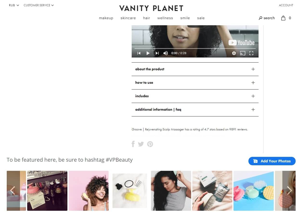
The marketing agency Yotpo analyzed this trick and found that it increased the conversion rate of the store by 24%. Impressive, huh?
Turns out, users participate in content generation, feel involved, and trust brands more. Well, there’s always some vanity: one wants to buy a dress to be beautifully photographed in it and brag to a large audience.
Read also:
👉 Live Chat Best Practices: 20 Hacks to Make Customer Service Better
👉7 Best Live Chat for eCommerce: Boost Conversion on your Website
👉 Top 5 live chat mobile app: find the best fit for your business
👉 Live Chat: How Online Chat Tool Can Help Your Business
👉 20 Best Live Chat Software for your website chat service
👉 Acquisition funnel marketing: Grow customer conversions at each step of user journey
👉 The top 15 inbound marketing tools: harness digital power and elevate your business
👉 10 best website personalization tools to deliver top-notch visitors experience
👉 7 best email capture tools: features and pricing compared for 2024
8. Don’t insist on signing in
Don’t make users login only to visit the catalog or add products to cart. Only ask for their details at the checkout stage. The trick is simple: the faster a user can place an order, the more often they will buy from you. If you want your user to sign up, offer it to them after they place an order. For example, promise to send order updates to the specified email.
9. Make gifts and give discounts
Have you ever considered promo codes and coupons as a way to quickly boost profits? In fact, they greatly influence the conversion rate. Be careful: the main thing here is to plan the budget so that you can afford to give discounts.
The method is especially effective in anticipation of holidays when users are looking for gifts for their loved ones. Offer discounts, gifts, organize lotteries.
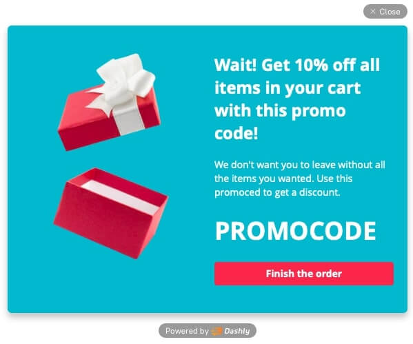
Make compliments to users as they have a great influence on loyalty and it, in turn, impact the conversion rate.
In addition to occasional special offers, create a promo section on your website and remember to keep it up to date. Customers will look for bargains no matter what they want to buy. The “Sale” section will always catch their attention.
It works just like this. A user enters a website, scrolls through the main section, and sees the section with discounted products. They go there, fall in love with something, admire the discount, calculate their potential savings, and add the coveted goods to the cart. After that, they stay on the website so they’ll probably check out and buy something else. Eventually, everyone is happy: a user made a purchase, and you have increased the conversion rate.
10. Offer free delivery
According to a study conducted in 2016 by Walker Sands, 88% of customers consider free delivery the most important reason to buy. This factor has a great impact on user loyalty, so thanks to the increase in conversion rate, you will gain more than you probably lose delivering orders at your cost. Basically, you can do a little trick and include shipping in the price of goods.
11. Create a sense of urgency
One way to convince a customer to buy from you is to show them the urgency and exclusivity of the offer. Make sure you use this trick correctly.
You’ve probably seen online stores that are full of “Buy Now” or “Hurry up” calls-to-action. Ok, the urgency is obvious. The problem is that there’s no reason why a user needs this product or service right now. In other words, a loud call-to-action is not enough. There are several ways to “give the creeps” gently and convincingly.
The product stock is running out
Show how popular your product is. The fact that it’s quickly sold out will make the user interested. However, be careful: if you sell a product that is bought in bulk, this method may not work.
Usually, it looks like this:
19 people booked rooms in this hotel today! Only 1 room left!
Only 5 left in stock. Hurry up!
Specify delivery terms
This small trick works just right. The point is that a potential customer wants to know when they can get an order even when they only choose products. If you have a quick delivery service and orders can be delivered the same day, don’t hesitate to say it loud! This is your great advantage and it greatly increases the conversion rate.
You can specify that if a customer places an order before 1 PM, they will get it delivered the same day. The number of morning orders will skyrocket, you’ll see for yourself!
12. Run flash sales
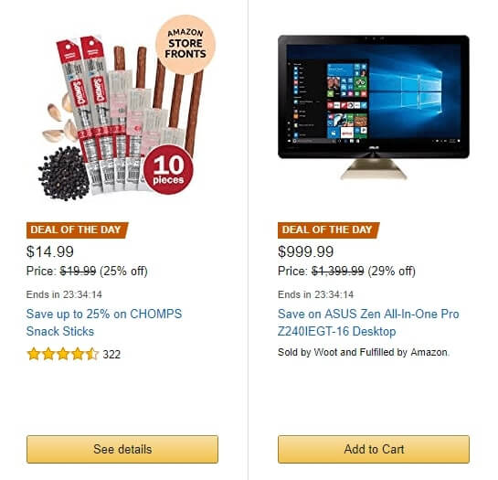
Offer a great discount for a couple of hours. Make sure to inform users about the sale on your website and start the countdown when it begins. Let users see how much time they have left and how many people bought from you on sale.
You can always find such offers on Amazon. Here’s how they look:
13. Arrange customer support
The key advantage of offline stores over online is that customers can communicate with shop assistants live, ask questions, and get immediate answers. You need to organize sales and support so that the customer doesn’t feel the difference to increase the conversion rate.
Work on your contact page
Be sure to specify several communication channels on the contact page: phone, email, social media. Plus, add a contact section on the FAQ page, the refund policy page, and on your forum if available.
One-click calls
Add a button to your mobile website that will automatically call you.
Live chat
A live chat allows users to get immediate answers without leaving a product page. Econsultancy Marketing Agency has concluded that customers using live chats are the most loyal ones. The trick is simple: a user gets answers to their questions while staying on the website. When the conversation is finished, you win their favor and they are highly likely to make a purchase.
Dashly live chat collects user data that you can bring together and analyze. Besides, you can merge all communication channels not to mix up conversations. Try it, it’s very convenient!
14. Optimize images
Since consumers cannot see your products live, special attention must be paid to their images.
Above all, these should be high-quality photos that show your product at different angles. Make sure the image resolution allows users to zoom in the images.
In the online store of gaming equipment SteelSeries you can not only look at photos of headsets but also rotate the 3D model.
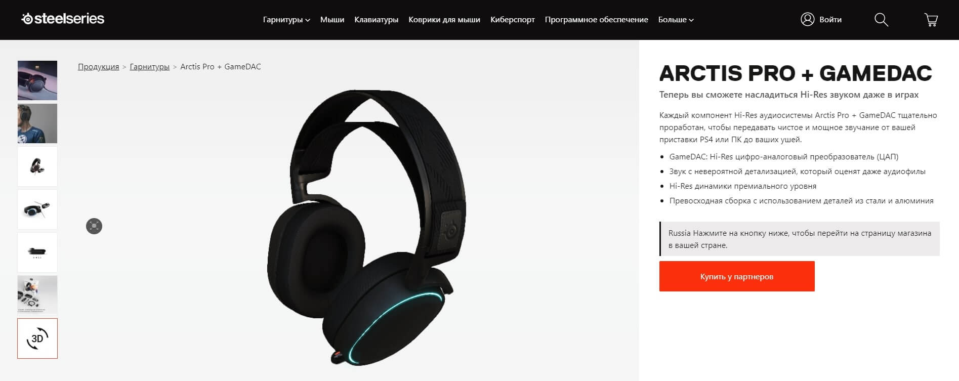
High-quality images have a significant impact on the willingness to buy. It would be perfect if you added a video about the product: it would increase the willingness to buy by 97%.
15. Run pop-ups
There’s a stereotype that pop-ups are annoying and useless. No way! The global study by SumoMe based on the analysis of 2 billion pop-ups showed that the conversion rate of effective pop-ups is about 9.3%, some of them reaching 50%, and the average conversion rate is 3%. Pop-ups work if properly configured and show useful content to a user. For example, the online fruit bar store Kutoa has increased its conversion rate to purchase by 147% via the competent use of pop-ups that offered a 20% discount.
At Dashly, we configure pop-ups for various purposes: lead generation, collecting reviews, and, of course, converting users to purchases. And we made it even easier thanks to our pop-up builder!
16. Share your success stories
Don’t hesitate to brag about your awards, publish reviews of satisfied users and customer stories. This is especially important for young companies that have not yet made their names. According to a BrightLocal study, 84% of customers trust feedback on the website as much as they trust recommendations from their friends. Of course, this has a huge impact on the conversion rate: studies have shown that, on average, on websites with over 50 reviews, conversion rates are 4.6% higher.
If you haven’t collected any feedback from your customers yet, start now. Here are some tips:
- eliminate doubts about purchased feedback, tell users how you collect feedback, show customer photos, and names;
- offer users to vote for a review and specify if it is useful;
- allow users to attach photos and videos to reviews;
- enable Q&A where users ask each other questions;
- as soon as you gather enough reviews, place them at the top of the product page as this will help get users interested and engaged.
17. Run a blog
Online stores often run a blog. The problem is that it is usually focused on selling something rather than publishing something interesting to a user.
Here are the signs of a good blog:
- it tells a user how they can solve their problems;
- it is entertaining and funny;
- it discloses company intrigues or shares important events.
This method works both on retaining existing customers and acquiring new ones and also increases the conversion rate well. The fact is that quality content is credible. People see value in it first, and then in your product.
Integrate your product into publications and share tips on how to use it unobtrusively (this is important). Make sure selling content only takes a tiny part of your posts. Your main goal is to solve the reader’s problem, not to sell a product.
Don’t forget to adjust your blog to search engine algorithms. This may not affect the conversion rate directly, but it helps generate leads. Besides, an SEO requires keeping website pages in order, and that makes your website clear for users.
18. Personalize
A study done by The Commerce Shop showed that 73% of users prefer personalized content in online stores, and 86% of them say personalization greatly influences their purchasing decisions.
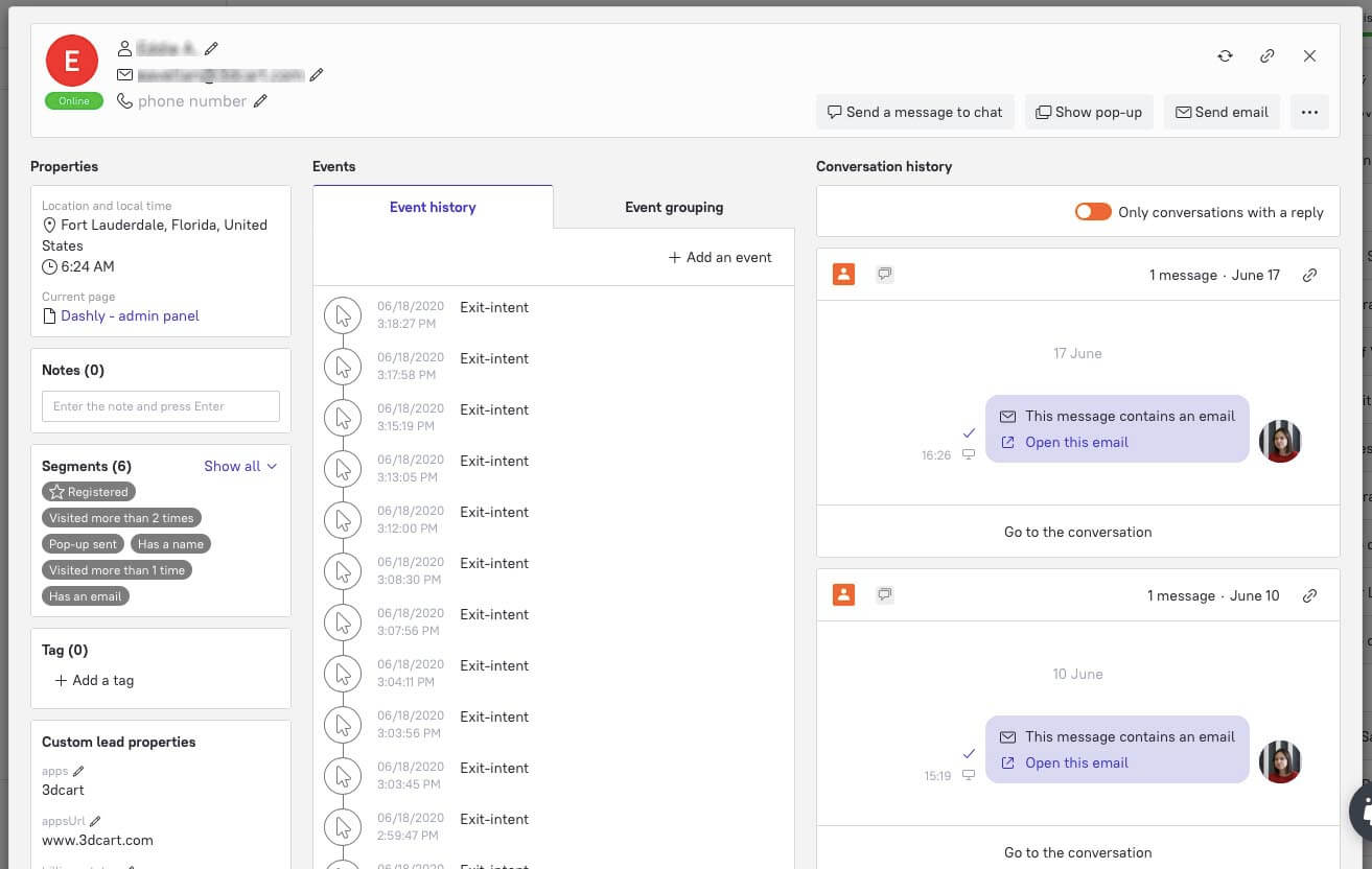
Analyze user behavior on your website, their purchasing history and catalog views as this may tell you a lot. If you learn to address each user separately, they will purchase more and get back to you in the future.
Don’t know how to do this? Here’s where user segmentation comes in handy. You need to clearly divide your audience into segments. Make a personal offer to each segment as your visitors will already be interested in your products.
Dashly has a very convenient segmentation tool. It compiles all information on a user and their activity from various sources. You can analyze it, distinguish segments, and configure acquisition channels for each of them.
19. Cross-sell and upsell
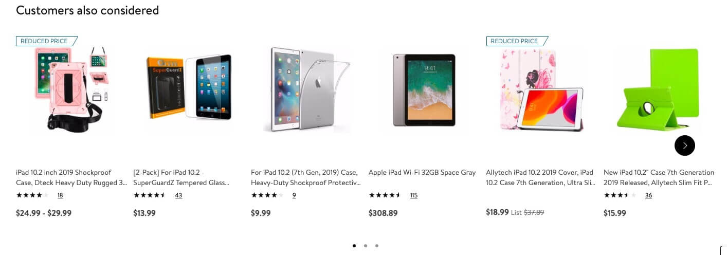
Some stores may earn more via upselling than acquiring and selling to new customers. The trick here is to increase the average order value; in case of upselling this increase happens thanks to selling a more expensive product or a larger quantity (buy 3 bottles and get the 4th for free), and thanks to selling related products in case of cross-selling. The most important thing is to remain unobtrusive.
For example, if you go to the description of the iPad on the Walmart website, you’ll be offered to see related products immediately after the product characteristics: headphones, a case, or a protection glass. This is an example of cross-selling.
20. Work on abandoned carts
Each time a user abandons their shopping cart, you lose money. Stores don’t always pay attention to this, unfortunately: 69.23% of shopping carts in online stores are abandoned.
An email campaign is a common way to return users. For example, we configured a triggered email campaign for Boxmarket24, an online clothing and shoe store. The results are impressive: 65% of people who received emails about their abandoned carts opened it, and 24% of them made orders.
21. Optimize your website for mobile devices
Like it or not, users buy from their gadgets more frequently. Mobile traffic currently takes exactly half of all traffic to online stores.
You need to make sure your mobile version is the same as the desktop one. Develop at least 4 website versions for different screens and operating systems. This is also a way to reach out to a larger audience and eventually increase sales.
22. Customize
If a user can adjust the product to themselves, they are likely to get interested and buy it. People love to express themselves, so let them do it in your online store! This is fun and helps users get attached to your products even before they purchase.
If you just provide an opportunity to choose the color of a T-shirt or a print on a bag, this is already considered customization, and this greatly influences the conversion rate.
23. Add the CTA button
The Call-To-Action button is one of the most important ones on a website. Your goal is to make as many visitors as possible click it. There are 3 main principles of the button design. Well, here they are:
- it should be bright and stand in stark contrast to the background;
- leave some room around it so that it meets the eye;
- use a clear call-to-action in the button text.

For example, this is a button on the slider banner on the Walmart website.
Again, user segmentation gives you a helping hand here: personalize calls to action and guide customers to different pages.
Cheat sheet
That was a whole lot of information, huh? Here’s a checklist for you not to get confused. If you put some of these tricks into action (or all of them, which is better), you’ll definitely see your conversion rate grow.
Let’s cut it to the chase.
- Work on your traffic quality.
- Personalize descriptions.
- Optimize your checkout.
- Ensure security.
- Work on website navigation.
- Make the website search convenient.
- Collect user-generated content.
- Don’t insist on signing in.
- Make gifts and give discounts.
- Offer free delivery.
- Create a sense of urgency.
- Run flash sales.
- Arrange customer support.
- Optimize images.
- Run pop-ups.
- Share your success stories.
- Run a blog.
- Personalize.
- Cross-sell and upsell.
- Work on abandoned carts.
- Optimize your website for mobile devices.
- Customize.
- Add the CTA button.
Now that you’re armed with arcane knowledge, it’s time to take action!
May your conversion rates be high as the sky?


