How to Pay Off Your Investments Into Traffic and Reduce Abandoned Carts

Have you ever spoiled the marketing budget on traffic that didn’t turn into sales but into cart abandonment? What emotions did you experience? Denial? Aggression? Bargaining? Depression?
Anyway, I bet you don’t want this to happen to you again.
To resolve this issue and convert more visitors to buyers, you need not just drive the traffic on your website, but work with it.
How?
The aim of this article is to help you find out this answer.
The problem
Meet Abigail. She is a marketer in an online shop and sells cosmetics. And she’s very familiar with the problem of shopping cart abandonment. Abigail spent $500 on traffic and got just 7 purchases while having AOV $39. Also, she had about 70 cart abandonments.
Shopping cart abandonment costs $18 billion a year for the entire ecommerce industry. According to statistics, this is a very common problem — users leave about 70% of all the created carts.
Let’s see what we can do in this case.
How to reduce cart abandonment rate
Definitely, you can’t eliminate this problem completely — about 40% of users add items to the cart without any intention to buy. But you still can lower the number of shopping cart abandonments.
1. Catching-up pop-ups
This is the mechanic that every marketer will advise you to try if you have a lot of abandoned shopping carts. And this makes sense — if you want users to stay and buy from you, catch them before they close the browser tab.
For example, you may offer some promo-code or discount that the user will get if they finish their order:
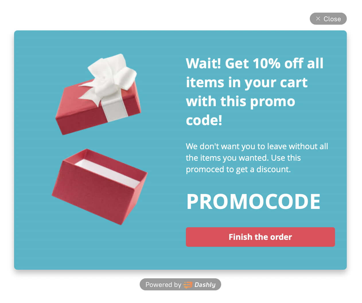
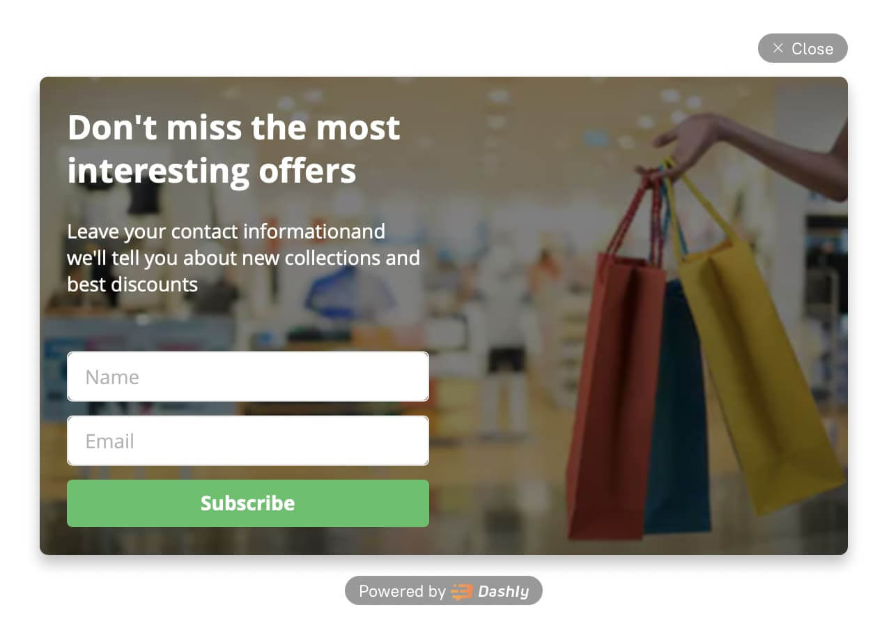
Or suggest users leave their email in exchange for the best offers in your shop. This way, you’ll get their contact and increase the chance to buy while reducing the chance of cart abandonment.
In case the user left their email, they are already interested in your goods — your goal is to make the desire from this interest, and lead the user to the action — to buy from you:
2. Email them
Almost 50% of users open shopping cart abandonment emails. This means there is a chance to bring them back. Why shouldn’t you try this method then?
When you already have the email address, it’s time to establish relationships with leads, and prove your value to them. Try not to spam with daily newsletters — nobody loves this, and most likely they will unsubscribe from you soon.
Create a sequence of 3+ emails. If you send only one email, the user may miss this, but the chance that they’ll open the second or the third email. Don’t forget about the timeout between the emails — this should be at least 2 days.
In these emails, you may not only remind users about the items they left in the shopping cart, but suggest some complementary goods that they may also like, or other blocks that may engage users. For example, this may be a help with diagnosing their problem, or some article related to your goods topic.
Add different email topics to make the newsletter sequence more interesting and engaging. Don’t limit your imagination.
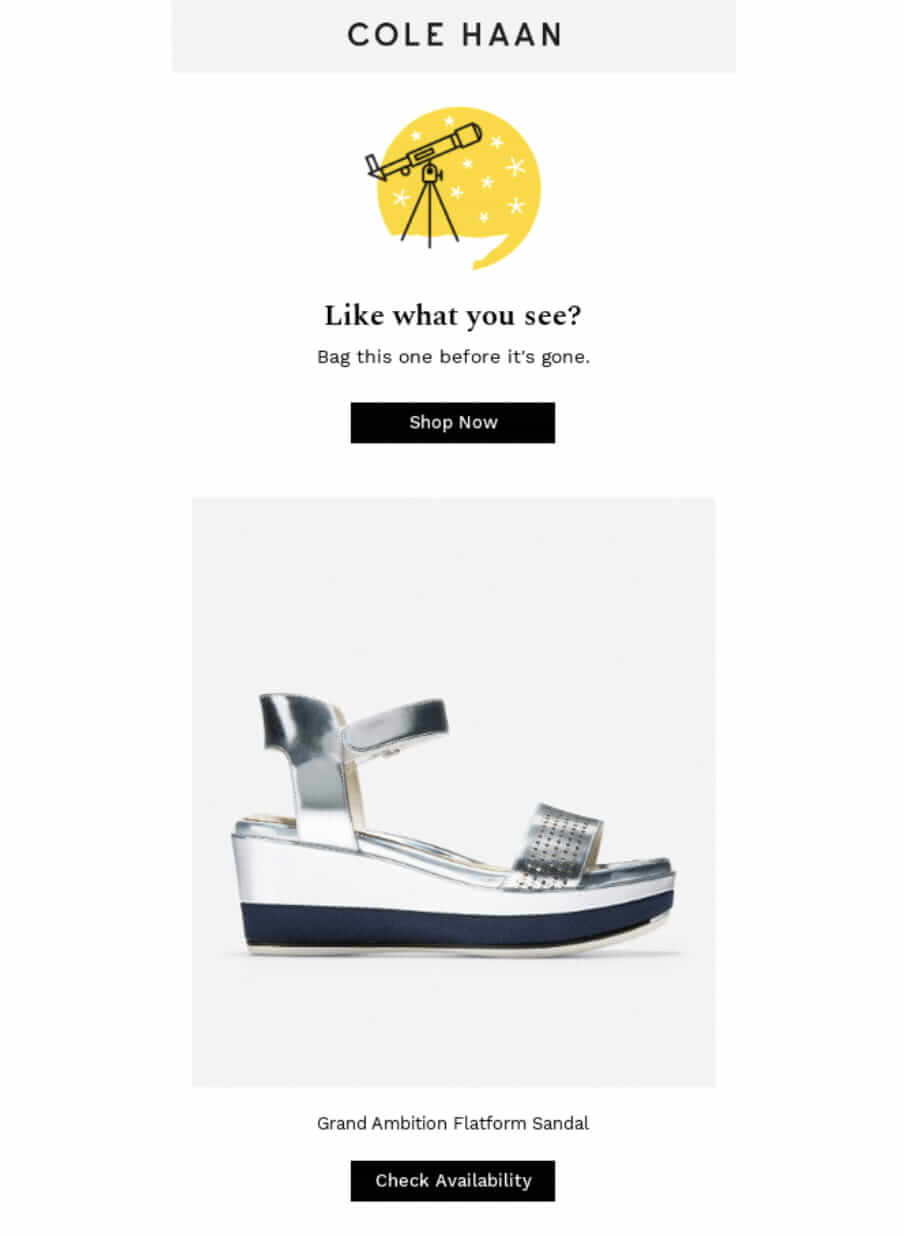
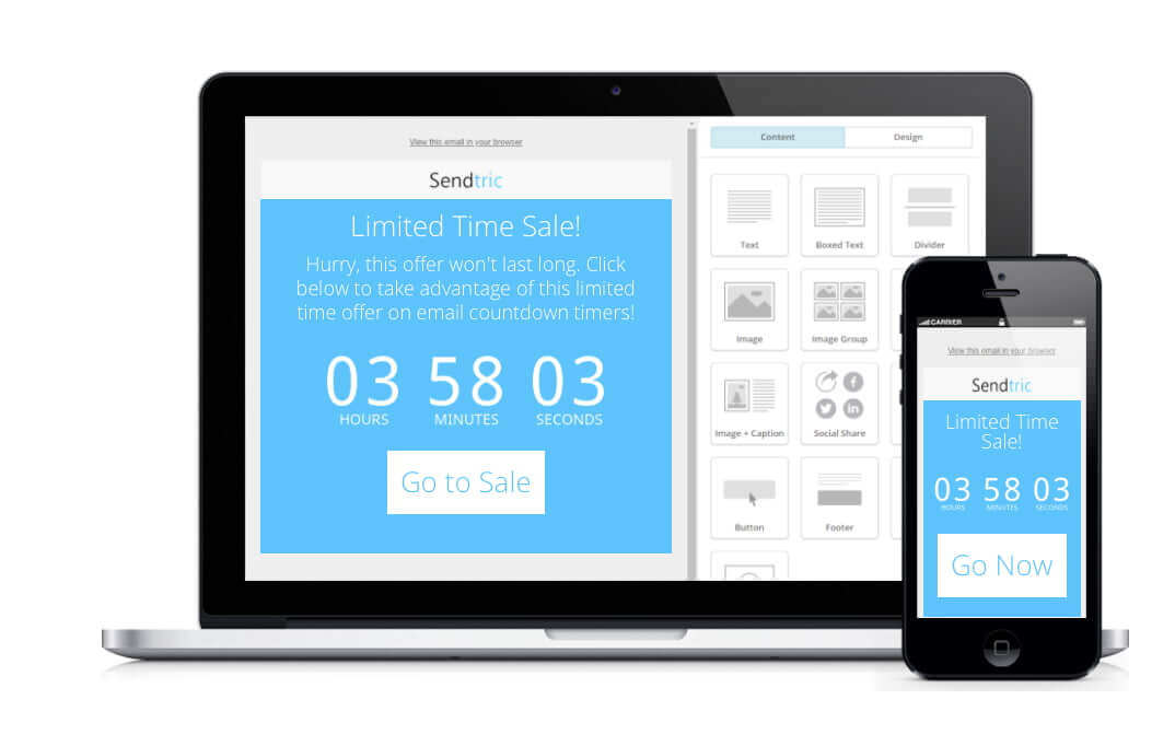
Dashly tip: To add urgency to these emails, you may use a countdown timer to your emails using this platform. For example, offer a 10% discount for those who buy within 2 days after receiving the email.
P.S.: Before sending another email about a cart abandonment, don’t forget to check if the user already bought these goods. Add user events that will track whether a particular person bought items from the abandoned cart email.
In case they’ve already made a purchase, don’t send them the email about their abandoned shopping cart — this will be very irritating to them.
3. Motivate them with bonuses
This is very common advice, but still worth trying. Here are main ways to convince visitors to buy from you:
- Discount with an urgency effect
In case a user is not pretty sure whether they’re ready to buy or not, they often add items to the shopping cart and forget about them. Offer a discount for those who proceed with an order within 30 minutes (or 10 minutes — this depends on your business). This will make them take a decision faster and not forget about the order.
For example, one of our clients made such a pop-up with the countdown timer that gives you a promo code that works only 30 minutes:
For example, one of our clients made such a pop-up with the countdown timer that gives you a promo code that works only 30 minutes:
Write to us if you want to try this!
- Provide some unexpected gift
In the case of Abigail’s cosmetics shop, this could be a mask or samples. This way, customers will be more loyal to you and more likely to buy.
Pop-up windows are powerful. But they aren’t a ‘silver bullet’ to turn your customers’ shopping cart into a purchase and avoid abandonment. There may be other things that spoil the conversion rate to purchase.
Secret UX-tips to decrease the number of shopping carts abandonment from Dashly experts
Let’s go back to Abigail. In her case, there were a lot of UX mistakes on her website. We decided to help her and collect several pieces of advice to make the website more convenient for users in general. See additional tips to reduce shopping cart abandonment:
1. Don’t force to create an account or improve the checkout process (=don’t force filling long forms without actual need)
Nobody loves when shops force them to fill out a lot of forms just to make a small purchase. In the best scenario, you will cause negative emotions associated with making a purchase in your shop; in the worst case, a shopping cart abandonment and a customer who probably won’t go back.
It’s absolutely OK to collect some data from your users — in the future, you will be able to use this to offer relevant goods and help them make a decision.
To make a compromise, collect only essential data — email, name, and probably some specific info that is important for your business (e.g. date of birth, place of residence, and so on — but only if it really makes sense!). This is especially important if you’re taking recurring payments for subscriptions, ensuring that customers can quickly get set up and won’t be put off by unnecessarily long-winded processes.
By the way, checkout optimization increases the CR to purchase by almost 40%. Just keep it in mind when making your customers fill out another form before purchase.
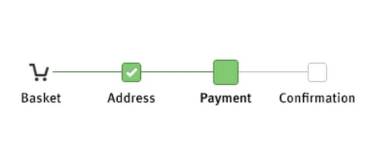
2. Include progress bar on checkout page
This will help users understand how many steps they need to proceed to finally make a purchase. This is a kind of gamification — make a quest of order placement.
For instance, Abigail could use this progress bar in her online shop:
3. Offer free shipping
Imagine the situation. You’ve collected all the items in your cart, estimated the cost of your purchase, but on the checkout stage you found out that you’ll have to pay an additional $20 for delivery. Will you still need these goods this much?
To better work with customer expectations and avoid negative associations with making a purchase from you, including all the shipping costs into the product’s price.
Free shipping is a small bonus that will give you a big advantage over competitors. If you have the ability to add this option — do it.
Read also:
Mastering Sales Funnel Reports to Optimize Conversions
Step-by-Step Guide: Building an Automated Sales Funnel That Works
4. Use popular payment methods
The more payment options users have — the more likely they will buy from you. Lack of payment methods is one of the popular causes of shopping cart abandonment. Implement such digital methods as PayPal, Apple Pay, and Amazon Pay if you haven’t done this so far and compare the conversion rate to purchase before and after. You’ll be surprised.
5. Improve navigation
This is also a very popular tip — to make more users buy from you, make it easier to find what they came for.
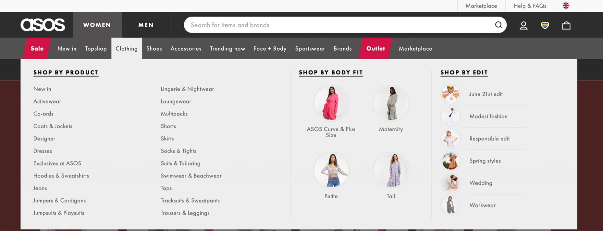
To my mind, one of the most convenient websites is Asos.
There is a drop-down menu on clothing categories where you can easily find everything you need. What’s more, pictures add more convenience.
When you have already decided on the product you want to buy, there is all the information in the item card, including shipping info, promo codes, and returns.
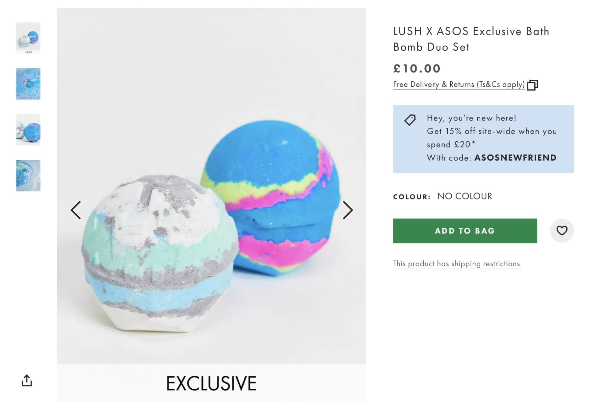
And finally, there is simple checkout and several payment methods:
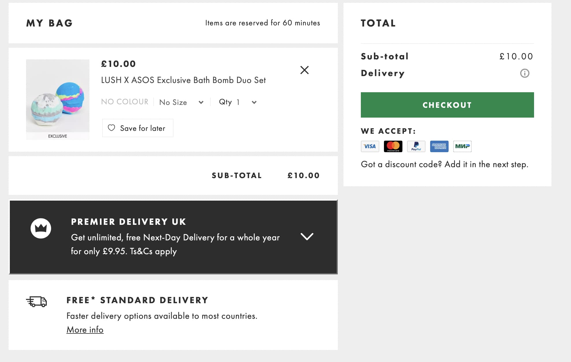
Simplicity is the key. The simpler everything seems to the user, the more often they will return to you.
6. Optimize page load speed
When we checked Abigail’s website, we had to wait about 10 seconds until this was loaded. 57% of users leave if they wait for the page to load longer than 3 seconds — and you lose your customers. Page load speed is important:
“2 seconds is the threshold for e-commerce website acceptability. At Google, we aim for under a half second.”
Maile Ohye, Google.
To optimize the load speed, try to compress images, reduce code massives on the website, and reduce redirects.
There may be different tips — check your website on Google checker and fix everything that might slow down your page load speed.
7. Offer fast customer support
And the last piece of advice — be friendly to your customers and offer customer support. No matter how ideal your website UX is — users will always face problems at every stage of interaction with your product, whether it is a problem with finding needed goods or tracking problems. Provide this and help them: customers always appreciate this experience and pay by their loyalty.
Customers expect companies to reply in live chat for 1 hour or less. Give them this to reduce shopping cart abandonment. Add Dashly live chat to your website and help users fastly.
The secret of high website traffic conversion is simple. Love your customers: make everything for them, and they will stay with you ❤️
Read also:
- Acquisition funnel marketing: Grow customer conversions at each step of user journey
- Top 13 follow up email software to elevate your email marketing strategy
- 10 best predictive lead scoring software to boost your sales funnel

