To use or not to use? 8 Client Onboarding Trends And Their Adoption in SaaS
It was 10 PM when I saw the “what if we remove the mandatory code installation step from onboarding” message from our Product Marketer in a team chat. And she wasn’t alone. Each of us was a bit excited after the series of client onboarding ideas brainstorming.
We enjoyed reviewing the most popular customer onboarding trends and their adoption by different B2B SaaS products during the last month. The big job was done. So why not share its results with you guys!
In this article, we’ve collected the best examples of how SaaS companies adopt in their products sign-up flows, welcome screens, personalization, checklists, videos, email sequences, and other onboarding trends.
See how competitors are doing customer onboarding to test tried-and-true ideas in your product!
But first, special for newcomers and Google, let’s recall what user onboarding is.
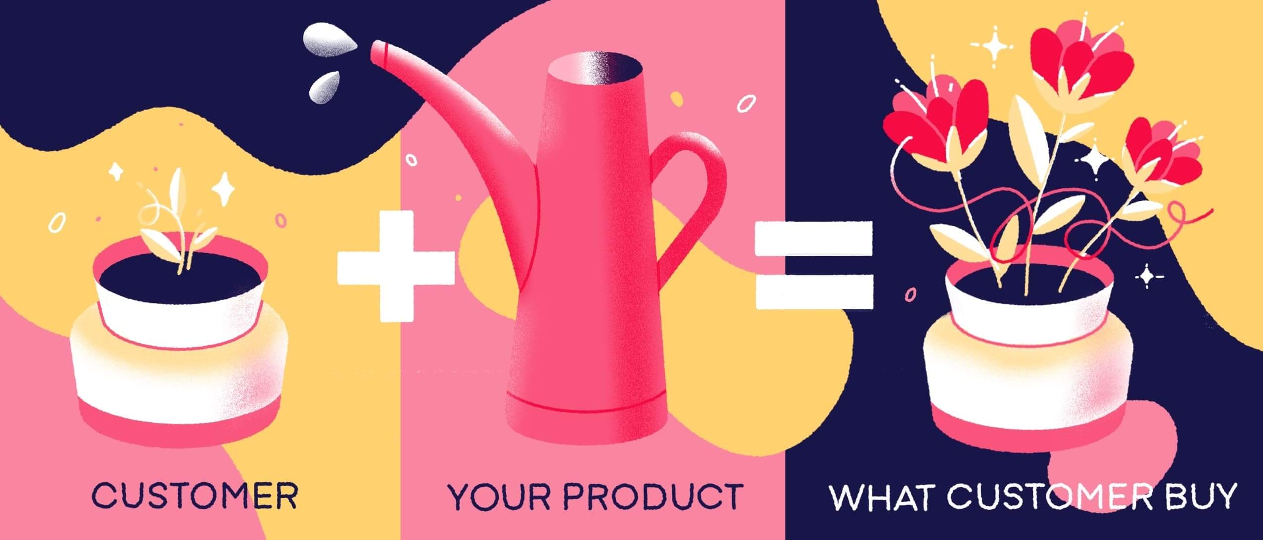
Client onboarding is a set of activities aimed to welcome new users and help them to grasp the product value. After registration or purchase, with the help of welcome screens, product tours, in-app videos, email nurturing campaigns, etc., a company demonstrates to users how to use product features and functions.
How has changed client onboarding of B2B SaaS products in 2022?
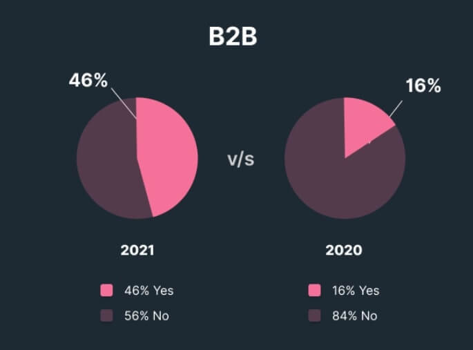
First is the number of SaaS companies that use onboarding tools. And it isn’t a guess, but an actual stats:
The number of companies that help clients master their products increased by 12% compared to the previous year.
Userpilot research
This research was the thing that inspired me to write this article. I’ve summed it up into the shortlist of customer onboarding trends in 2022.
- No friction-based sign-up. It is about the endless screens, sign-up fields before actually seeing the product. If in 2020, 37% of SaaS companies found this a barrier to using a product, today, 74% refused using this onboarding element.
The easier you make it for your customers to do something, the more they will do it. Eliminating friction breaks down the barriers preventing your customers from doing what you want them to do, especially if they’d like to do as well.
Think back to Zappos. The main reason why they succeeded is that they eliminated the friction involved in online shopping, allowing customers to try as many shoes as they want and then send back the ones that didn’t work for them. The result? Customers tried more shoes and kept a majority of them!
- 62% of B2B SaaS companies ask for email confirmation when a new client signs up.
- More than a name-based personalization in onboarding emails. 71% of SaaS companies went ahead and started tailoring onboarding according to clients’ job roles, use cases, industry.
For example, to point users to the features that fit them best, companies ask them about the goal. It helps to show only the product parts they need instead of everything.
Personalization is receiving the email to push me towards going to an event. However, as a first-timer and a stranger, I might feel a little lost and confused about what to do. If someone or I got an email telling me to check out certain kiosks, I’d have more motivation to stay.
That’s what hyper-personalization is. It goes beyond personalization and uses real-time data to communicate information that’s relevant to the customer contextually.
To make hyper-personalization work, you have to follow a data-driven approach. Every click your customer makes, Every post they scroll past- these are all valuable pieces of data that can help you create an experience tailored to your customer.
- But be careful when asking for that personal information. 3-4 sign-up fields during the client onboarding are considered to be ok. Adding more turns this process into an interrogation.
- In-app onboarding videos get back on the horse. Userpilot stats prove this.
How many B2B SaaS companies use in-app videos during client onboarding?
- Using templates instead of empty states. Not to leave customers on their own with a blank canvas, they replaced it with templates (predefined info showing the possible way to fill those empty states). 23% of SaaS companies are sure that it reduces time to value.
- Signing up to an app with third-party accounts like Facebook, LinkedIn, and Gmail became more popular. Despite quick access and better conversion potential, only 20% of companies use it.
- Client Self Serves outside an app is a crucial aspect of SaaS onboarding. 85% of companies invest in products academy: knowledge base, FAQ, help widget, support chatbot, help widget, etc.
Read also: 17 Zendesk alternative services and 13 live chat alternatives to try this year
Client onboarding trends we like but couldn’t keep on top
- Displaying the reaction to users completing the onboarding stage. The Dashly team loves that firework animation, flying unicorns, dancing GIF congratulations. It motivates users to continue using a product.
But this year, SaaS companies do not share our delight. Only 9% of B2B included a milestone celebration in their onboarding.
- Pointing out the most critical features with tooltips isn’t in favor as well. (29% use this element in 2021)
- Compared to 2020, this year, SaaS checklists as an onboarding method lost their fans also. The number of B2B companies using it decreased from 56% to 36%.
- 78% of companies don’t use product tours during new clients’ onboarding. Whether it is a lack of resources because of the need to involve developers or just a mistake, we will see further in the best companies’ onboarding analysis part.
What experts say about this onboarding trend:
Product tours are a great way to very quickly establish credibility after the purchase with a new customer. They’ve cut the check — now you need to prove to them, it’s worth it by getting them using the product as quickly and seamlessly as possible.
While there are no absolute right or wrong answers when it comes to onboarding, the key to a successful product tour is simplicity — both in terms of design and copy. Even if you have a complex product, strip it back to the essentials and give the user an option to discover more information if they need it.
Product Tours, in my opinion, aren’t terribly helpful. Typically they are presented when the user first logs in. Since the user is still trying to get familiar with all the buttons, panels, etc., product tours overwhelm information.
Effort can be better spent writing excellent documentation. The reality is the customer will hit a snag as they try to work (a few hours in), and they will go straight to Google. That’s where you can show them the best way to get something done.
For us, this info is quite surprising. But the theory can be different from the practices. So, let’s check if it is accurate and review how four B2B SaaS products onboard clients on a website and in-app.
Thank you! The playbook is already in your inbox
The Best Client Onboarding Practices #1: LeadGen App
About a company: LeadGen App is on a mission to maximize the number of high-quality leads from a website. Providing a form-builder, they help SME businesses, digital agencies, and marketers create conversion-optimized forms that get more responses in lead generation campaigns.
- Sign up flow
After clicking “Get Started” on the main page, you’ll see the sign-up low:
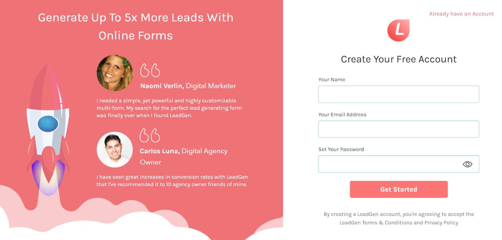
The sign-up page looks straightforward and minimalistic. Users’ feedback proves the fact that you’re on the right way. LeadGen App asks for your name, email address, and password. It matches the stats of the 3-4 sign-up fields we mentioned before.
After this, an in-app step of onboarding follows.
- The first product experience
What’s great about this part is that LeadGen App doesn’t just drop users onto the product. First, they show a welcome message, “Welcome to your new LeadGen account,” promising to help to create the first form.
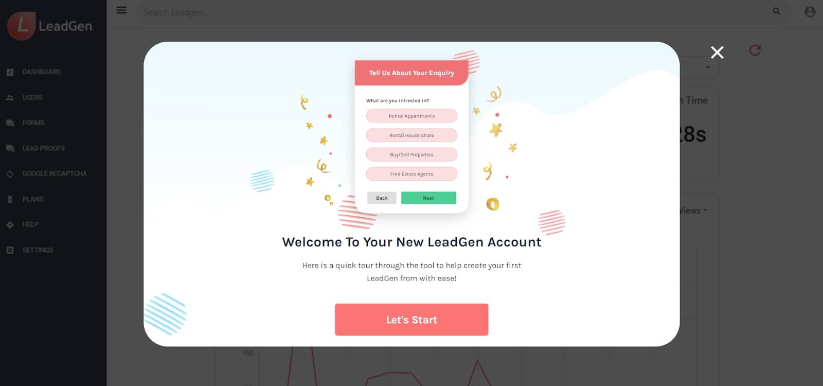
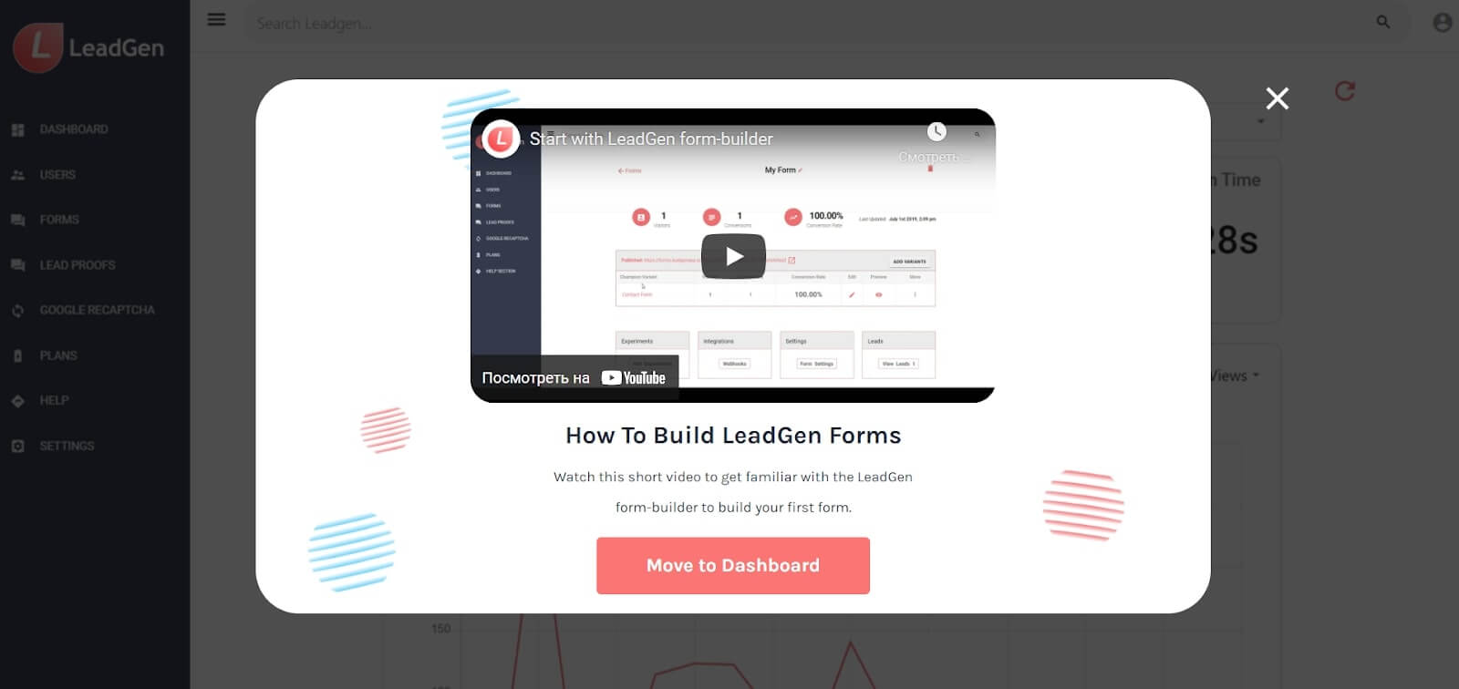
Then clients see a pop-up window offering to watch the video. The first one is step-by-step guidance on how to create a form. You also see how every part of a dashboard will look, like creating forms and collecting data.
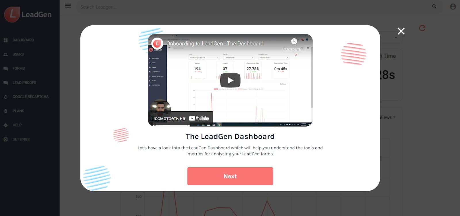
The second one is about a dashboard. Personally, I like this part because you see Christopher, one of the LeadGen founders, in addition to guidance. Such a video implies that the founder is personally involved in your success as a LeadGen app user.
After watching the video, you end up on the LeadGen App dashboard. The success pop-up message invites you to build the first form and also offers to join the LeadGenerators community or contrast support via email.
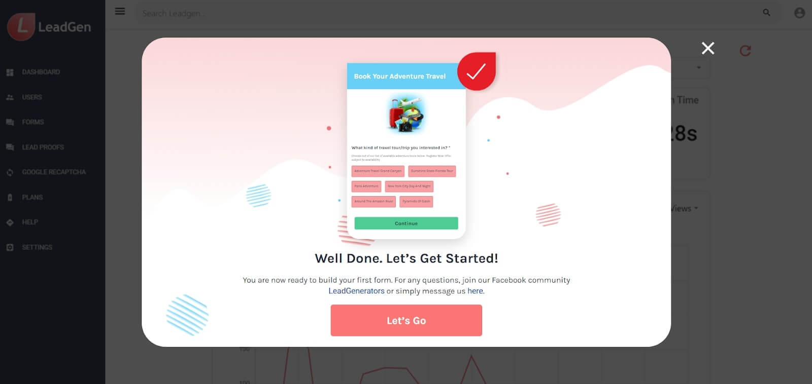
The “Let’s Go” button leads users to the dashboard. Since you haven’t any data collected by the form, it’s empty.
If users need more info on how to build a form, etc., in the relevant menu tab, they can contact the support agent, visit the knowledge base, Facebook group, YouTube, consult the LeadGen bot:
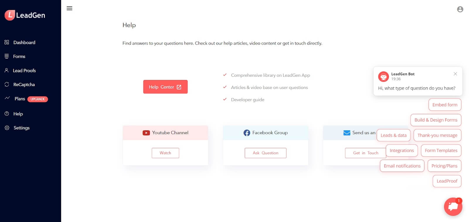
The last one helped LeadGen App to reach 2X reduce the support team workload, by the way.
How?
Read the case study: How LeadGen App grew sales by 30% and improved support with Dashly Leadbot
I got a chance to ask Christopher more about LeadGen App client onboarding during my chat with him:
Onboarding is one of the most critical parts of providing a great user experience in a SaaS tool. We want to provide the tools that make it very easy to take the proper steps within the first logging-in session.
Also, it’s important to us to give the confidence to our new users that we’re available and that anyone is welcome to reach out for questions. The ideal onboarding is based on straight-to-the-point information on how to get value from the app and personalized support quickly.
Time to check if this SaaS company follows the customer onboarding trends:
| Frictionless Sign-up | — |
| Email Confirmation | + |
| Advanced Personalization | – |
| 3-4 Sign Up Fields | + |
| In-app Onboarding Videos | + |
| Using Templates Instead Of Empty States | – |
| Signing Up With Third-party Accounts | – |
| Client Self Serves | + |
| Milestone Celebration | + |
| Tooltips | – |
| Client Onboarding Checklists | – |
| Product tours | – |
The Best Customer Onboarding Practices #2: Grammarly
About the company: Grammarly is a personal writing assistant app. It checks word choice, grammar, spelling, and more through in-line suggestions.
- Sign-up flow
The very first page of Grammarly sign-up flow offers three ways to:
- Enter email and sign-up for the app.
- Use a third-party account to sign-up with one click.
- Log in if you’re already a client.
- Proceed without creating the account.
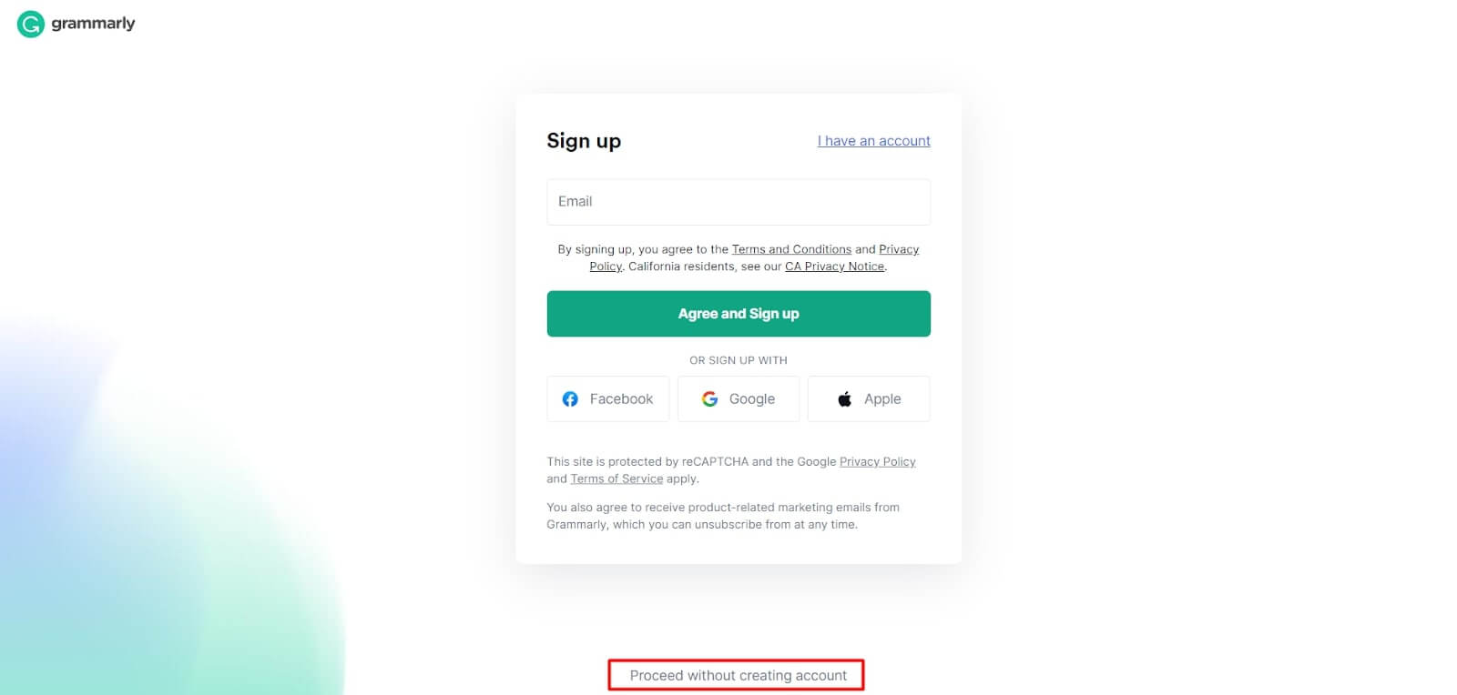
The opportunity to see how the app looks inside without login is fascinating.
It builds motivation.
But to try how the suggestion work in a doc, you have to sign in any way.
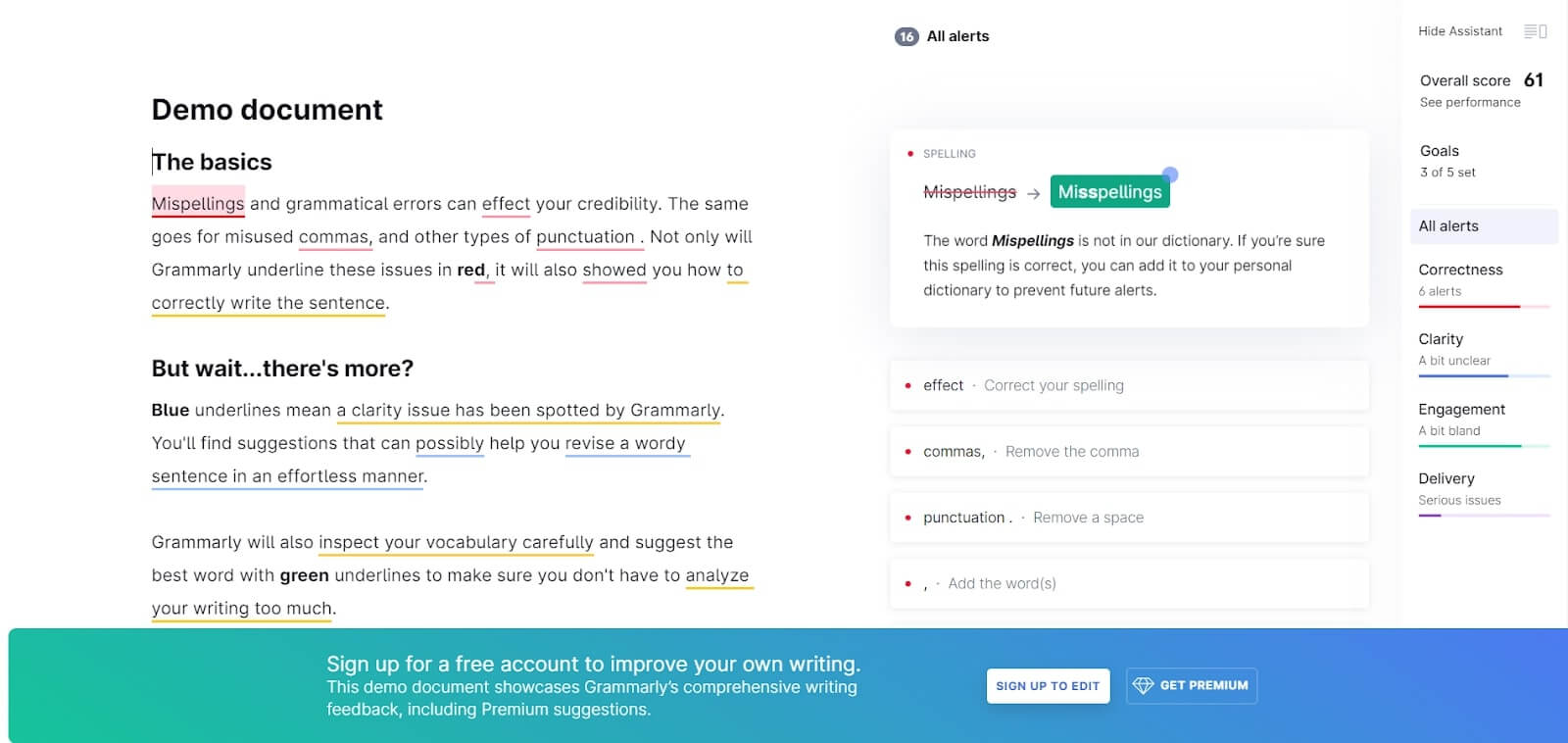
The “Sign up to edit” button leads you to a basic sign-up form with three fields (name, email, password) or Facebook/Google alternative.
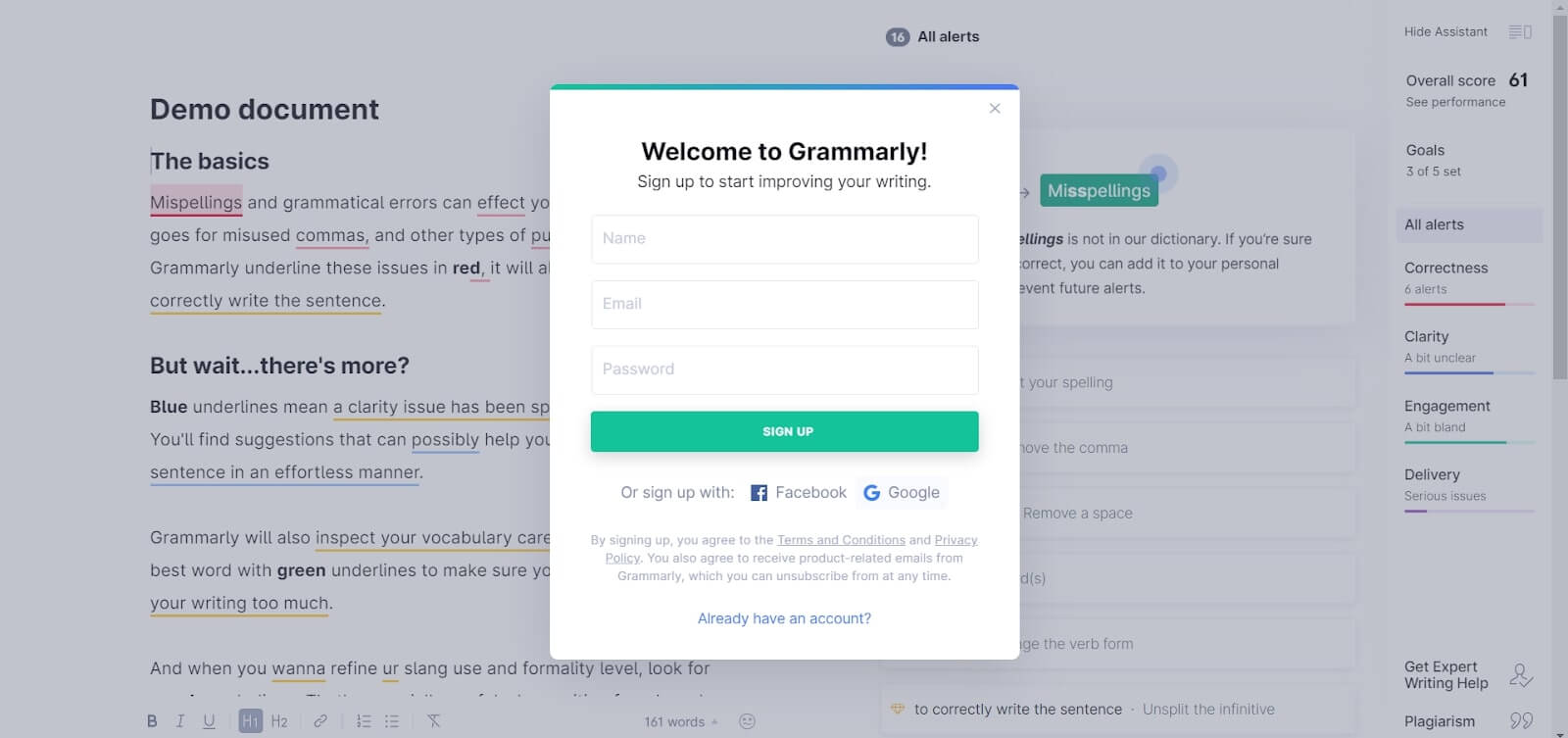
But first, you see a “Welcome to Grammarly” message. I love this simple element. Speaking about the sign-up methods, all of them lead you to account creation.
Read also: The secret weapon of your competitors or Why you should focus on customer service first
- Account set up
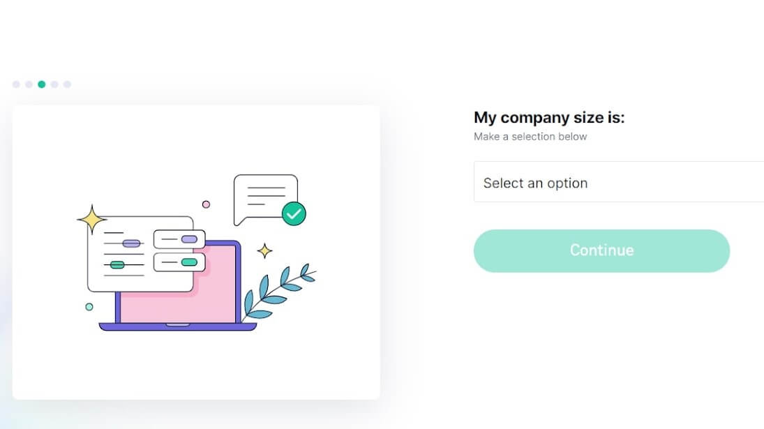
Grammarly asks users about the goal, their occupation, company size, and knowledge gaps. This info will help to set the app workflow according to a user’s personal needs. At the beginning of this client onboarding questionnaire, it would be good to mention the importance of this step and not skip it.
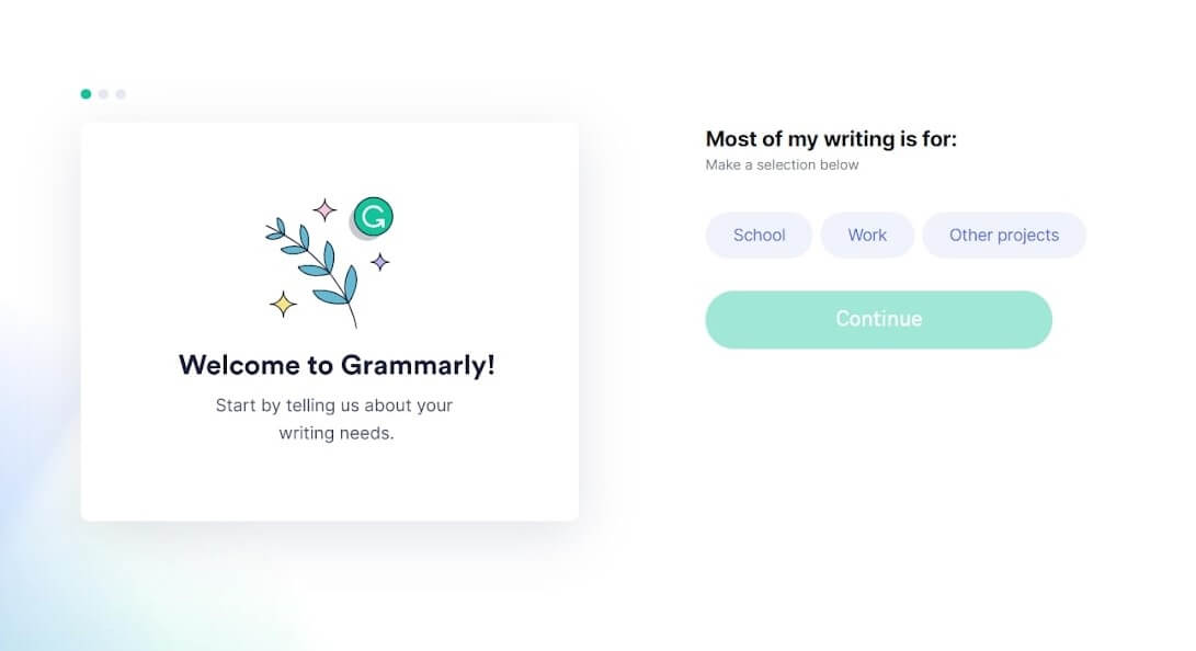
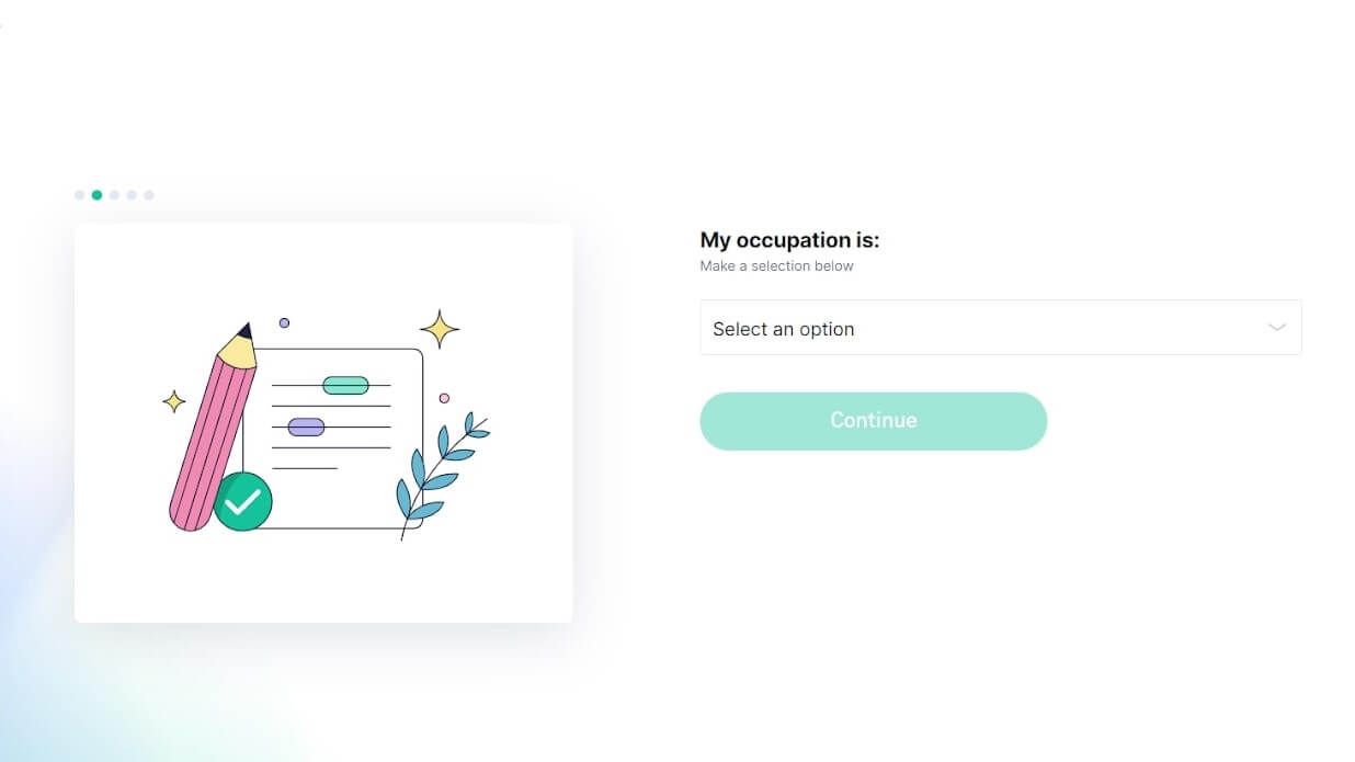
What’s good about this part is displaying the user’s steps to set up an account.
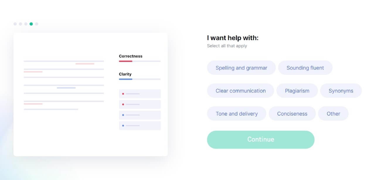
After this, you’re allowed to enter the sanctuary ─ Grammarly app dashboard.
- Product tour across the main features
Before Grammarly drops you into the product, they explain to you the main features work with a quick product tour (which you can skip, by the way).
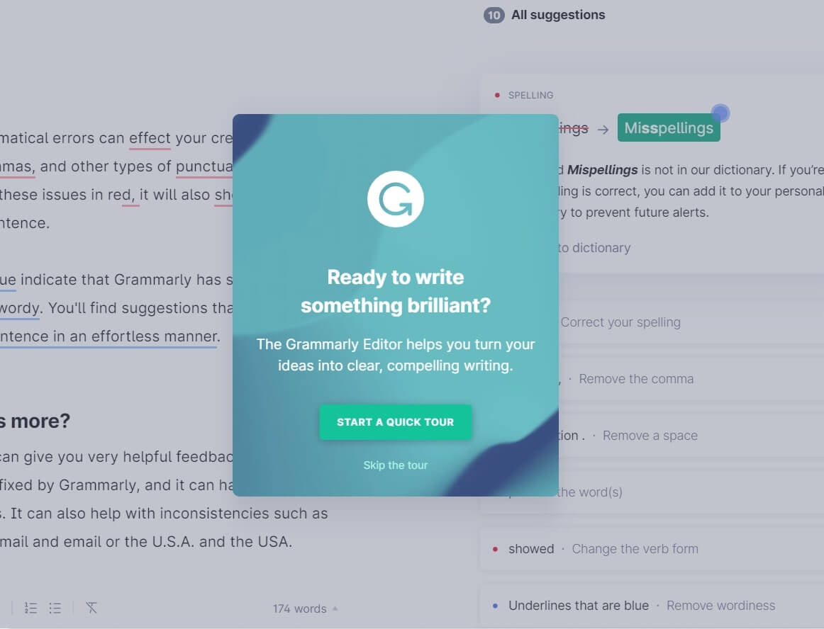
It consists of four steps, which you can track with the help of a progress bar. This is an excellent tactic to manage clients’ expectations.
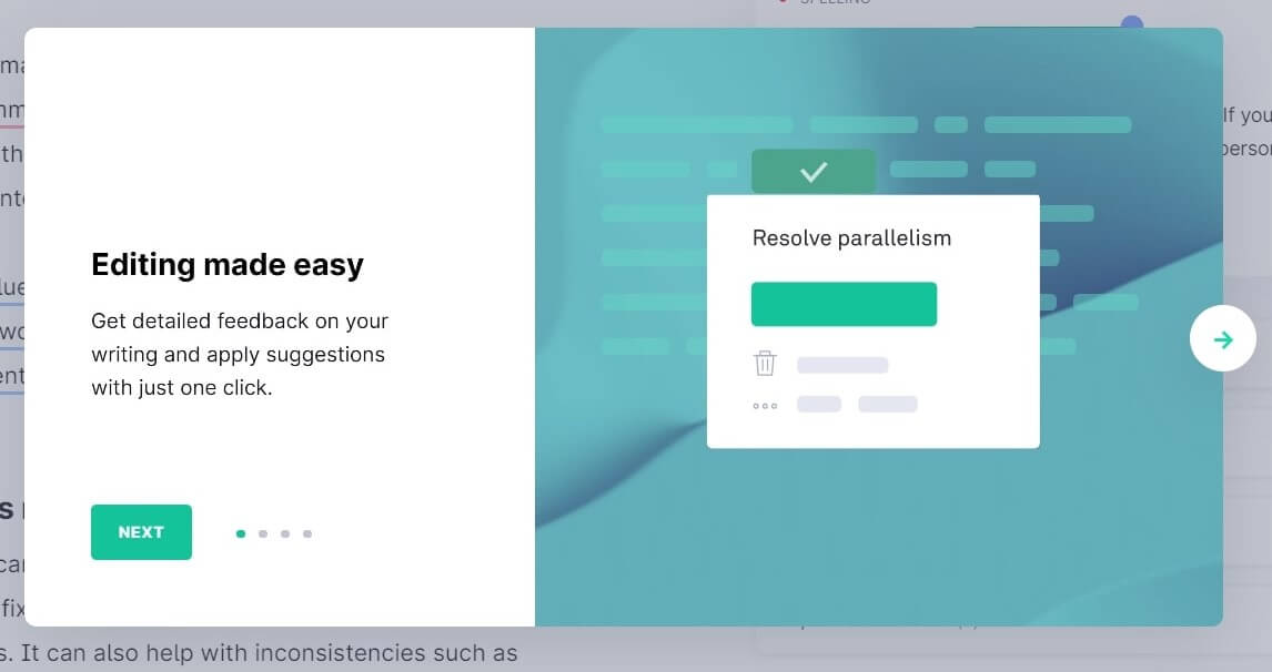
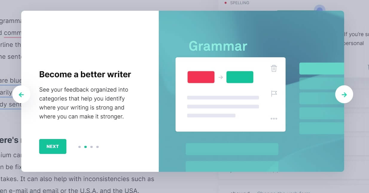
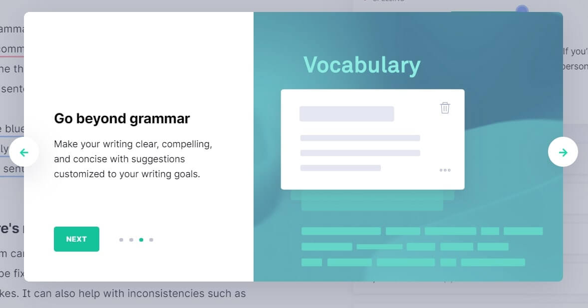
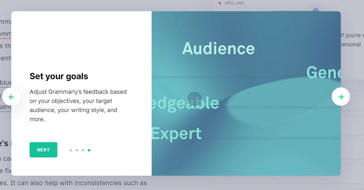
Short text with product illustrations is a great way to explain the value of your product in theory. But what is good about Grammarly client onboarding is that they prove this with the practical part. ?
- The first product experience
Grammarly doesn’t drop you in an empty state. They use a demo doc to demonstrate the grammar, style, vocabulary suggestions work in action.
The pulsing hotspots highlighting the following onboarding step guide a new user through the app dashboard:
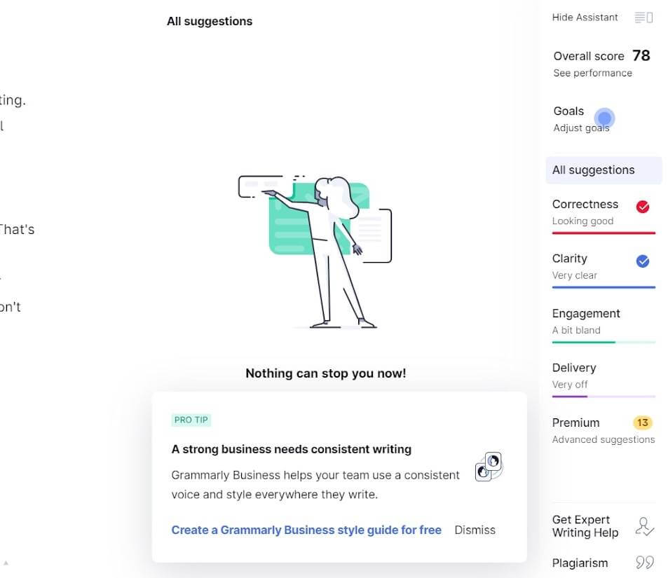
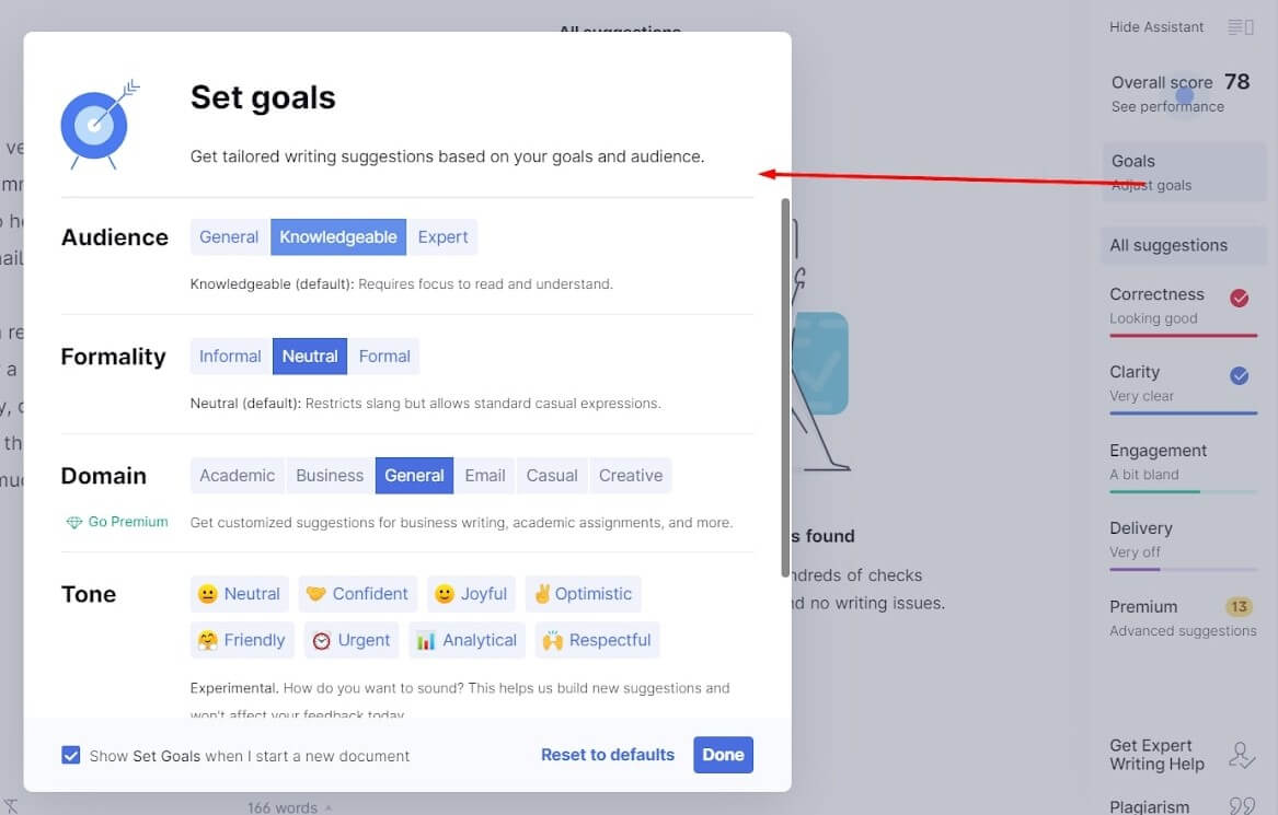
They are eye-catching enough but don’t obscure the interface.
When clicked, the hotspots reveal tooltips that give short explanations of the highlighted feature:
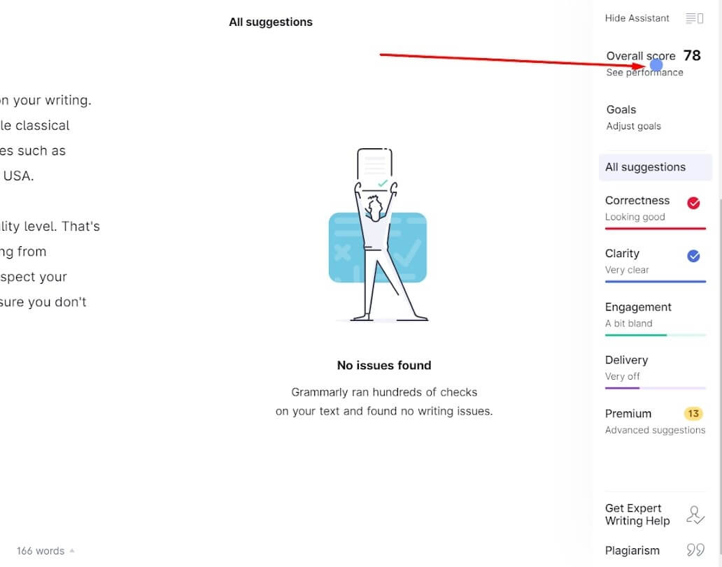
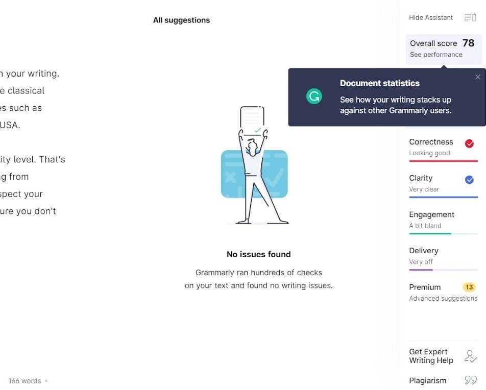
The unobtrusive style of how Grammarly teaches its clients makes its onboarding a good example to follow.
Let’s check if Grammarly client onboarding meets trends from the first part of this article:
| Frictionless Sign-up | — |
| Email Confirmation | – |
| Advanced Personalization | + |
| 3-4 Sign Up Fields | + |
| In-app Onboarding Videos | – |
| Using Templates Instead Of Empty States | + |
| Signing Up To An App With Third-party Accounts | + |
| Client Self Serves | + |
| Milestone Celebration | + |
| Tooltips | + |
| Client Onboarding Checklists | – |
| Product tours | + |
Read also: 15 best lead generation services to grow your base in 2023
The Best Customer Onboarding Practices #3: Mobile Monkey
About the company: Mobile Monkey (now customers.ai) is an all-in-one messaging platform for marketers and support via socials and SMS chatbots, live chat.
- The sign-up flow
Mobile Monkey sign-up flow starts with the account creation. A client can use a Facebook login or fill out six fields with a first and last name, email address, company, website, and password.
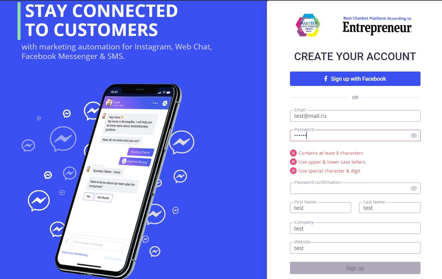
What’s interesting is that the password field has three requirements. These easy tips help a new user to create a safe password. And if something is wrong, the relevant information gets highlighted accordingly.
If you choose Facebook login, the following screen will ask your company name, email, and website anyway.
Read also: 10 conversion rate optimization tools to enhance your funnel and boost revenue
- Account set up
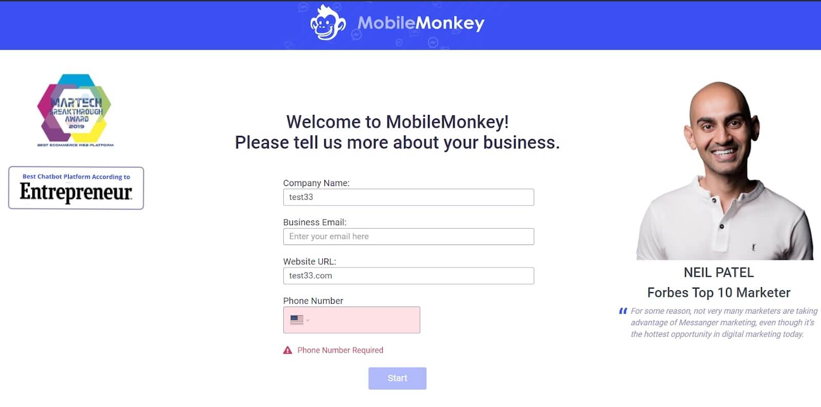
These sign-up screens include proof that this tool is cool: Best Chatbot Platform award by Entrepreneur and Neil Patel feedback. These elements increase clients’ confidence in their choice.
After that, a set of six qualification questions follow:
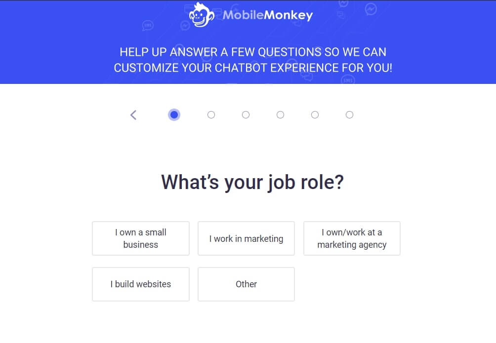
What’s good about this part is that Mobile Monkey provides the reason why they need this info. But as marketers, we know that it is a part of the lead qualification process, data from which they’ll use for marketing and sales.
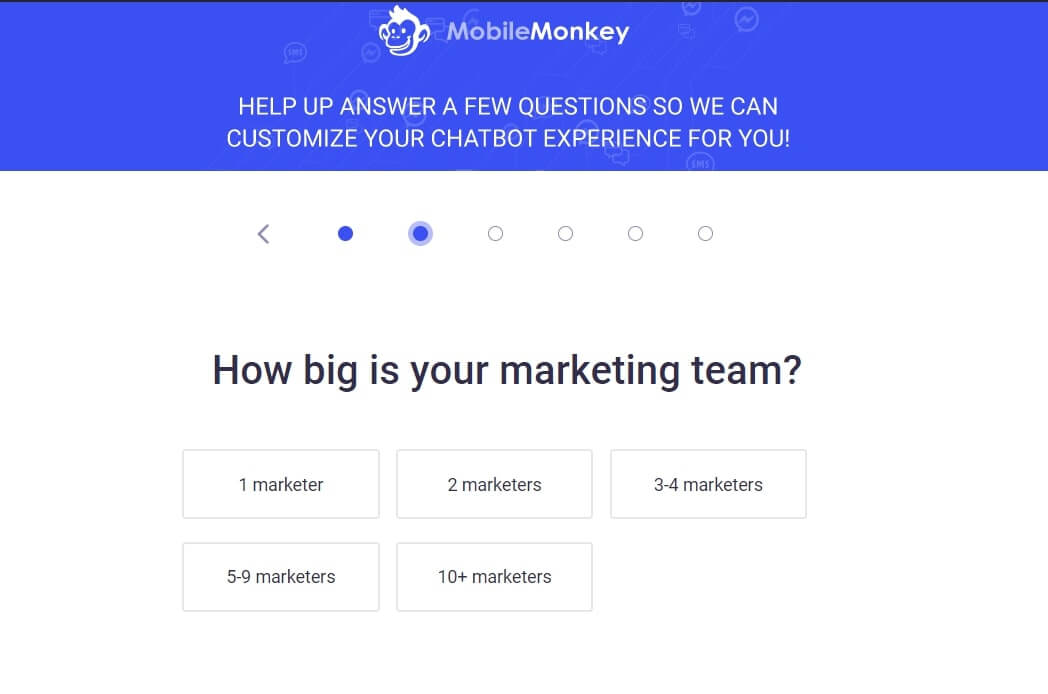
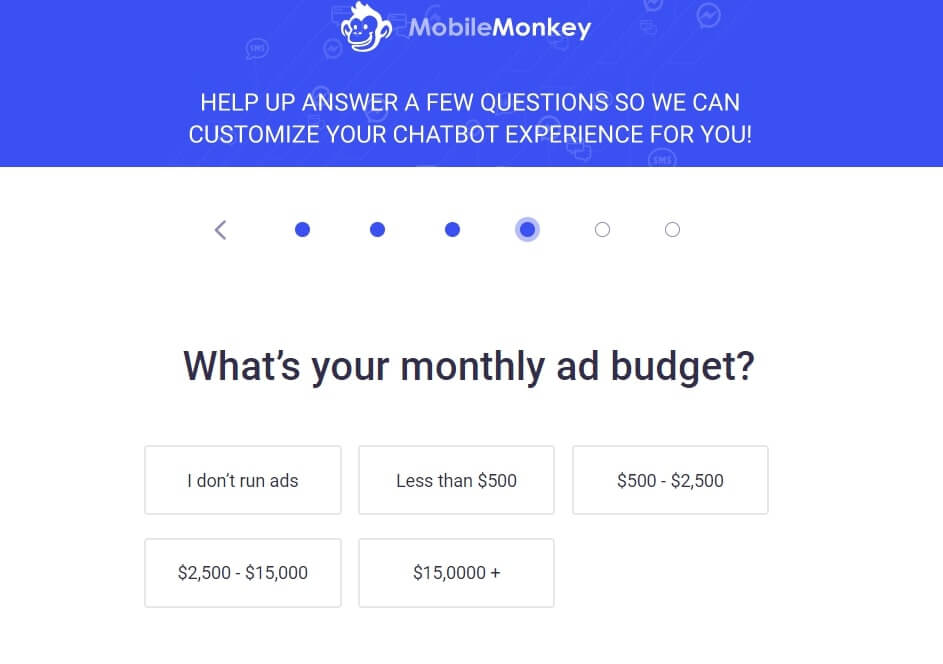
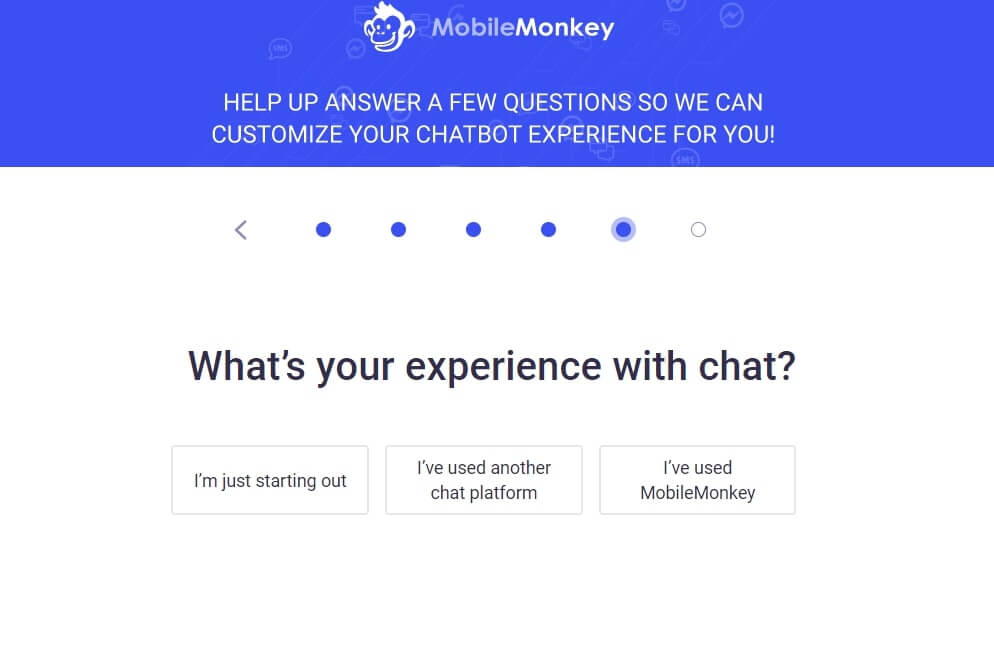
Thanks! Now check your email. We’ve send your copy there
The progress bar indicates how close you’re to finishing the onboarding process and motivates you to finish it.
The last screen provides one more explanation to the goal question ー “We’ll customize your chatbot for you based on your answer.”
It makes sense.
For example, you don’t have to look for the relevant template. The system will recommend it automatically as well as other tips to improve your customer experience.
- The first product experience
Again they don’t drop you into an empty state but offer to check how simple their navigation is.
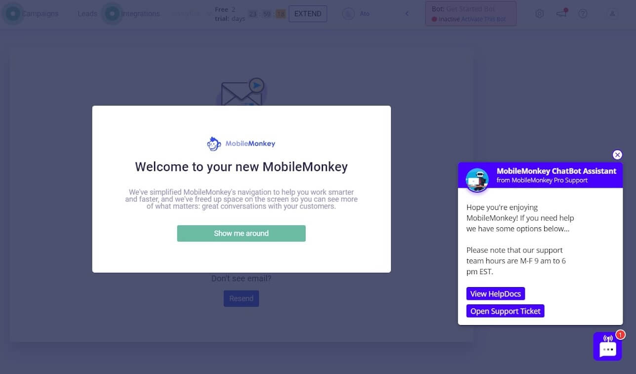
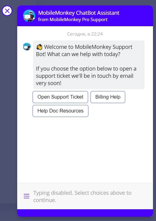
In addition to the welcome message, there is a chatbot widget offering to view help docs or send a support request.
Choosing the first one, you start a conversation with a chatbot for business which helps you find the needed info fast.
Read also: Customer engagement strategy template to create omnichannel campaigns
You can close it any time. The chatbot is always available in the right lower corner.
But let’s back to the “Show me around” button. It leads you to the four-step product tour explaining the menu bar sections.
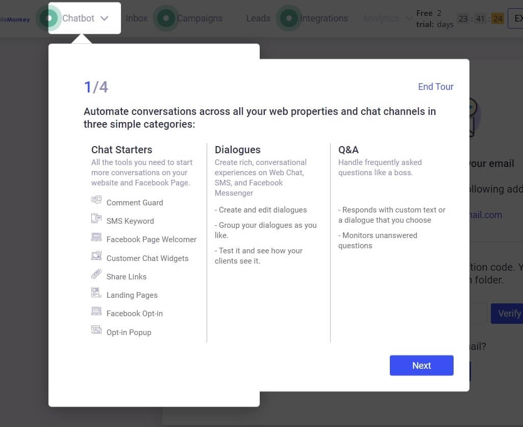
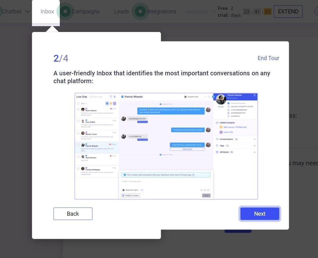
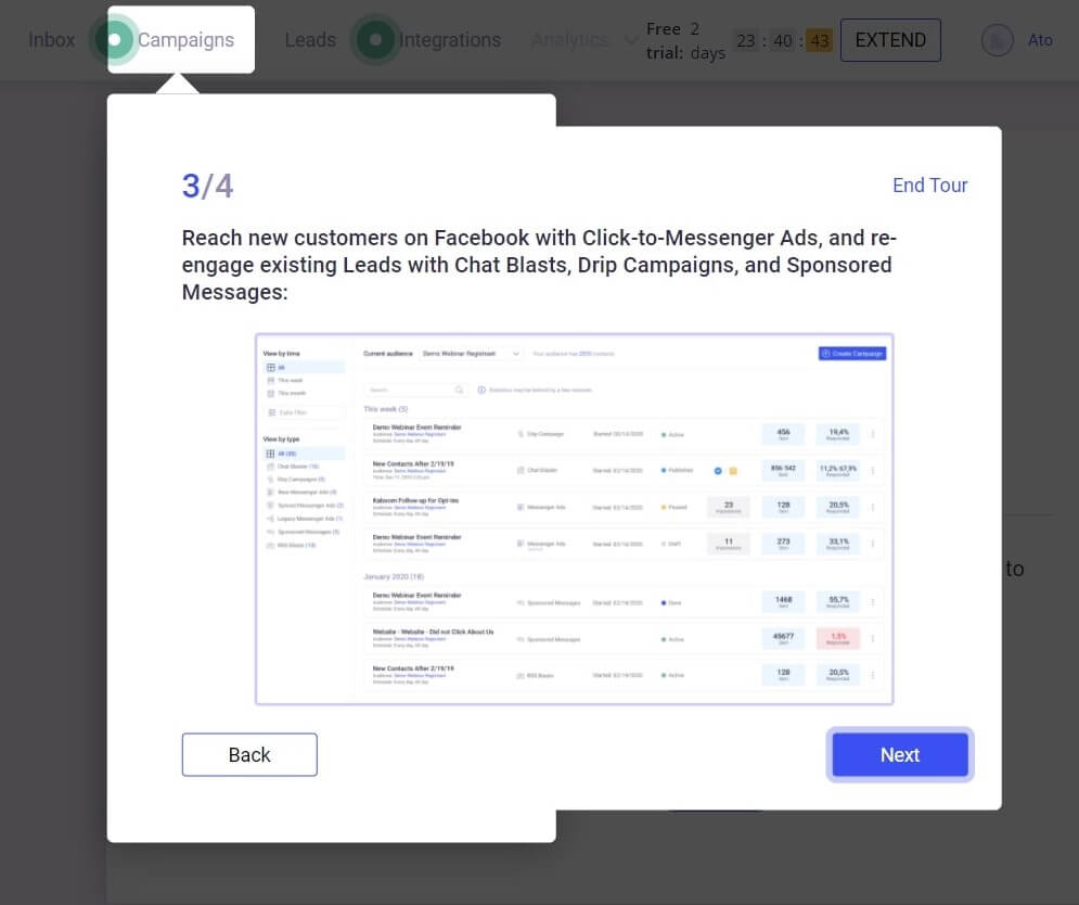
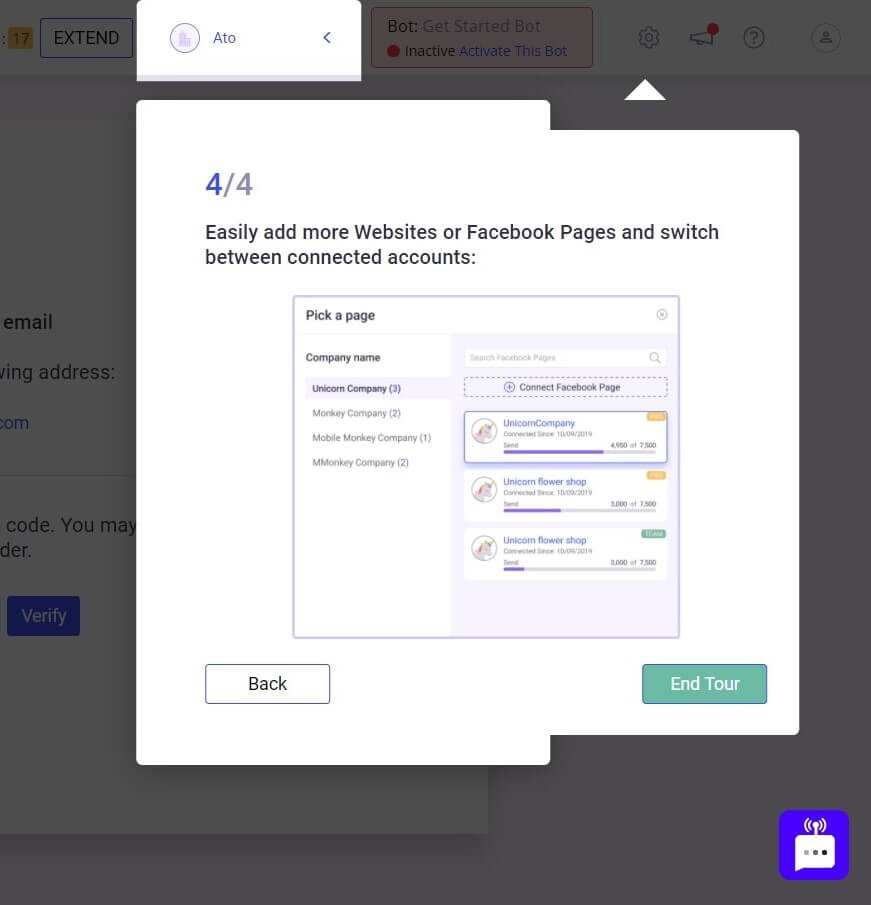
In the end, an upgrade offer window appears. The 50% off and a personal consultation is a pretty good offer for a hot lead.
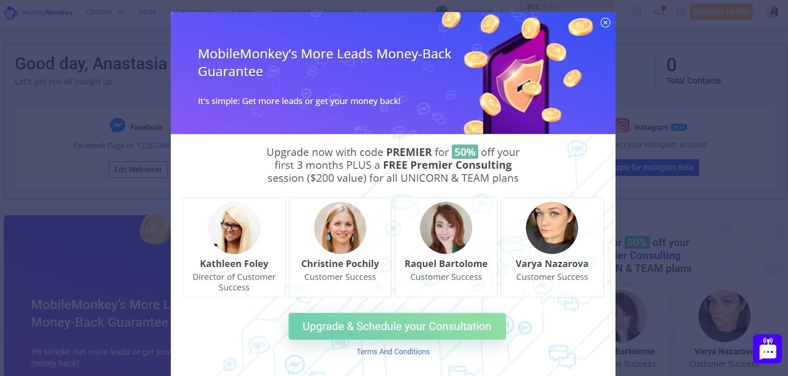
Skipping this step leads you to the email verification screen:
And then pulsing hotspots guide you to the next steps like connecting a Facebook account.
Mobile Monkey offers an excellent example of a short client onboarding. Its product tour isn’t overwhelmed with info and includes only four steps. Easy and helpful ― perfect for a new user to master the tool.
Let’s check if Mobile Monkey customer onboarding meets trends:
| Frictionless Sign-up | — |
| Email Confirmation | + |
| Advanced Personalization | + |
| 3-4 Sign Up Fields | – |
| In-app Onboarding Videos | – |
| Using Templates Instead Of Empty States | – |
| Signing Up To An App With Third-party Accounts | + |
| Client Self Serves | + |
| Milestone Celebration | – |
| Tooltips | + |
| Customer Onboarding Checklists | – |
| Product tours | + |
The Best Customer Onboarding Practices #4: Slack
About the company: As one of the most popular team messaging apps, Slack does a great job explaining to new users how to use the tool functionality.
1. The sign-up flow starts with emphasizing (in the title, subtitle, and a tooltip) the importance of the work email address to input in the only field this screen asks for.
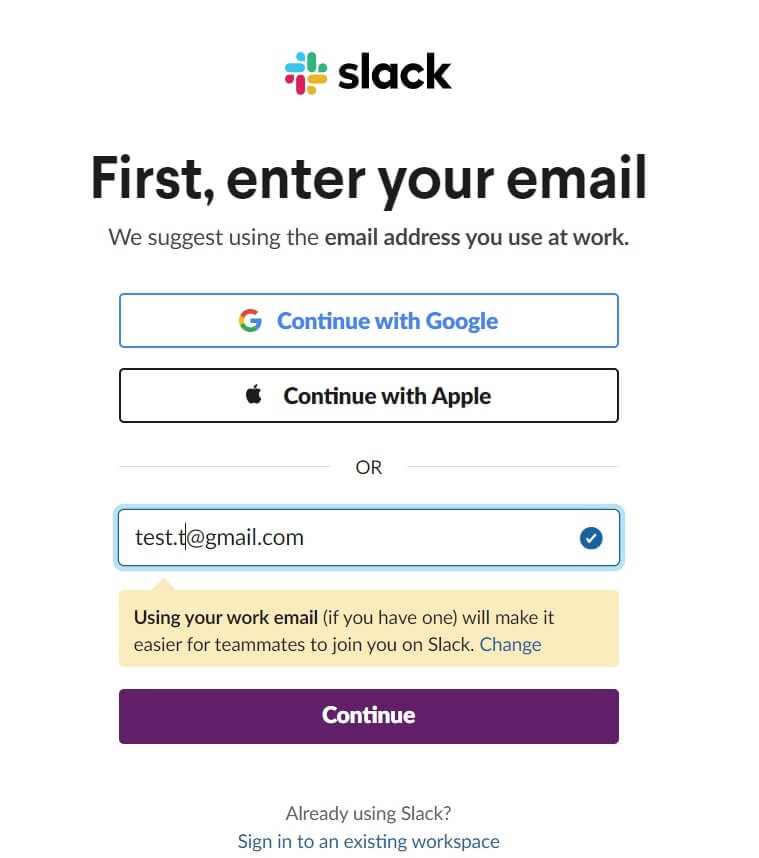
Of course, there is an alternative to email sign-up with a Google/Apple login. No matter what method you choose, it leads you to the email validation:
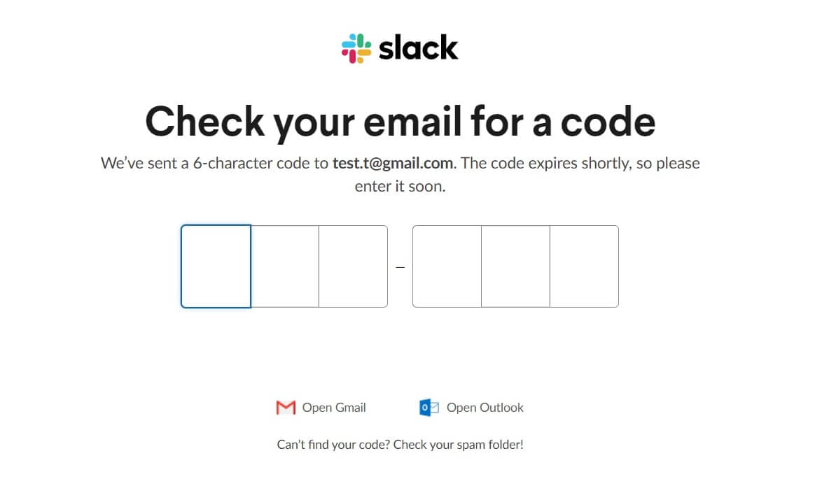
I like how Slack cares about the usability of this onboarding process, offering a direct link to the mail to save customers time opening the new tab.
2. The workspace creation first screen welcomes a new user and reveals tool advantages.
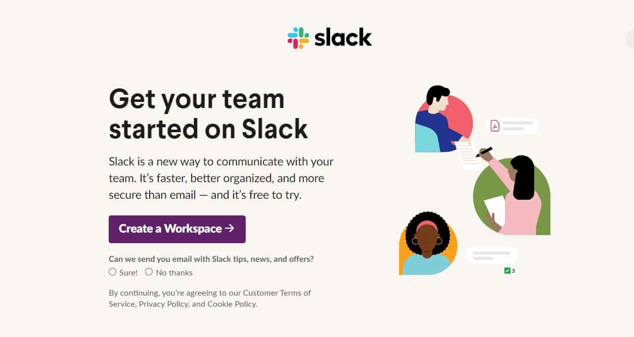
Slack designers did a great job highlighting the priority: the primary CTA is a bright button when an email subscription with a small font size has taken the back seat.
The next step leads you to a client onboarding questionnaire. Three steps are asking you to share:
- Company/team name
- List of tasks your team working on
- Colleagues’ email addresses
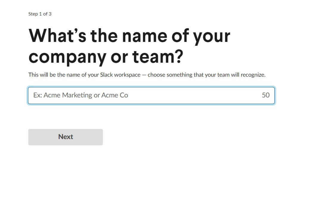
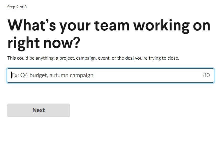
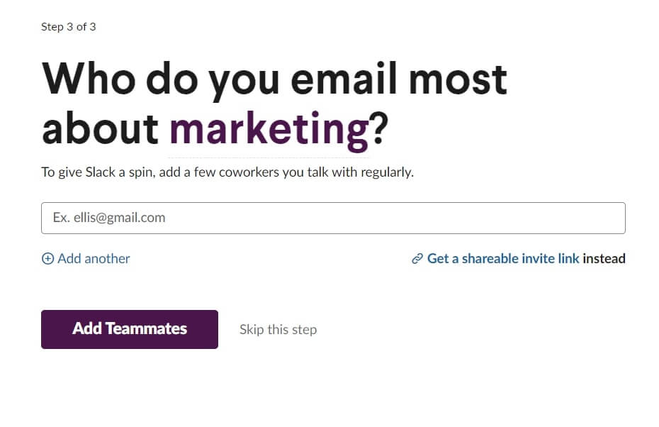
Each of the screens here contains an explanation of why clients have to provide this info. The answer they provide to the “What’s your team working on right now?” is used for the chat threads and channel titles.
Read also:
👉 Live Chat Best Practices: 20 Hacks to Make Customer Service Better
👉7 Best Live Chat for eCommerce: Boost Conversion on your Website
👉 Top 5 live chat mobile app: find the best fit for your business
👉 Live Chat: How Online Chat Tool Can Help Your Business
👉 20 Best Live Chat Software for your website chat service
3. The first product experience
With the help of a tooltip, Slack explains to a new user an app dashboard. Starting with channels, they display all the changes in the chat via statuses and messages. It’s a nice touch that makes the whole experience feel more personalized. Thus, a client discovers product features in action.
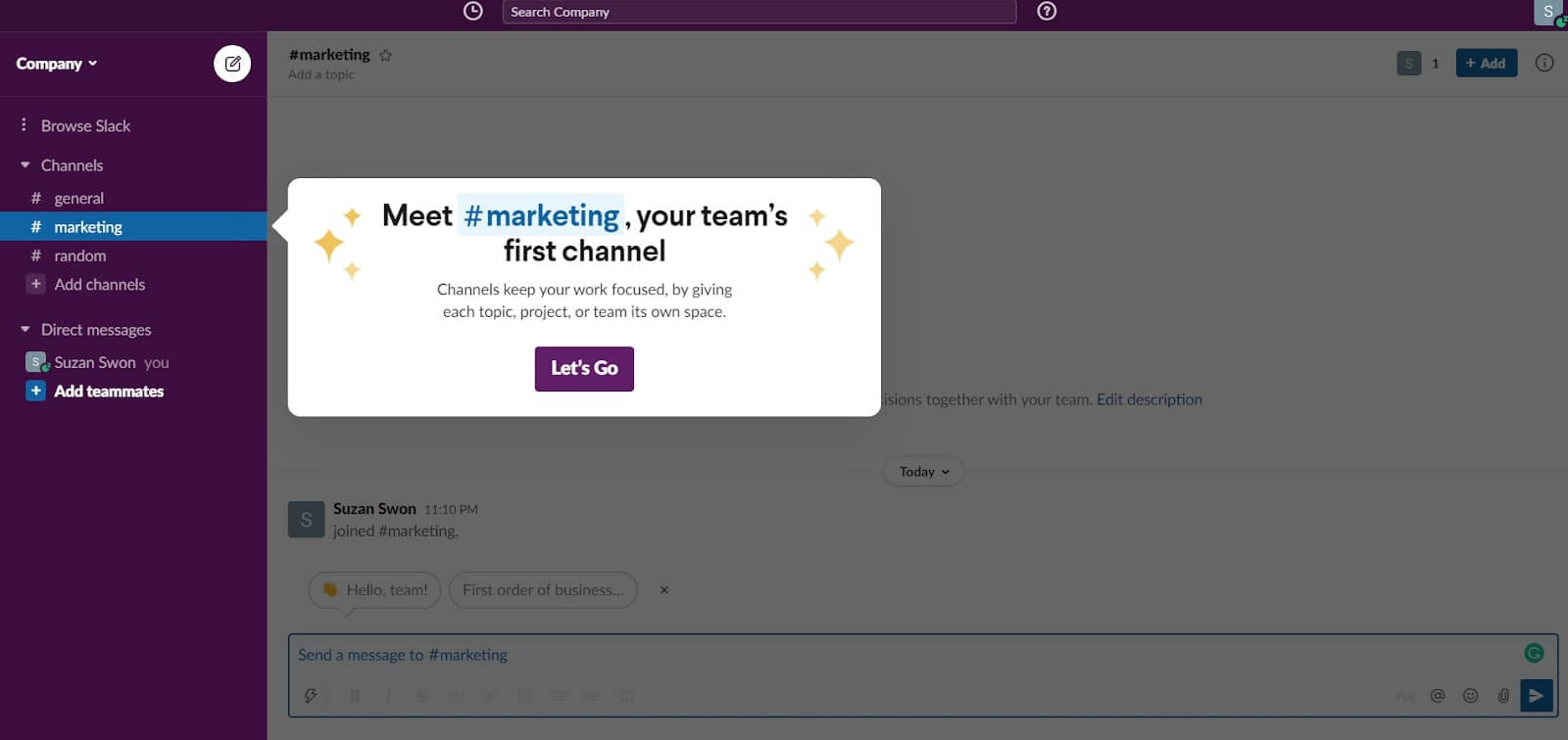
The instructions here act like highlighted menu items. In the “Learn how to” section, they guide you through the basic functionality with an onboarding progress bar down the screen:
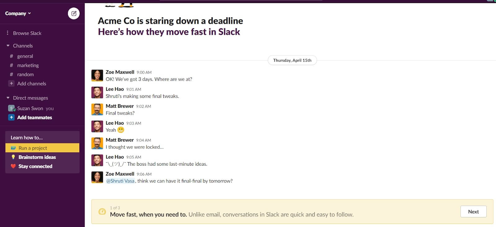
Slack demonstrates each of its three jobs is via examples. Just how they did with a “Run a project” job by presenting it via Acme Co team chat example:
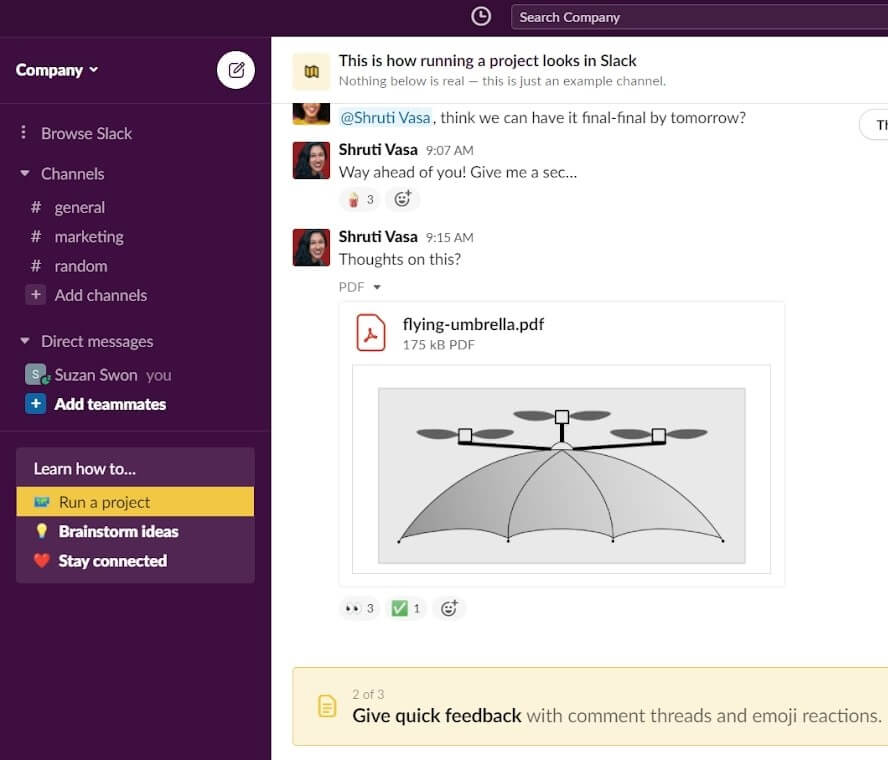
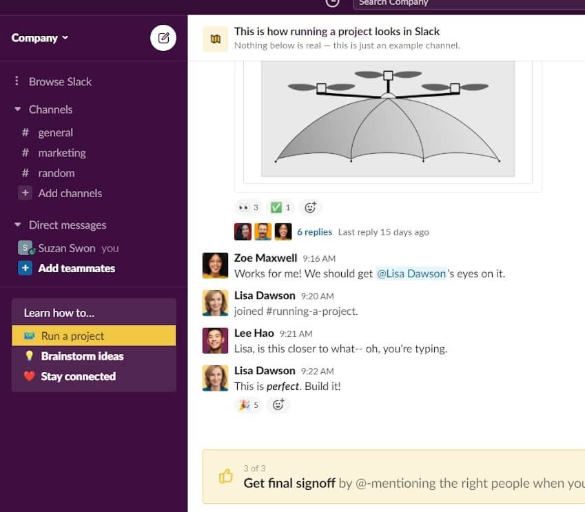
The imitation of a real conversation with situations and photos makes the client onboarding process live.
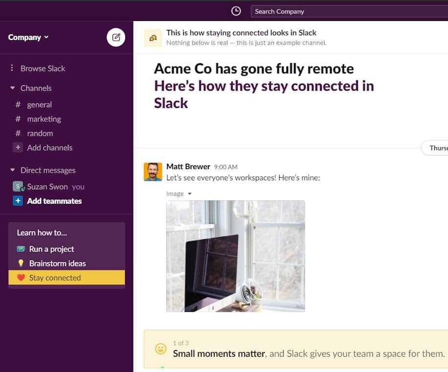
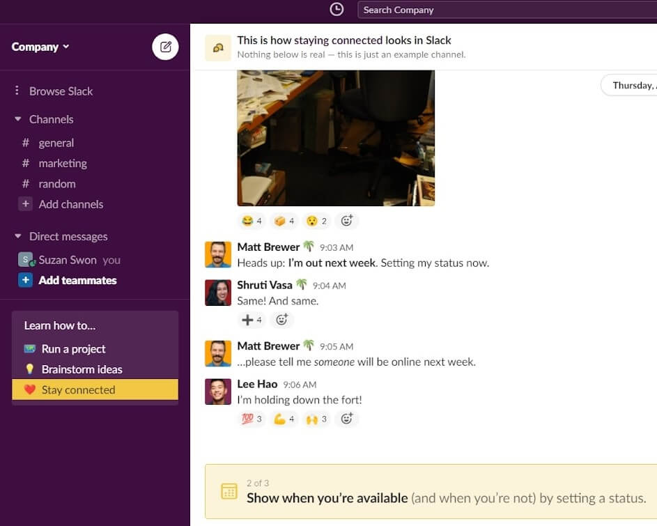
Speaking about the entire client onboarding experience, it feels fast and easy. Slack doesn’t drag a new user through an exhaustive tour of every feature. Thanks to the product jobs’ explanation via a team chat, customer Slack onboarding deserves to be a great example to follow.
Which of the customer onboarding trends does Slack follow?
| Frictionless Sign-up | + |
| Email Confirmation | + |
| Advanced Personalization | + |
| 3-4 Sign Up Fields | + |
| In-app Onboarding Videos | – |
| Using Templates Instead Of Empty States | + |
| Signing Up To An App With Third-party Accounts | + |
| Client Self Serves | + |
| Milestone Celebration | – |
| Tooltips | + |
| Client Onboarding Checklists | – |
| Product tours | – |
That’s all.
Don’t forget your free product marketing playbook.
Thank you! The playbook is already in your inbox

What we learned from these client onboarding examples
- If you care about new clients, save their time with a short sign-up flow containing 1-3 fields and the opportunity to use third-party accounts to log in.
Those who hesitate companies use an additional step of product demo with no need to log in or add social proof.
- Email confirmation is a must-have step. Thus, you can send onboarding email newsletters and communicate with the client.
- It is better to manage customers’ expectations during the onboarding with a progress bar, descriptive CTAs, a short explanation of why they need to share personal data in fields, how it’ll be used.
- In-app onboarding videos do a great job when welcoming new clients or explaining product value and features.
- Using templates instead of empty states is my fav client onboarding trend. It helps a new user to understand how a product or feature works without getting confused.
- In this article, each of the companies we reviewed offered clients a self-service opportunity to find the needed info by reading knowledge base articles, starting a conversation with a chatbot, watching video guides, or visiting social communities.
Read also: Answer questions before users ask: create your own Knowledge base
- Despite its motivating potential, the milestone celebration onboarding element is rare in SaaS onboarding today.
- And the star of this article ― tooltips. Almost every client onboarding example in this article has this element. Usually, they are combined with pulsing hotspots and guide customers to the next onboarding step.
We found this trend a native way to teach users how to use a product without benign annoying. Both tooltips and hotspots don’t prevent them from discovering product features by themselves. - If your product aimed to serve different buyer personas or use cases, include advanced personalization in the onboarding process. I mean, not just welcoming users by name (because it is a must), but offering the features, guides, and templates relevant to their needs.
- Client onboarding checklists have become a thing of the past. There is no company on our list that uses it.
- Exhaustive product tour isn’t too popular also. But we noticed them to become shorter and easier than before.
Want more? Now we are interviewing experts about the typical mistakes SaaS companies make when onboarding new clients.
Subscribe to be the first who’ll get this publication and other product marketing insights from the Dashly team!
Read also:
👉 Live Chat Best Practices: 20 Hacks to Make Customer Service Better
👉7 Best Live Chat for eCommerce: Boost Conversion on your Website
👉 Top 5 live chat mobile app: find the best fit for your business
👉 Live Chat: How Online Chat Tool Can Help Your Business
👉 20 Best Live Chat Software for your website chat service
👉 Acquisition funnel marketing: Grow customer conversions at each step of user journey
👉 The top 15 inbound marketing tools: harness digital power and elevate your business
👉 10 best website personalization tools to deliver top-notch visitors experience
👉 7 best email capture tools: features and pricing compared for 2024




![12 Mistakes When Choosing Live Chat, Users Regret About [Based On Capterra Reviews]](https://www.dashly.io/blog/wp-content/uploads/2021/03/live-chat-mistakes-720x308.jpg)
