Black Friday and Cyber Monday best practices and pop-up examples
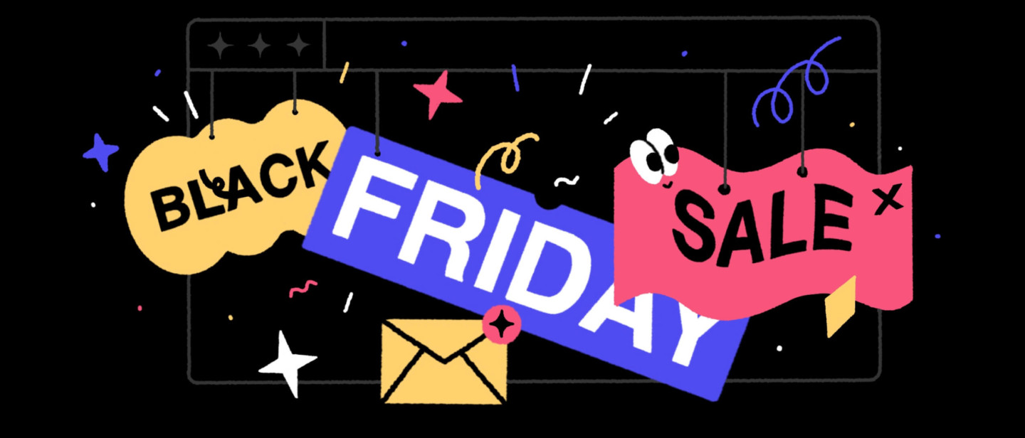
Welcome to the team of the late birds who jumped into the holiday sales in the nick of time.
Since we’ve already missed October 26, and Black Friday is just around the corner, let’s get cut right to the chase. Here is a list of the best Black Friday and Cyber Monday practices that you can launch right now!
I mean, the must-have element to engage website visitors on marketing holidays — pop-up windows.
Read the article to find the list of creative ideas and proven tools to craft your marketing campaign in 15 minutes. Skyrocket your sales with pop-ups using the best practices and ready-made design examples.
And we’ll start with…
The best of the best sales ideas inspired by the 2021 holiday season
Analyzing Black Friday and Cyber Monday best practices we found surprising marketing tactics. Here are the best of them:
Check your inbox to find the CTA list copy

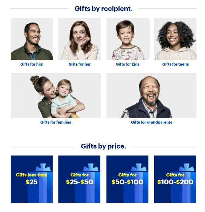
1. Black Friday is much about purchasing gifts for the winter holidays. A good practice is to help customers and group products in gift lists by personalities, prices, etc.
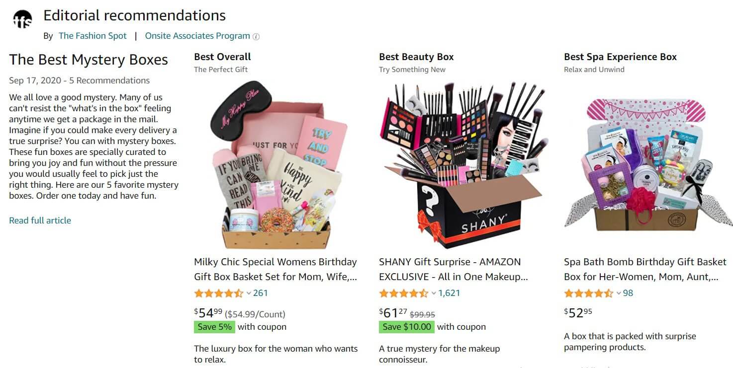
The gambling version of grouping practice is a mystery box. The key intrigue is whether you get an item that is worth more than the price of the box (like an iPhone 12) or a bundle of items which sum price is equal to the mystery box one.
2. For those who aren’t sure what to get their loved ones, e-stores offer Printable Gift Cards.
Here is how Amazon uses it:
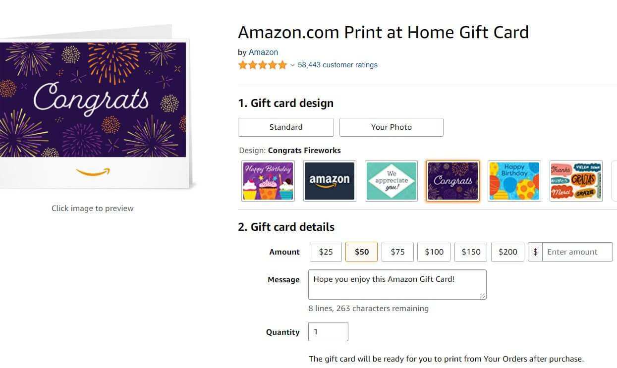
Customers customize it choosing the amount of money to pay and message on it. Then they register, buy it, print, disinfect! (all this Covid-19 stuff), and send or give as a present. On this sum of money the future owner can shop any products in the e-store.
3. If you missed the start of the Black Friday and Cyber Monday campaign, why to miss its finish? I mean an unexpected extension of the discount time ㅡ last chance for sleepy birds like we are?. When your competitors finish their sales, announce sale “extended __ hours/days”.
And don’t forget to send an email reminder.
What’s the point? Low competition. Customers are more likely to buy when you are the only store offering them a second chance to save.
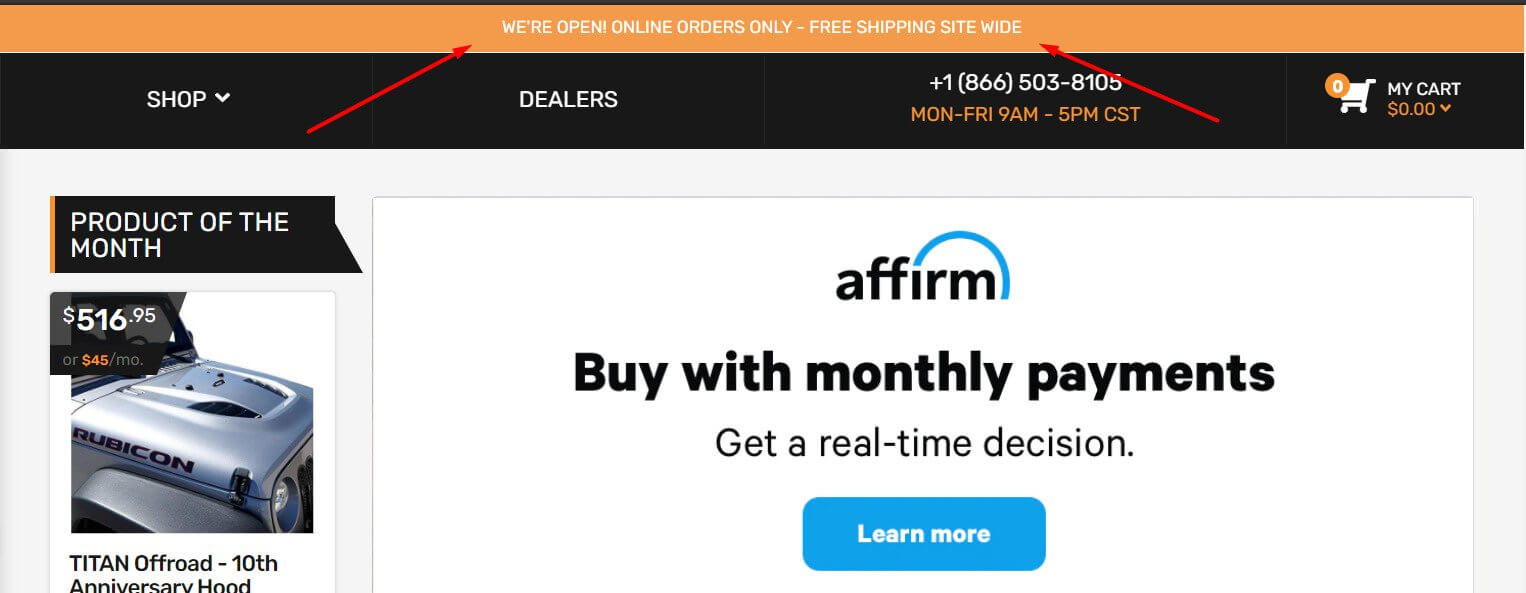
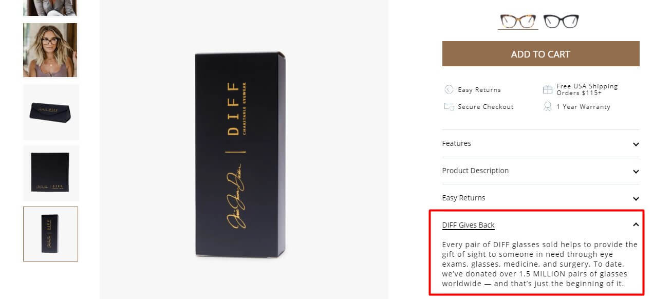
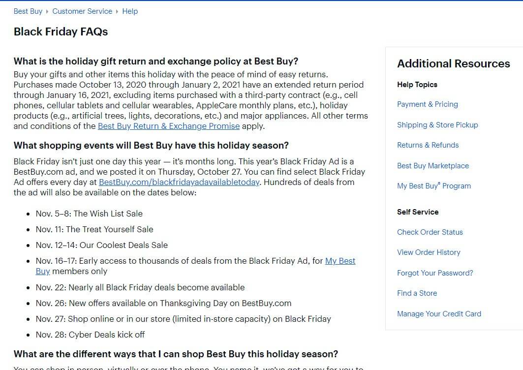
4. Prove it’s safe. Monsters and darkness are nothing compared to data privacy disclosure ㅡ customers’ fear #1. Calm down potential customers by privacy policy highlight on each product page during the sale period.
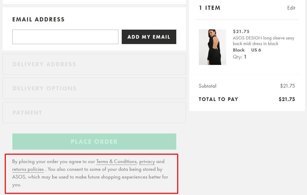
This also applies to shipping, returns, and refunds policies. Don’t hide it into the footer. Make sure it is written in simple, accessible language.
So, how to highlight?
In a form of a simple banner:
As a plain text on the product card info:
You can collect all the necessary documents into the Black Friday FAQ:

5. And now, sit down… because we offer you to buck the system entirely and increase your prices for the holiday. It may seem crazy, but it worked for Cards Against Humanity Black Friday campaign.
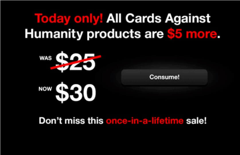
It’s incredible, but people found it funny and jumped on the promotion and paid an extra of $1-5 for a good belly laugh. I don’t mean you should repeat it, the key point here is a provocation. If your brand image and tone of voice suggests humor, why not to try?
Another example is REI Black Friday shut down. They proclaimed this period as a time for families.
6. Sale calendar. You probably have an event calendar and schedule your sales ahead. So, why not to share it with customers as Disney did:
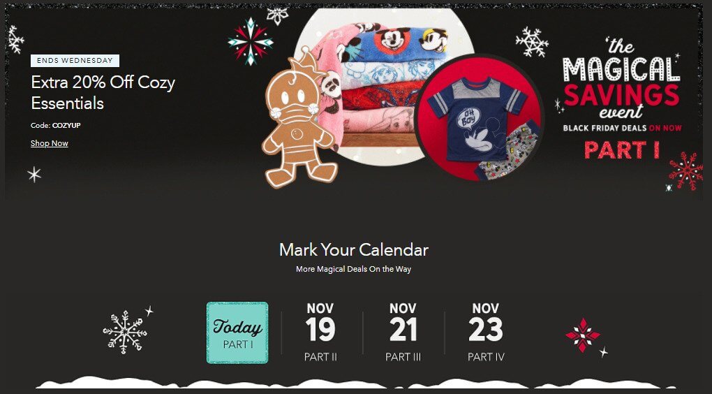
Announce your sales to help customers plan their shopping.
Speaking about discounts:
Purple Dog research says that less than 20% is not seen as a worthy offer.
7. It’s a giving season start, so encourage customers to do good. For example, donate a part of the money you get from sales

Go further and provide customers with the options to choose where their contributions go.
8. Don’t be greedy and provide complement products. Not yours, but your parnters’ one. That is what Serpstat, SEO growth hacking tool, did this Black Friday:
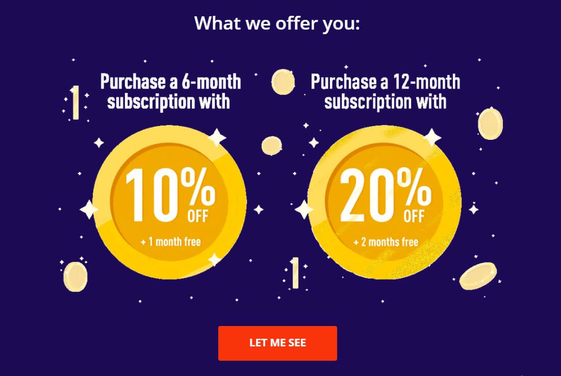
But that isn’t the end. 2 scralls lower you’ll see a list of Black Friday offers from their partners:
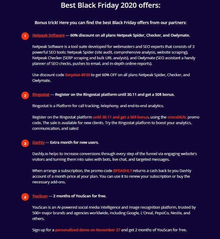
Thus, you’ll win customers and their loyalty.
Ok, the theory part is over. It’s time to move to the promotion part.
The fast and killing: Take the best from holiday pop-up marketing
Americans plan to spend $148.5 billion on Black Friday and Cyber Monday this year.
Finder
A big online rush for exclusive deals is expected. It means that your customer will have multiple website tabs opened, of you and your competitors. Your task is to catch the customer’s eye and stop them with an offer they can’t resist.
Let’s be clear, pop-up windows are a quick and effective way to achieve that.
Pop-up is a graphical user interface (GUI) display area, usually, a small window that suddenly appears (“pops up”) in the foreground of the visual interface.
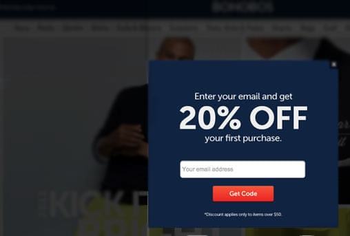
That’s more than a talk. These micro-messages help your business to:
- Grab attention to the most crucial. Short and contrast they cure customers’ banner blindness.
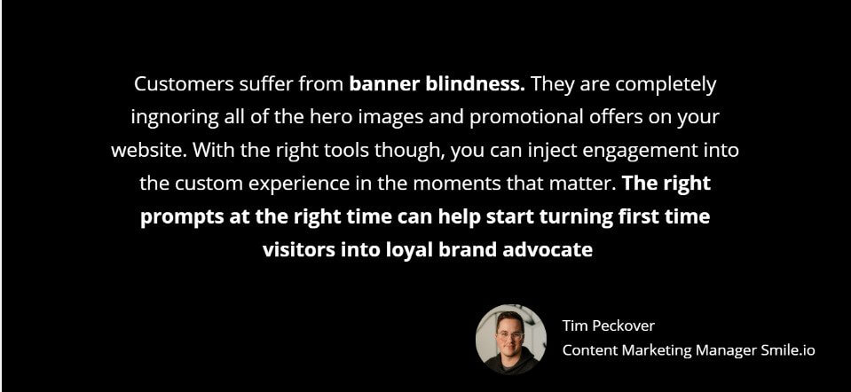
- Personalize promotions. Make customers feel special by mentioning their cart items, names, actions on your website. Dealing with pop-up settings is a matter of minutes, but what an effect!
- Get higher conversions. Comparing to 2.5% paid ads average conversion rate, the pop-up is a marketing rock star:
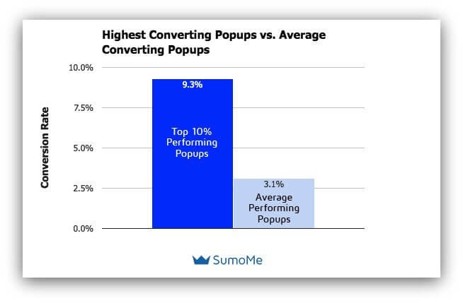
3% may seem a kind of small, but it would be premature to judge it without going deeper. Let’s say you have 100K unique visitors monthly. With a 3.01% conversion rate pop-ups can bring you over 3,000 subscribers!
So, don’t get me started about 9.3%.
But how to turn that 3.1% into a 9.3% conversion machine? It is easier than you think.
Black Friday and Cyber Monday pop-up examples made under 5 minutes
My specialization is text, not design. Following the best pop-up practices, I made 7 examples to prove that it’s real to craft something cool quickly with zero coding skills.
So, how to create a holiday pop-up quickly without a designer? Here is a simple plan:
- Find free Black Friday and Cyber Monday background images
- Register at Dashly (it’s free) and find pop-up window templates
- Customize them with the help of pop-up builder tools
Now it’s your turn to get inspired and create!
1. Invite customers to your Black Friday sales landing page
Segment: First-time website visitors
Create a pop-up window and help your visitors to see Black Friday or Cyber Monday offers in one click.
Using Dashly Pop-up Builder, I created Black Friday pop-ups: Free background + text and clickable button from the pop-up builder.
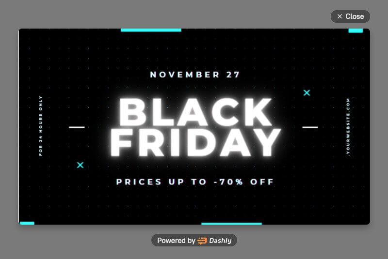
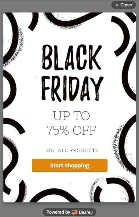
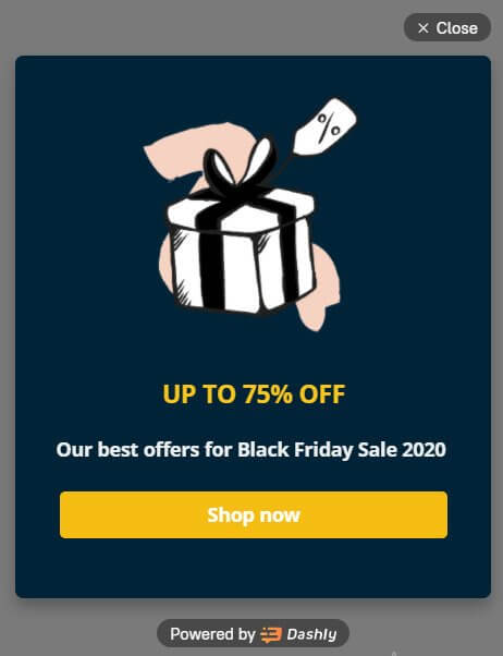
Design tips:
And here is a desktop and mobile version of the Cyber Monday pop-up:
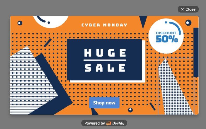
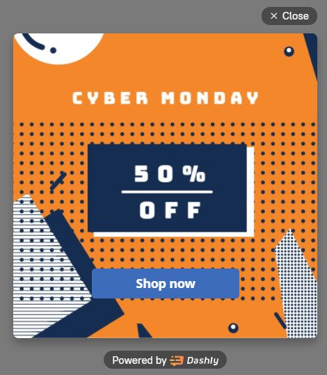
Free background images from Crello
Design tip: Geometry elements don’t cross the text field, the mobile version pop-up has a big button to click easier.
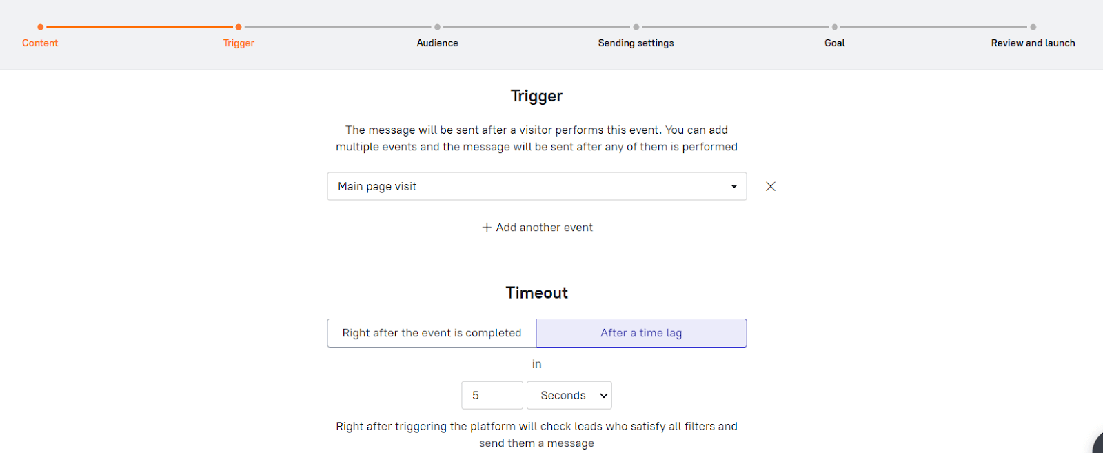
Set a 3-10 seconds delay of pop-ups to appear. In Dashly you can set the timeout right after the pop-up creation:
2. Start a long-lasting friendship with a valuable present
Segment: First-time visitors
Email capture is nothing without giving back to your website visitors for their contacts. It can be a coupon code, a discount, free shipping, valuable prize.
A discount pop-up window example:
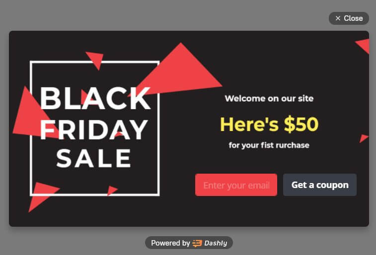
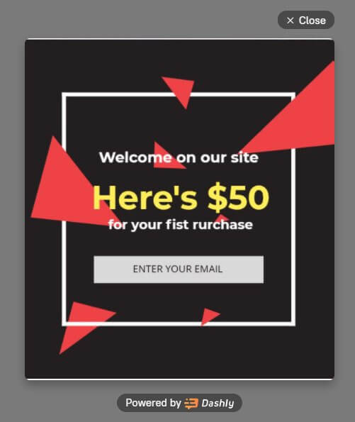
The desktop and mobile versions of the same pop-up. Free background image from Crello
Make sure your visitors will get the thing you promise instantly. Thus, first, I created a special event in Dashly to set it for a button click:
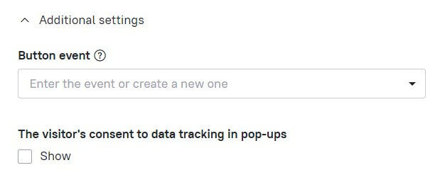
Later I’ll create a plain text email with the coupon code or a discount. It will be sent automatically when the button is clicked.
3. Welcome those who came back
Segment: Returned website visitors
If the content is a king, context is a god. This type of pop-up can bring you a 40% conversion rate!
“Welcome back” pop-ups make customers feel special because the company remembered them.
To build this pop-up, I used the Return_to_product page trigger event:
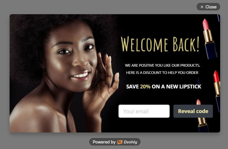
Design tip: White text on the black background goes in hand with a holiday main color style. Moreover, it is easy to read.
The trigger event is simple to set up on the next step of the pop-up window creation:

4. Rescue abandoned carts
Segment: Who have products in the cart, but intend to leave the website.
4% — 5% is an average Conversion Rate of an exit pop-up. Here is how it looks:
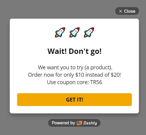
Design tip: People adore clicking on big and bright buttons.
The same logic works for the abandoned cart event. Encourage to take a second look at the cart by offering the most wanted service: additional discounts, free shipping, gifts, etc.
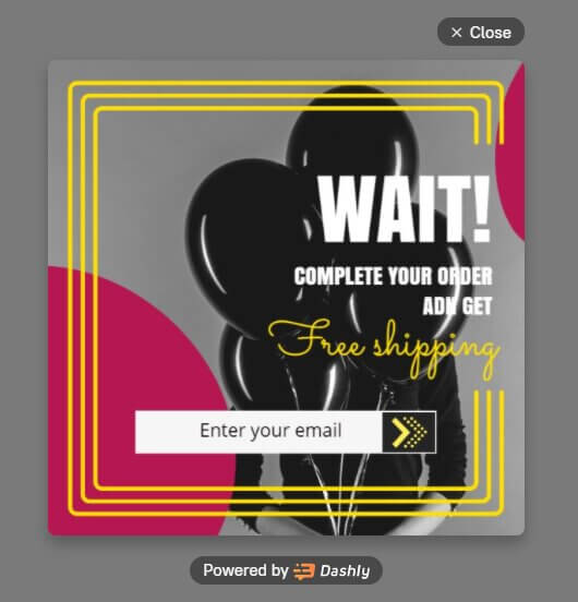
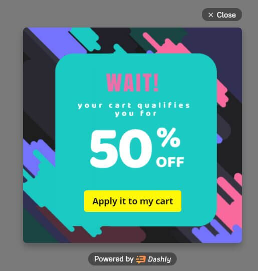
Design tip: Bright colors came back in 2019, and now they work great as a contrast to the minimalism trend.
5. Experiment with time-limited offers
Segment: All visitors
It’s in human nature: the majority of us value things only when they are limited. A sense of urgency calls excitement and FOMO. Black Friday and Cyber Monday are the perfect time to try it. Just put a small phrase telling about the end of the sale in your pop-up text.
This is a simple pop-up using the Dashly builder:
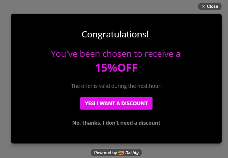
Design tip: Here you can see a closing link used instead of the traditional [X]. It helps to make sure that users have scanned the pop-up window.
Keep your word and cancel the discount when the time is up. Don’t use this marketing hack just to create panic and get more sales.
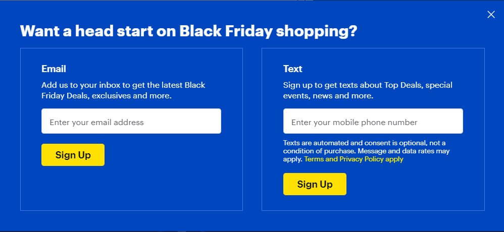
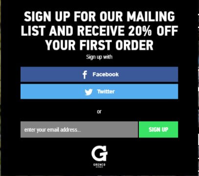
Bonus: Provide sign-up options
Here I collected real pop-up examples displaying freedom of choice. I mean, in the multichannel marketing era you shouldn’t limit your customers with the sign-up options.
Where to look for free customizable backgrounds for your pop-ups:
Check your inbox to find the CTA list copy
Wrap-up
If you’re looking for a tool to boost holiday sales fast, check out Dashly. Pop-up windows are a small part of the features it offers to convert your website visitors into buyers. There are Leadbot, A/B Testing, Live chat, Knowledge base, Email marketing, User tracking, Ready-made campaigns, and a list of useful integrations.
Dashly has all that you need to start Black Friday and Cyber Monday campaigns fast and effectively. Test it for free: we offer a 7-day trial. No credit cards needed.

Don’t forget to repeat for Cyber Monday!


![21 proven tools for your 2025 marketing tech stack [Recommended by market experts]](https://www.dashly.io/blog/wp-content/uploads/2022/08/martech-stack-999-720x317.png)

