We All Need to Develop Chatbots to Move The Technology: The Story of Dashly Leadbot

Chatbot is the feature we’re truly proud of. What is a bot? It’s software that helps our customers qualify users on their websites, collect leads, and sell more with the same traffic.
We began developing Dashly chatbot 1.5 years ago. Today we want to tell the story behind Leadbot and share our experience. This is what we’ll talk about in this post:
- why the first version took the whole year and how we managed to finish the second version in just three sprints;
- how the team learns to set realistic deadlines;
- what tasks you can skip and what can’t, and what ugly sheets got to do with it;
- how bugs should be handled when releasing a huge feature;
- what’s important in the chatbot identity;
- and what place hallway tests take in the development cycle.
On the article cover, you can see the team who worked on the chatbot:
- Dima, Head of Product
- Alex, Frontend Developer
- Olga, Backend Developer
- Sergey, CTO
- Dimitrii, CEO
- Helene, PMM
- Victor, Frontend Developer
- Eugene, Product designer
Chatbots accelerate customer communication
Businesses need to talk to customers to help them and prevent churn. However, support agents are not superheroes: their time is expensive, they only respond during working hours, and they have limited capacity and speed. That’s where customer service chatbot comes in handy.
We’d like to create a chatbot that accelerates both sides. It offloads support, reduces our costs, and saves the time of our customers as it can answer any time. It works round-the-clock with no break for lunch or smoke, and it doesn’t have to sleep.
The chatbot is already helping us grow faster as it sorts incoming leads by campaigns. Within campaigns, we differentiate communications so our sales reps work to target leads, close more deals, and generate bigger revenues.
Thank you! The playbook is already in your inbox
Leadbot is the hottest thing demanded by our users
Our users often asked for a website chatbot. We analyzed all requests and found out possible use cases and value to customers, and then concluded that a chatbot facilitates customer communication:
- customers prefer clicking buttons in case of typical questions as it ensures a quicker response;
- companies can collect customer data and adjust their communications.
Our main goal is to help digital businesses improve customer communication which means growing the customer base without scaling sales and support teams. You can only do it if you automate tasks and optimize the workforce. That’s why chatbot platforms are getting so popular, they help resolve the automation issue.
If we see that our feature doesn’t help our customers grow, we won’t invest in it.
We started developing Leadbot before the pandemic. With time, we got more and more requests from our users. The eCommerce industry transformed:
- people buy online with more time to compare options, they choose more carefully considering limited resources;
- businesses acquire larger traffic and engage in more conversations risking wasting money talking to non-target leads.
Manual communications definitely mean larger spend, but not necessarily higher revenues, so customer communications should be automated. Leadbot filters incoming messages, offloads agents, and helps reallocate resources in favor of target leads.
How we did a prototype in two days
Starting fresh isn’t easy, that’s why we teamed up for a design sprint.
We needed to build Leadbot ASAP, but it had to be user-friendly. Design sprint was a perfect tool for that: we dived into the issue, explored the existing solutions in the market, discussed our options, then built one option and did the QA of it.
Design sprints are quick, they usually take a week. We only needed to build the overall logic of the chatbot, so we reduced our design sprint to just two days.
These are the guys who developed the first prototypes:
- Dimitrii, CEO
- Dima, Head of Product
- Sergey, CTO
- Eugene, Product Designer
- Alex, Frontend Developer
Prototyping stage one: team catch-up, task setting
At stage one, we discussed the most essential things:
- what the main Leadbot’s “job” was;
- which campaigns should be engaged;
- what competitor options there are,
- and what the minimum required functionality was required for Leadbot.
Our major task was to ensure Leadbot meets these requirements:
— it can appear timely when needed;
— it’s compatible with our live chat;
— you can run and adjust it;
— you can edit threads and conversation stages.
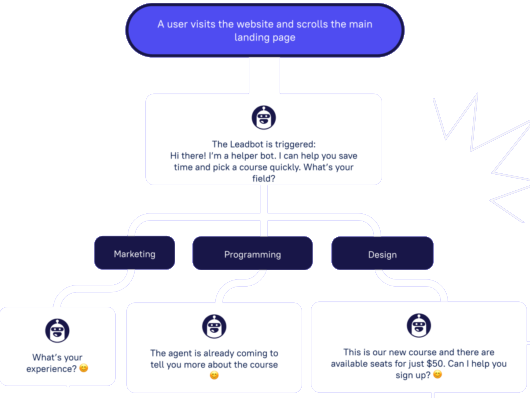
At that moment, we already realized it would be a chatbot with buttons, text messages, and a tree-like structure.
In addition, the software shouldn’t be too complicated to use. We wanted people to understand how to create a chatbot intuitively and with no coding skills.
We researched our rivals and user requests, learned more about chatbot best practices, and then decided we would build a chatbot that collects leads.
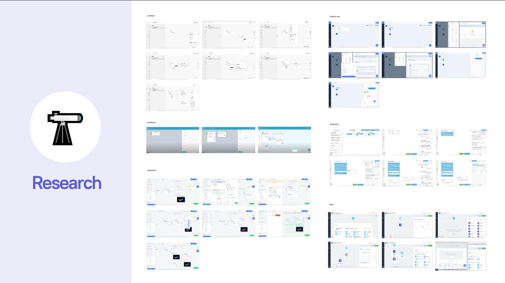
After a discussion of the research outcomes, each team member sketched their option of a prototype.
Prototyping stage two: each team member designs their MVP
At this stage, we considered the logic under the hood of a chatbot. We decided to prototype on paper to create and show them faster. Besides, this stage was offline as the team didn’t go remote at that moment.
When drawing on paper, you don’t bother with how it looks. One ugly sheet cuts away all the dirt.
We ended up with a bunch of tree-like chatbots with various visualizations. All prototypes looked alike except for one thing: CEO Dimitrii drew a mind map system that was too complex for an MVP (minimum viable product), that’s why we settled upon the tree-like structure.
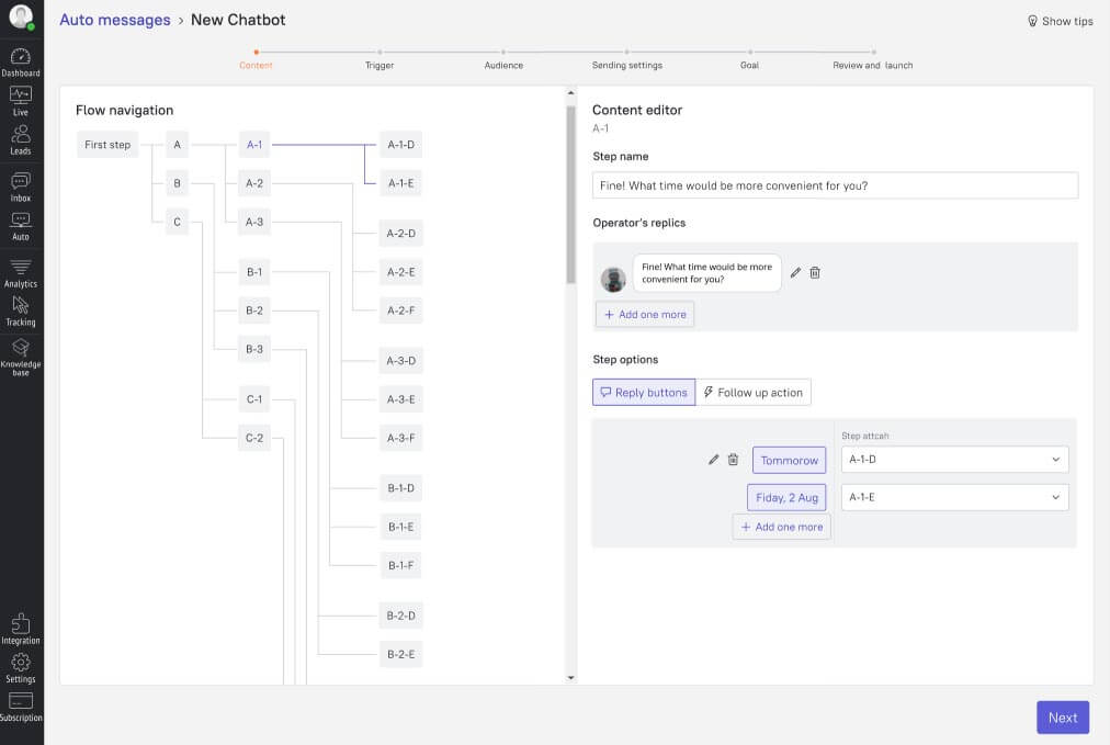
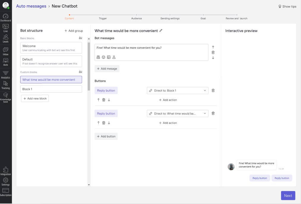
We prototyped a tree-like chatbot, revealed its limitations for users, and decided to redo it. It wasn’t so expensive compared to starting from scratch with the Canvas system.
Disclaimer: After the first release of the tree-like chatbot and the end of the beta test we collected user feedback and then built a chatbot with the full-fledged visual builder.
Prototyping stage three: finishing the prototype and assigning it to developers
After running ideas, we assigned to our developers the first option of a prototype:
- with buttons,
- text messages,
- with threads as the main elements,
- with the tree-like structure,
- without cycles.
“We thought it would only take one sprint, and it went on for four sprints in a row”: how we worked on Leadbot’s version one
We initially planned to finish Leadbot in one sprint. To accelerate the development, we decided to make maximum use of the code we already had.
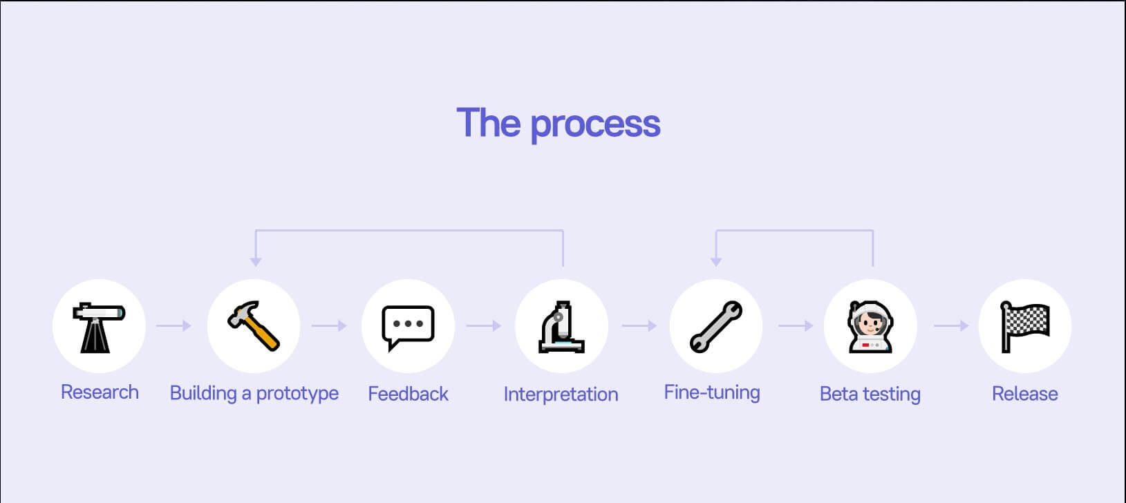
For example, we based the chatbot on the existing framework of auto messages. The bottleneck was that the chatbot’s functionality was wider than that of auto messages. It also had to allocate conversation between channels and agents.
A chatbot means user qualification, not only auto messages
Eventually, our “auto messages” framework was running the new code responsible for showing Leadbot, processing incoming messages, and building threads.
In a nutshell, we made the code reusable. We used the code that we wrote for auto messages and wrote some more code for a chatbot.
During the development and QA, we revealed some tasks that we couldn’t complete in one sprint.
Developing the first chatbot was tough and exhausting. We moved deadlines several times, and the team burned out. We couldn’t meet our own expectations: we thought we would finish in one sprint, and it happened four times in a row. More bugs appeared, and we experienced issues with the live chat. After that, the team gathered, ordered lots of delicious food, and we talked about setting realistic deadlines. Remember: it’s the team that sets deadlines, not team leads.
Executing asynchronous code didn’t come cheap to the team.
“Buttons jumped somewhere to the middle”: executing asynchronous code
A chatbot means several messages triggered by one event, and they should be sent sequentially so that the logic isn’t interrupted. Before the chatbot, each message was triggered by a particular event, so there was no need to send them in a sequence.
We found an issue in executing asynchronous code. A user could see several notifications (messages appearing when the chat is closed) in the wrong order.
We text “Hi there!”, then “I’m a bot”, and then options “Yes” and “No”. These options should always go last. Messages can get mixed, but buttons should always appear at the end. However, sometimes buttons jumped somewhere to the middle.
Then, we added the message sequence check to ensure the right order and the chatbot’s logic.
With these notifications, the message order was crucial as the new message could erase some important information. We began to accept not just separate messages, but a group of messages that follow one another and end up with some user interaction — a button with reply options or an input field. There, we had to work on the promise system and handle cases when the RTS (Real-time system) returned messages in the wrong order.
Another feature of notifications that ruined the chatbot’s logic was the moment of reading a message. In auto messages, showing notifications meant the message was read. That was an issue as users stopped seeing the chatbot if they got a welcome message. Though they didn’t interact with the chatbot, the system thought the opposite and no longer showed messages.
We taught the system so that it wouldn’t consider a message as read until a user doesn’t hover at it and clicks the chatbot. Plus, a notification disappears after a while: it unfolds once and the unread count goes up. At first, users complained that they didn’t see messages from the chatbot. After the redesign, there were fewer complaints, and the conversion rate went up.
“Be ready to burn it”: building the architecture
Though we could complete some tasks faster, we deliberately invested more time. Considering the architecture and developing the chatbot’s backend went a little beyond the design sprint and took a few weeks.
Dima first told us: “Consider the structure in a nutshell, but be ready to burn the bot. It’s a test version, and you can reset all progress and start fresh”. Eventually, we decided to spend more time on the architecture. Then, we didn’t have to redo anything as the architecture that we considered fit the new logic well.
We decided not to bind the architecture to the tree-like structure; in the backend, there are chatbot actions linking to certain threads, the list of threads, and the list of links to them. They’re not related to each other and can run in any order. All threads and possible actions simply exist like lists, and there’s a list of links to them.
It’s very interesting! The chatbot’s replies run so that for the backend, it doesn’t matter what was before. The command “Run that thread” simply makes the backend run it.
Thank you! Your playbook is already in your inbox
“When you’re working on something big, you don’t want to waste it”: saving the intermediate phases of Leadbot
We learned from our beta test participants about the things we should improve. Before we started to develop Leadbot, the platform couldn’t save the intermediate phase of auto messages. You need to fill out all required fields and create an auto message to save it. You can run it immediately or save it for later. An auto message is validated: the system checks if all properties are specified correctly.
Building a chatbot is a more complicated task than running auto messages, so we had to save partially created chatbots.
The chatbot’s structure is complicated, you can’t copy it and edit it in a separate place. When you’re working on something big, you don’t want to waste it so you save your progress.
We derived two stages in the chatbot creation process: saving the structure and running validated messages. This way, we could ensure that users wouldn’t lose progress and could save it. A user can save the structure and the content, and the system will check it before the launch.
When a user creates a chatbot and clicks “Save”, a chatbot is created, but it doesn’t run. If it doesn’t, there’s no strict validation of fields, actions, links in buttons, and assigning to agents
“When my customer’s platform is down, they don’t want to talk to the chatbot”: the interruption thread
This task appeared at the beginning of developing Leadbot, and we implemented the minimum required functionality:
- threads with buttons for Leadbot to qualify users;
- the input field for lead collection.
Early birds complained that their users couldn’t text the live chat, because the input field only appeared after the conversation was finished.
Users who interacted with the chatbot and dropped halfway couldn’t see the input field. It’s hard to guess that you need to click the hamburger button to start the new conversation.
We enabled users to include the interruption thread: a user can send a message to the bot at any time, interrupt their conversation, and start talking to a human agent.
It’s an auto chatbot that starts talking first. A user may have an issue like “My customer’s platform is down, nothing is working, they don’t want to talk to the bot!” We’ve changed the setting for these cases.
We initially implied an opportunity to interrupt the bot. This was a precaution in case a user managed to text the bot. Users wanted to see the field during their conversation, so we gave them this opportunity.
The bot should be stopped correctly, and ditching a user is bad, that’s why we ask our customers to set up the interruption thread in addition to configuring the input field. It’ll tell users that the bot received their question and it can assign the question to a channel or an agent, so a user gets their answers quickly.
“The bot should be friendly”: the identity
The bot’s user pic and name make up its identity. We started to develop it together with our regular agents’ userpics. They should be styled the same though still look different, so users wouldn’t mistake Leadbot for a human agent and vice versa.
We didn’t want the Leadbot’s userpic to look like a human. Inside the platform, we advise users to change a userpic so users see it’s a chatbot and don’t have too high expectations.
The user experience viewpoint suggests that the chatbot should look appealing so users want to talk to it.
The bot should be friendly. People often feel suspicious about chatbots. They think it would be dumb or too obtrusive.
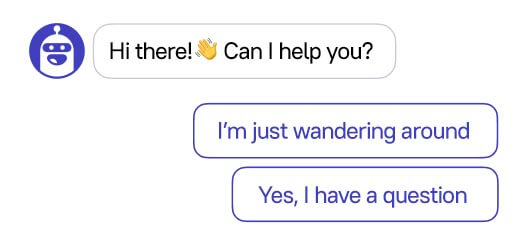
Our design team made a set of userpics for Leadbot expressing various emotions. We use one of them by default. In the final version, the bot looks friendly with its mouth open. It looks like it’s talking as its userpic is always next to a message.
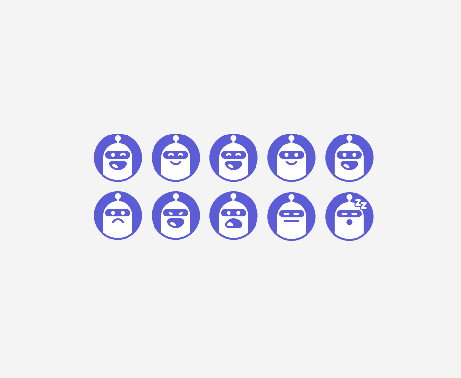
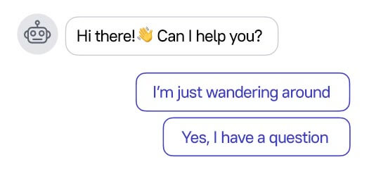
During the first iteration, Leadbot’s user pic looked like a standard system icon with a robot:
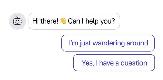
Then, we made it friendlier:
Finally, Leadbot’s userpic looks like this:
Leadbot’s userpic turned out to be popular within the company.
“It looked like we didn’t want to change our code”: how we did the QA and redesigned Leadbot
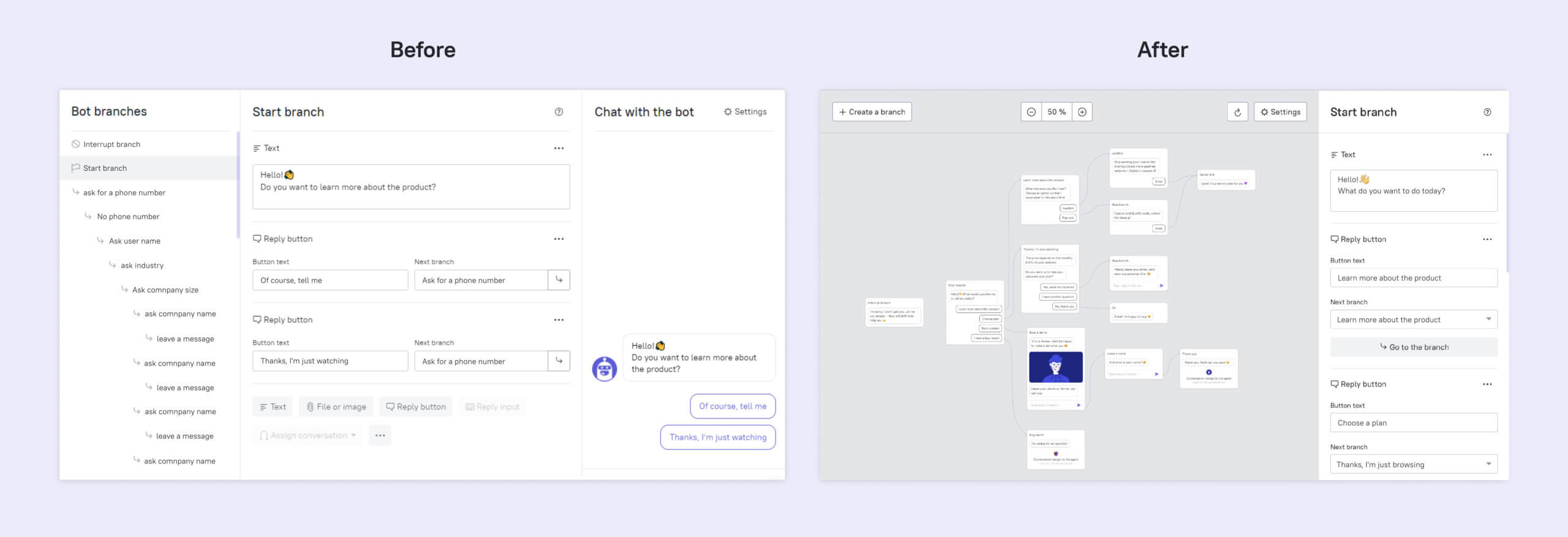
Leadbot version one with the tree-like structure was developed quickly, but its functionality was limited. We launched the free Leadbot beta test to see if it fits users’ needs. During four months, 232 customers tested Leadbot on their websites.
We found out from user feedback that users experience difficulties creating complex structures due to linear threads in Leadbot. They had to copy threads, and they couldn’t take a conversation back to previous messages.
We had many similar cases, and “Polly’s bot” where we had to create 161 threads was the most catchy. Polly, our manager, ran a qualification bot on the customer’s website and she discovered that she had to create a separate conversation for each new thread.

The team started to explore possible solutions to this issue within the linear bot’s structure, but the Leadbot builder wasn’t getting better visually.
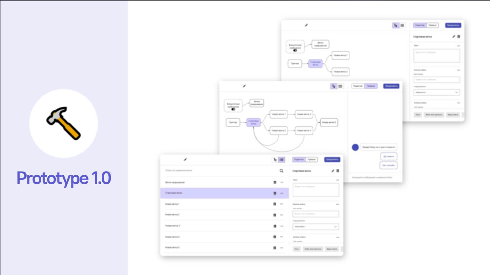
It looked like we didn’t want to change our code and use the Canvas technology, previously unfamiliar to the team. We realized we should proceed towards the visual builder.
We solved it by giving up the linear structure in favor of the visual Leadbot builder.
Our task was to make the Leadbot builder visually friendly and threads reusable. We couldn’t do it with the tree-like structure, so we decided to execute it using the mind map framework.
We considered three possible solutions: SVG, HTML, and Canvas. Our major criteria were:
- performance (we couldn’t slow the platform down);
- a large and active community of the open-source project;
- Angular compatibility (that’s what our admin panel is working on).
We started prototyping using HTML; it was fast, but we realized we would have to use a lot of band-aid solutions. After competitor research, we found some limitations of this solution. In many of them, complex relations were filled with bugs or didn’t work at all. We thought we would face difficulties after a quick HTML prototype, so we settled on Canvas.
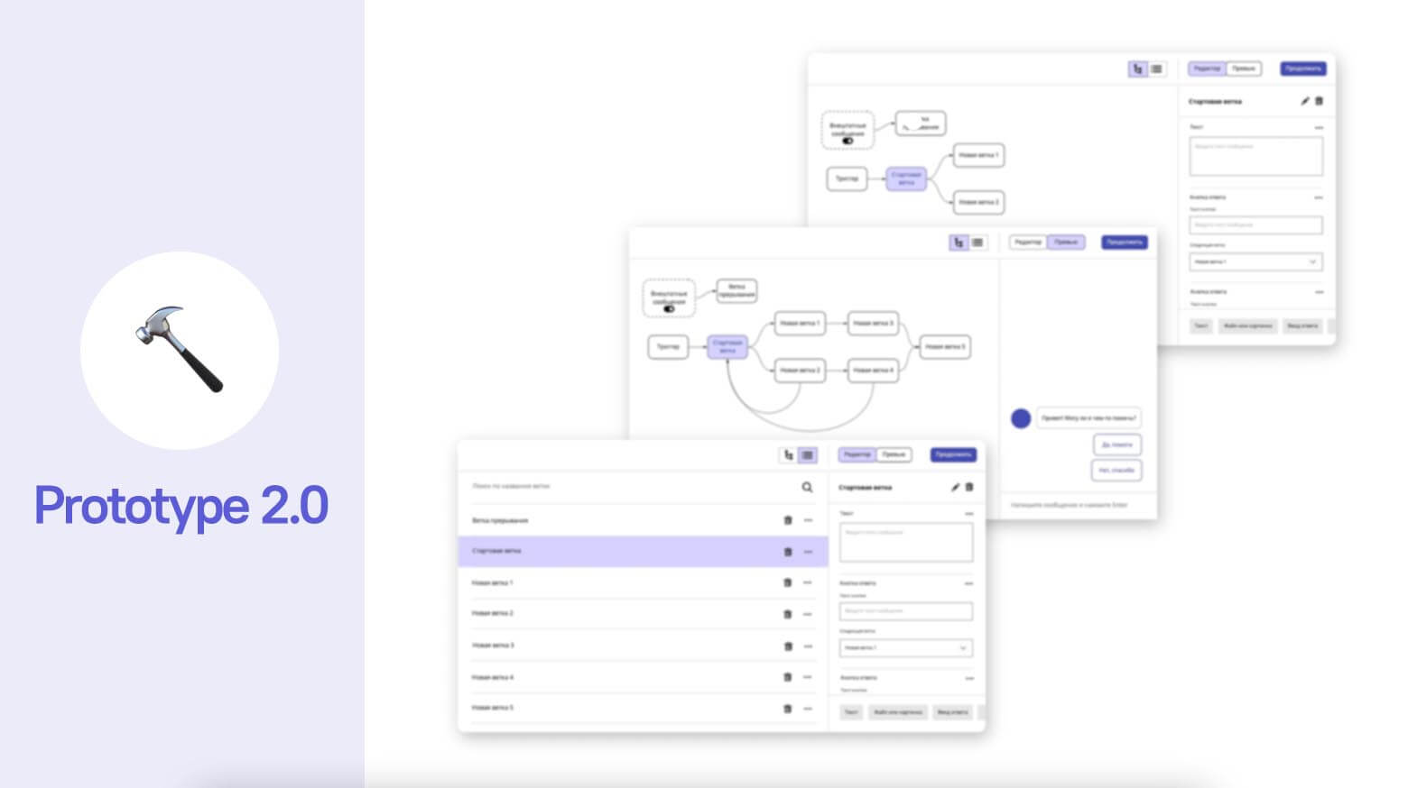
When prototyping, we deliberately gave up design to accelerate idea generation and discussion.
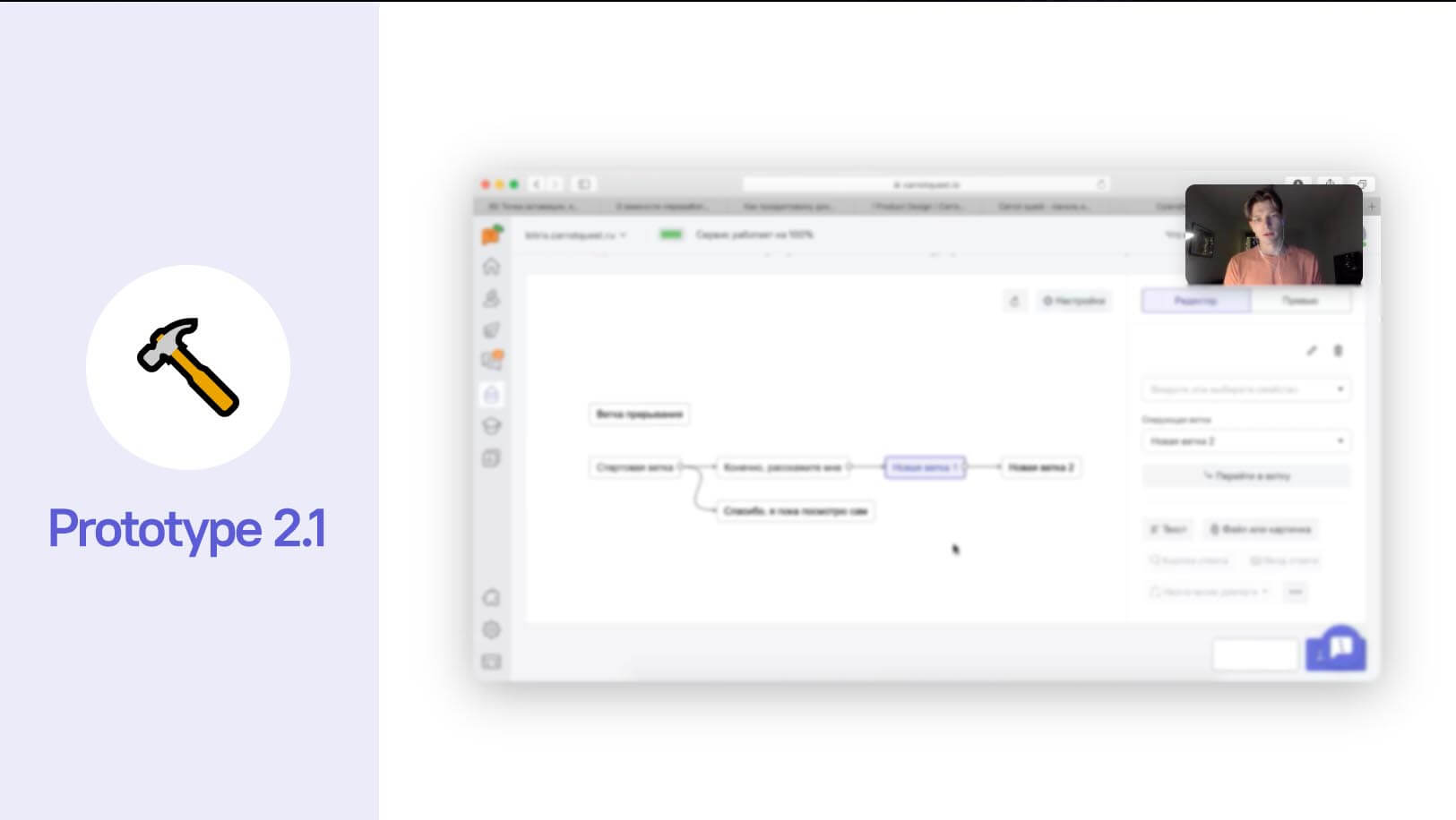
We tested all prototypes using hallway tests in several iterations:
- how well users understand the structure of the interface;
- which terms are better understood (journey, step, thread, etc),
- whether users notice the preview and see that they can interact with it.
During hallway tests, we found out that it was hard for users to relate a visual scheme to a campaign they were configuring. The issue was that they couldn’t create a thread and then enrich it.
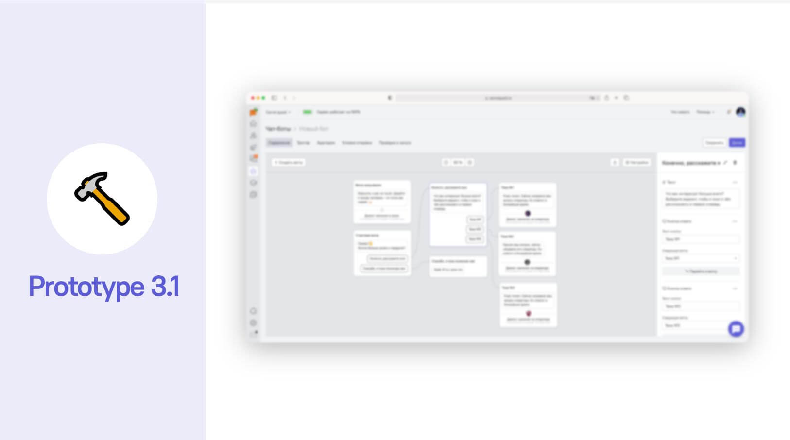
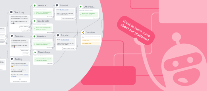
After some fine-tuning, that version became the new visual builder. Now users can configure and edit Leadbot campaigns, and it’s much easier. What users can do now in the builder:
- see all messages from Leadbot and their options in one screen;
- relate threads to each other and loop conversations;
- create and launch more complex campaigns.
Though Leadbot version one didn’t come cheap to the team, we rearranged our processes and learned to set more realistic deadlines.
Developing the visual builder was seamless. We did it all in three sprints. The first one was the technical review, in the second one, we already started to execute it, and we used the third sprint to fine-tune the builder. We reconsidered how we approached bugs and engaged one more developer from another team. Though it’s not always a good solution, the guy got the point quickly as we all work on the same platform and code.
We also reconsidered our standups and took a different approach to bug fixing.
Previously, the guys collected a bunch of bugs and fixed them for most time of the sprint. If one developer got stuck with one bug, all of his tasks got stuck, too. Other guys handled their bugs and then turned to lower-priority ones. We couldn’t reveal it during standups, and the guys only asked for help when it was a disaster. Now, guys take one or two bugs daily and only handle them. If a guy is stuck with one bug, other guys take on the remaining critical bugs. It works well like that.
What’s next? Developing and improving more chatbots
What Dashly’s Leadbot can do now:
— collect and qualify leads even at night when sales reps are sleeping;
— collect user feedback and tell the audience about new features;
— close repetitive requests before users send them;
— offer goods tailored for a particular user.
We are working on the bot that replies to a message sent to live chat. We keep an eye on chatbot future trends, so our product meets the expectation of the users. Subscribe to our updates and be the first to beta test it!
The industry is moving towards automation that proves the demand for chatbots: for higher performance, businesses need to engage customers better at a lower cost. Chatbots reduce costs for businesses, facilitate the routine of different teams, and improve customer loyalty with precise and quick replies. It’s a win-win-win scenario!
Calling the information office to find out the address is something insane now. You can just open Google Maps! But it’s not the same with chatbots, and users still prefer human agents. Chatbots are definitely moving towards user needs. We all need to develop chatbots to move the technology.


